Door signage ideas play a bigger role than most people realize. I’ve seen well-designed spaces lose clarity simply because the door signage felt confusing, outdated, or poorly placed.
A good door sign does more than label a room, it guides people, sets expectations, and quietly reflects the identity of the space. Whether it’s a home office, classroom, clinic, or workplace, the right signage improves both usability and first impressions.
In this article, I’ll share carefully researched and widely used door signage ideas that professionals rely on, ideas that balance readability, material choice, and design so the message feels clear, intentional, and easy to understand at first glance.
1. Minimalist Nameplate Door Sign
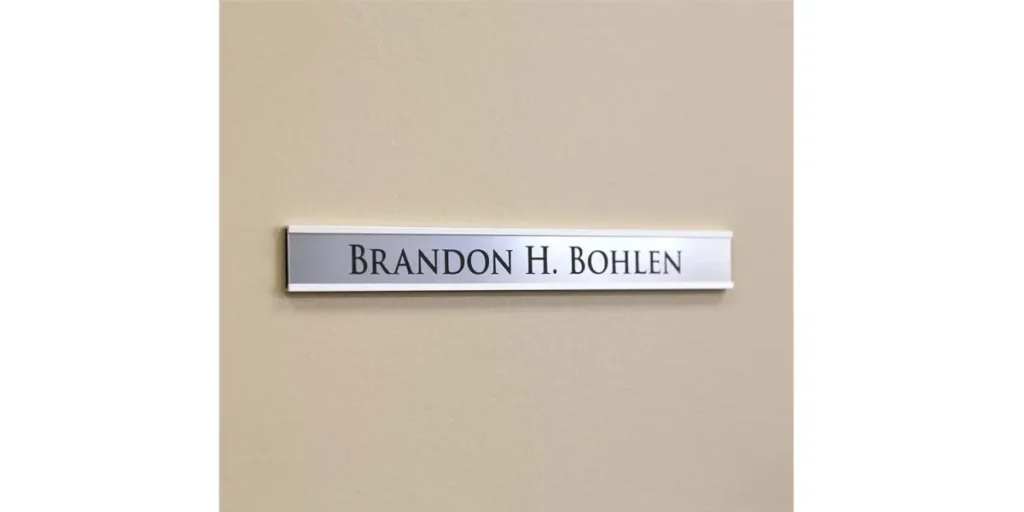
A minimalist nameplate door sign focuses on clarity and simplicity. Clean typography, neutral colors, and uncluttered layouts help people read the information instantly.
This style works especially well in homes, offices, and apartments where subtle design feels more appropriate than decorative signage.
Designers often use simple materials like acrylic, metal, or matte-finished plastic to maintain a modern look. Sans-serif fonts and balanced spacing keep the sign readable from a distance without demanding attention.
I’ve found minimalist nameplates effective because they age well. They don’t rely on trends, which makes them a long-term solution for spaces that value professionalism and order.
2. Acrylic Door Signage for a Modern Look
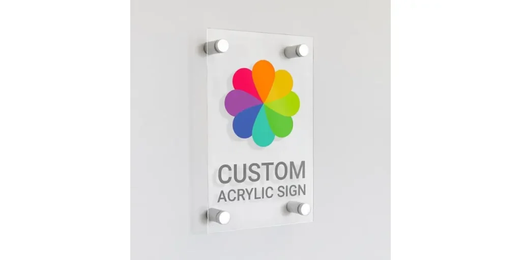
Acrylic door signage delivers a sleek and contemporary appearance that suits modern interiors.
The transparent or frosted surface allows the sign to feel light while still remaining visible and professional. This makes acrylic a popular choice for offices and commercial spaces.
Manufacturers often combine acrylic with metal standoffs or subtle printing to create depth. This layered effect adds sophistication without cluttering the door visually.
From a usability perspective, acrylic signs perform well in busy environments. They resist moisture, clean easily, and maintain their appearance even with frequent contact, which makes them a practical modern solution.
3. Wooden Door Sign for a Warm Feel

Wooden door signs bring warmth and character to a space. Natural wood grain instantly softens the look of a door and creates a welcoming atmosphere. This style works particularly well in homes, cafés, clinics, and creative workplaces.
Designers often choose engraved or lightly painted text to preserve the organic feel of the wood. Finishes usually remain matte or slightly distressed to enhance authenticity rather than shine.
I’ve noticed wooden signage connects emotionally with people. It feels personal and approachable, making it ideal for spaces where comfort and friendliness matter as much as clarity.
4. Engraved Metal Door Sign
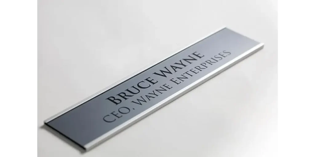
Engraved metal door signs communicate authority and professionalism. Materials like brass, stainless steel, or aluminum give the sign weight and permanence. This idea is widely used in offices, hospitals, and institutional buildings.
Engraving ensures long-lasting readability because the text does not fade or peel. Clean lettering and solid construction help the sign remain legible even after years of use.
In my experience, metal signage works best where reliability matters. It reinforces trust and order, making it suitable for formal environments that require durability and clear identification.
5. Typography-Based Creative Door Sign
Typography-focused door signage uses text as the main design element. Instead of icons or graphics, the sign relies on font choice, spacing, and layout to communicate meaning. This approach works well in studios, classrooms, and creative offices.
Designers often experiment with bold fonts, playful lettering, or custom typefaces while maintaining readability. The goal is to express personality without sacrificing clarity.
I’ve seen typography signage succeed because it feels intentional. When the font matches the space’s character, the door sign becomes part of the brand or learning environment rather than just a label.
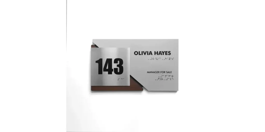
6. Icon and Text Combination Door Sign
Icon and text door signage combines symbols with words to improve understanding.
Icons help people recognize room functions quickly, while text confirms the message clearly. This approach suits public spaces like schools, offices, and healthcare facilities.
Designers use universally recognized symbols to avoid confusion. Proper spacing between the icon and text keeps the sign easy to scan at a glance.
I find this idea effective because it supports accessibility. It helps visitors of different ages and languages navigate spaces confidently without needing additional instructions.
How Door Signage Improves Navigation and First Impressions
Door signage does more than label a space; it helps people move confidently and understand what to expect before entering. Clear, well-placed signs reduce confusion, save time, and create a sense of order.
I’ve noticed that spaces with thoughtful signage feel more professional and welcoming, even when the design stays minimal.
When materials, typography, and placement align with the environment, signage becomes an invisible guide, doing its job quietly while reinforcing the identity and purpose of the space.
FAQs
What information should a door sign include?
A door sign should include only essential information, such as the room name, the person’s name, or the function. Keeping content brief improves readability and avoids clutter. In professional spaces, adding a title or department can help visitors orient themselves quickly.
How do I choose the right material for door signage?
Material choice depends on the environment and usage. Acrylic and metal work well in offices and public spaces due to durability, while wood suits homes and creative settings. Choosing materials that match interior finishes helps signage feel integrated rather than added later.
Where is the best place to install door signage?
The best placement is at eye level, usually beside or directly on the door, where it’s easy to spot. Consistent placement across a building improves navigation. Avoid areas where handles, frames, or reflections might block visibility.
Conclusion
Door signage plays a quiet but essential role in how spaces function and feel. When designed thoughtfully, it guides people effortlessly, reduces confusion, and reinforces the identity of a room or building.
The right combination of material, typography, and placement ensures that signage remains clear without overpowering the surrounding design. From my experience, effective door signs feel natural and intentional rather than decorative or forced.
They support daily movement while contributing to a professional and welcoming atmosphere.
By focusing on clarity and consistency, door signage becomes more than a label, it becomes a reliable design element that improves usability and leaves a strong, positive impression.