
Door sign ideas often determine how easily people understand and navigate a space. I’ve noticed that even well-designed interiors can feel confusing when door signs lack clarity or consistency.
A good door sign does more than label a room, it guides visitors, sets expectations, and reflects the character of the environment. Whether used in homes, offices, schools, or public spaces, thoughtful signage improves both function and appearance.
In this article, I’ll share carefully researched door sign ideas that professionals rely on, focusing on readability, material choice, and placement. These ideas aim to make spaces easier to use while maintaining a clean, intentional, and professional look.
1. Minimalist Text Door Signs
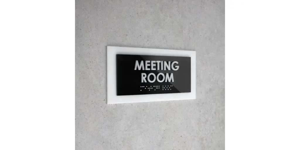
Minimalist text door signs focus on clarity above all else. Clean fonts, simple wording, and balanced spacing allow people to understand the message instantly. This style works especially well in modern homes and offices where visual simplicity matters.
Designers often choose neutral colors like black, white, or gray to maintain readability. Sans-serif fonts keep the look contemporary and professional without drawing unnecessary attention.
I’ve seen minimalist signs perform well over time. They stay relevant, avoid visual clutter, and support a calm, organized environment where information feels easy to access.
2. Wooden Door Signs for a Warm Touch

Wooden door signs bring warmth and personality to a space. Natural grain and texture soften the door’s appearance and make the area feel more welcoming. This idea works well in homes, cafés, classrooms, and creative studios.
Many designers prefer engraved or lightly painted text to preserve the organic look of the wood. Matte finishes help maintain authenticity and prevent the sign from looking overly polished.
From my experience, wooden signs create emotional comfort. They communicate friendliness while still providing clear information, which makes them ideal for relaxed or people-focused environments.
3. Acrylic Door Signs for Modern Spaces
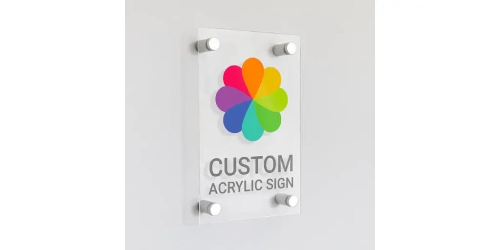
Acrylic door signs deliver a sleek and contemporary look. Their transparent or frosted surfaces feel light and modern, making them popular in offices and commercial buildings. They pair especially well with glass doors and clean interiors.
Manufacturers often mount acrylic signs with metal standoffs to create depth and structure. This layered design adds visual interest without cluttering the door.
I’ve found acrylic signage highly practical. It resists moisture, cleans easily, and maintains its appearance in busy spaces, making it a reliable modern option.
4. Metal Door Signs for Professional Settings
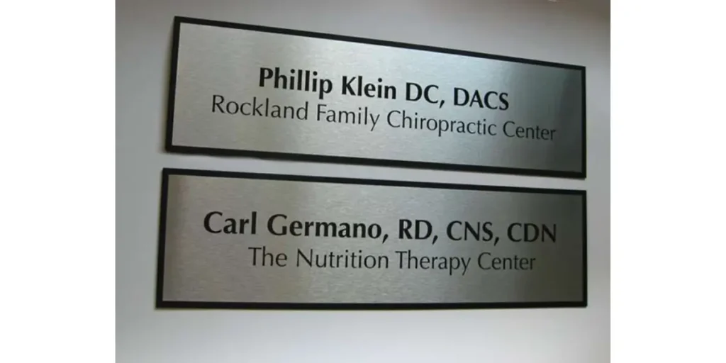
Metal door signs communicate authority and durability. Materials like stainless steel, brass, or aluminum give the sign a solid and permanent feel. This idea suits offices, hospitals, and institutional spaces.
Engraved or etched lettering ensures long-term readability and prevents fading. Clean layouts and strong contrast improve visibility even in high-traffic areas.
I often recommend metal signage where reliability matters. It reinforces trust, order, and professionalism while standing up to daily wear without losing clarity.
5. Creative Typography Door Signs
Creative typography door signs rely on font choice and layout to express personality. Instead of graphics, the text itself becomes the design feature. This approach suits studios, classrooms, and branded workspaces.
Designers experiment with bold fonts or custom lettering while keeping the message readable. Alignment and spacing play a key role in maintaining balance.
In my experience, typography-based signs feel intentional and expressive. When the font matches the space’s character, the sign enhances identity without sacrificing clarity.
How Door Signs Improve Wayfinding and User Experience
Door signs play a quiet but powerful role in how people move through a space. Clear, well-designed signs reduce hesitation and help visitors feel confident about where they are going.
I’ve noticed that when signage feels consistent and easy to read, spaces instantly feel more organized and professional. Good door signs also support accessibility by guiding different users, guests, staff, or students without constant verbal directions.
When design, placement, and messaging work together, door signs become part of the experience rather than a distraction, making environments easier to navigate and more welcoming overall.
FAQs
What should be included on an effective door sign?
An effective door sign should include only essential information such as the room name, function, or person’s name. Clear wording improves readability and avoids confusion. In professional settings, adding a title or department can further help visitors orient themselves quickly.
How do I choose the right material for door signs?
The right material depends on the environment and usage. Wood works well for warm, casual spaces, while acrylic and metal suit modern or high-traffic areas. Choosing materials that match the interior style helps signage feel intentional and integrated.
Where is the best placement for door signs?
Door signs work best when placed at eye level, either on the door or just beside it. Consistent placement across a building improves navigation and reduces confusion. Avoid areas where handles, reflections, or door movement can block visibility.
Conclusion
Door signs may seem like a small detail, but they have a lasting impact on how spaces function and feel. When designed with clarity, consistency, and purpose, they guide people effortlessly and reduce confusion.
The most effective door signs balance readability with thoughtful material and design choices, allowing them to blend naturally into their surroundings.
From what I’ve observed, spaces with well-planned signage feel more organized, welcoming, and professional.
Rather than treating door signs as an afterthought, giving them proper attention improves both user experience and visual harmony.
With the right approach, door signs become quiet yet powerful tools that support navigation, communication, and overall design quality.