
We know the feeling of staring at flat, boring drywall and wishing for a space that actually has some soul. Our favorite way to fix that cold vibe is with the soft, chalky texture of a traditional mineral finish.
Important Things To Know Before Using Limewash In Your Dining Room
We want to make sure you understand exactly how this traditional mineral finish behaves before you start rolling it onto your walls. Traditional lime paint is entirely different from the standard acrylic or latex cans you buy at the local hardware store.
This finish actually cures through a chemical process called carbonation as it absorbs carbon dioxide directly from the surrounding air. The result is a hard, rock-like limestone surface that bonds permanently to your wall rather than just sitting on top of it.
We love that this product is completely non-toxic, zero-VOC, and naturally resistant to mold and mildew growth without added chemicals. It acts as a breathable layer that regulates moisture, making it a fantastic healthy choice for spaces where your family gathers to eat.
You need to remember that the wet mixture looks significantly darker in the bucket than it does once it fully dries on the drywall. The true, chalky color and beautiful cloudy motion only reveal themselves after the surface is completely dry.
1. Cozy Earthy Beige Textured Backdrops
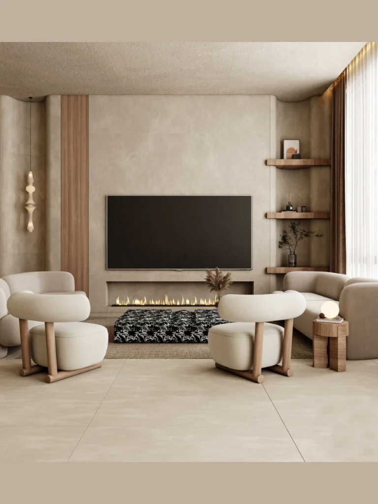
We love how a warm sand tone immediately removes the clinical feel from a modern eating space. This specific shade mimics the plaster found in old European villas without requiring a massive renovation budget.
You get a soft background that catches morning light beautifully while hiding minor wall scuffs. It sets a relaxing mood that makes guests want to stay at the table long after dinner ends.
Our testing shows this tone pairs beautifully with raw oak furniture and soft linen tablecloths. The matte finish absorbs glare, creating a cozy environment that feels premium yet completely unpretentious.
We suggest using a large block brush in random x-patterns to achieve this specific look. The technique creates subtle shading transitions that make a standard room feel like a historic sanctuary.
2. Dramatic Charcoal Accent Dining Walls
We believe every dining space benefits from a little bit of dark, moody theater to set the evening mood. Choosing a deep charcoal hue gives you that luxury restaurant feeling right in your own home.
The mineral variations prevent the dark color from feeling flat or looking like a chalkboard. Instead, you get a velvety surface that serves as a beautiful gallery backdrop for framed art pieces.
We noticed that brass light fixtures absolutely pop when placed against this deep textured finish. It creates a high-contrast look that feels expensive even if you did the work yourself over a weekend.
You do not need to worry about the room feeling like a cave if you keep the ceiling light. The texture reflects enough light to keep the space feeling sophisticated instead of gloomy.
3. Soft Sage Green Mediterranean Vibes
We find that bringing muted botanical tones indoors creates a peaceful setting for family meals. Sage green mixed with mineral lime creates a chalky, historical look that feels fresh and alive.
This color works exceptionally well in spaces that feature lots of potted plants and natural sunlight. The wall texture mimics the weathered stucco found along sunny coastal hillsides.
We love pairing this specific wash with matte black hardware and light linen window treatments. The contrast prevents the soft green from looking too sweet or resembling a vintage kitchen.
You will find that this shade acts as a neutral while still adding a distinct personality to the room. It handles the daily messes of a busy household without showing every single fingerprint.
4. Minimalist Warm Gray Industrial Textures
We know that gray can sometimes feel cold and industrial if you use standard latex paint options. A mineral wash changes the entire equation by introducing a soft, cloudy motion to the surface.
This specific approach gives you the sleek look of concrete without the heavy structural commitment. It fits perfectly into a contemporary home that values clean lines and simple styling choices.
We highly recommend matching this wall treatment with a dark walnut table and sleek leather chairs. The combination creates a balanced look that feels both warm and architecturally interesting.
The application requires very light layers to keep the cloudy effect subtle and sophisticated. It provides a clean backdrop that lets your favorite dining room lighting take center stage.
5. Terracotta Plaster Old World Charm
We always get excited about rich, clay-inspired tones that bring instant warmth to a northern-facing room. Terracotta mineral finishes give the illusion of baked earth and traditional Italian craftsmanship.
This option works wonders if your space lacks natural architectural details like crown molding. The sheer depth of the textured finish commands attention and fills the room with character.
We love how candle-light dances across the subtle ridges of a clay-toned textured surface. It creates an intimate evening glow that makes everyday dinners feel like a special occasion.
You can easily style this look with vintage rugs and antique wooden storage pieces. The result is a curated space that looks like it evolved beautifully over several decades.
6. Soft Cream Monochromatic Elegance
We think that an all-white room can sometimes feel a bit like a sterile dentist office. Switching to a rich cream mineral wash adds immediate depth without sacrificing that bright, airy feeling.
The subtle brush strokes create a play of light and shadow that keeps the walls interesting. It proves that you do not need bright colors to make a strong design statement.
We suggest using this backdrop to showcase high-contrast furniture like a black stained dining table. The stark contrast highlights the beautiful silhouette of your furniture choices.
This option is highly forgiving for beginners who are trying the brushing technique for the first time. The light color hides minor application mistakes while still delivering a gorgeous texture.
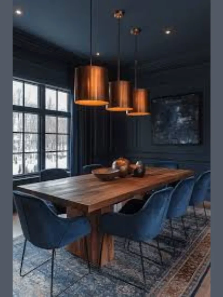
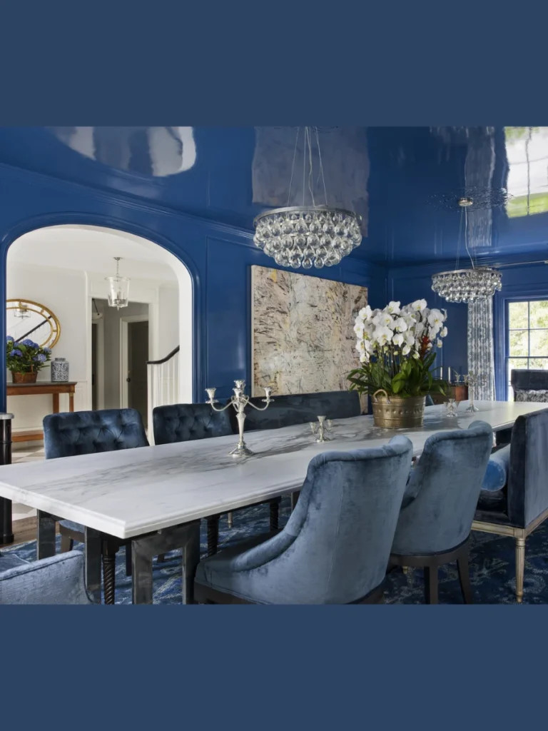
7. Moody Navy Blue Evening Sanctuaries
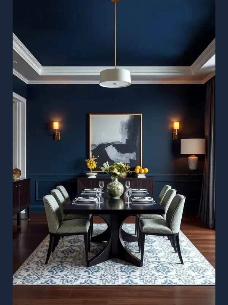
We love the idea of a dining space that embraces the dark hours of dinner parties. A deep navy mineral finish creates a regal, sophisticated backdrop that feels incredibly cozy.
The lime variations soften the blue, preventing it from looking like a teenager’s bedroom wall. You get a rich, stormy effect that changes beautifully as the sun goes down.
We find that warm wood tones like cherry or mahogany look stunning against this deep blue. The warmth of the wood balances the coolness of the paint for a perfect harmony.
Keep the accessories simple to let the texture of the deep blue walls do the heavy lifting. A single large mirror will bounce light around the room without cluttering the view.
8. Dusty Rose Romantic Textures
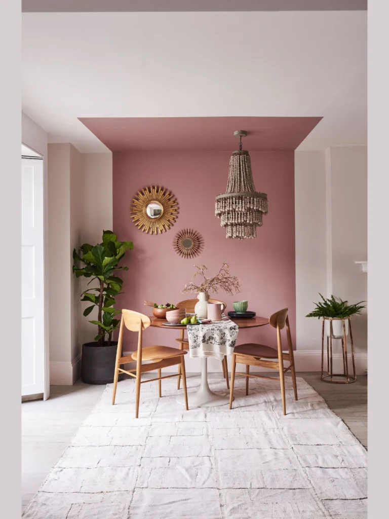
We know that pink can feel intimidating, but a dusty rose mineral wash is entirely mature. The chalky finish tones down the sweetness, leaving behind a sophisticated and warm glow.
This color creates an incredibly flattering light that makes everyone in the room look fantastic. It brings a soft, welcoming energy that encourages long conversations around the table.
We like pairing this shade with light oak furniture and modern minimalist light fixtures. The contemporary furniture keeps the romantic wall color feeling grounded and current.
It works beautifully in smaller spaces where you want to create a jewel-box effect. The texture ensures that the soft pink shade feels artistic rather than childish.
9. Distressed Concrete Look Loft Styles
We appreciate the raw honesty of an industrial loft aesthetic in a modern suburban home. A mottled gray wash lets you recreate the look of weathered concrete walls with ease.
The key to this style is applying the mixture with a trowel instead of a brush. This creates flat, polished areas contrasted with rough patches for authentic texture.
We recommend using sleek metallic chairs and a glass-top table to complete the urban look. The smooth surfaces emphasize the rough, tactile nature of the surrounding walls.
This treatment is perfect for hiding imperfect drywall or old patch jobs from previous renovations. The textured finish turns structural flaws into an intentional design feature.
10. Warm Ochre Sunny Breakfast Spaces
We find that a splash of golden yellow brings a cheerful energy to morning coffee spots. An ochre mineral wash provides a sophisticated take on yellow that feels earthy instead of loud.
The finish glows beautifully when hit by direct sunlight, creating a bright and happy atmosphere. It feels like a slice of sunny Southern France right inside your main eating area.
We love how this color complements rustic woven baskets and simple wrought iron details. The combination creates a casual, lived-in feel that is perfect for informal family gatherings.
You can control the intensity of the golden hue by adjusting the number of layers applied. Two thin coats usually yield the perfect balance of color depth and texture.
11. Forest Green Organic Retreats
We enjoy using deep botanical shades to connect our indoor eating spaces with the great outdoors. A rich forest green wash brings the grounding presence of nature right to your table.
The mineral base gives the green a velvety quality that looks incredibly luxurious in the evening. It creates a stunning backdrop for holiday dinners and celebrations.
We suggest using light-colored wood or white marble tables to cut through the deep green. The bright furniture pieces prevent the room from feeling overly heavy or dark.
This shade is excellent for creating a focal point behind a beautiful sideboard display. It frames your favorite dinnerware and glassware like a professional museum exhibit.
12. Pale Greige Modern Farmhouse Updates
We know the farmhouse trend is shifting away from stark whites and toward softer tones. A pale greige mineral wash provides the perfect update for a cozy, updated rustic look.
The blend of gray and beige creates a versatile neutral that works with almost any decor style. The subtle texture adds just enough interest to keep the walls from looking flat.
We love pairing this finish with reclaimed wood tables and slipcovered dining chairs. The look is entirely casual, comfortable, and ready for everyday family life.
It coordinates perfectly with existing white trim and molding for a clean, finished appearance. You get the benefits of texture without having to repaint your entire trim woodwork.
13. Deep Espresso Rich Chocolate Dining Rooms
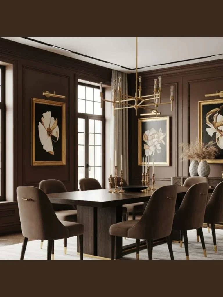
We think that chocolate brown is making a massive comeback in the world of interior design. An espresso mineral wash offers a luxurious, rich texture that feels like a warm embrace.
The matte finish prevents the dark brown from looking muddy or resembling old wood paneling. Instead, you get a sophisticated, leather-like appearance on the drywall surfaces.
We highly recommend using cream-colored fabrics and bright art to contrast the deep brown. The bright accents keep the space feeling balanced and visually exciting.
This color choice is perfect for dedicated dining rooms used primarily for evening entertaining. It creates an exclusive, upscale club atmosphere that your guests will talk about.
14. Soft Lavender Sophisticated Shabby Chic
We like exploring unexpected colors that bring a unique sense of calm to the home. A washed lavender offers a quiet, artistic alternative to traditional gray or beige options.
The chalky texture strips away any sugary sweetness, leaving a gray-toned purple that feels mature. It catches the late afternoon light in a truly magical way.
We find that silver accents and crystal chandeliers pair beautifully with this soft hue. The sparkling elements contrast nicely with the dead-matte texture of the walls.
It provides a beautiful backdrop for vintage white furniture and distressed wood pieces. The final look is elegant, peaceful, and full of charming personality.
15. Steel Blue Contemporary Crispness
We love a cool tone that manages to feel incredibly inviting rather than chilly. A steel blue mineral wash brings a crisp, clean energy to a modern dining environment.
The subtle gray undertones keep the blue looking sophisticated and architecturally grounded. The texture mimics the look of weathered slate stone or stormy coastal skies.
We suggest pairing this look with light maple wood and contemporary minimalist furniture. The clean lines of the furniture allow the movement of the wall wash to shine.
It creates a refreshing backdrop that feels energized during the day and cozy at night. The finish is durable enough to handle the daily movement of dining room chairs.
Best Practical Styling Advice For Textured Dining Spaces
We know that choosing your wall color is only half the battle when redesigning a room. The way you style the surrounding furniture determines whether your textured finish looks beautifully intentional or totally accidental.
We highly recommend prioritizing natural materials like raw oak, walnut, stone, and authentic linen fabrics. These tactile elements complement the chalky, organic depth of your new mineral walls instead of competing with them.
Best Furniture Combinations For Textured Environments
| Material Category | Recommended Items | Visual Purpose |
| Natural Hardwoods | Raw Oak, Dark Walnut, Reclaimed Pine | Adds grounding warmth against chalky finishes |
| Woven Textiles | Flax Linen, Heavy Burlap, Cotton Canvas | Introduces soft contrast that absorbs intense glare |
| Sleek Accents | Matte Black Iron, Aged Brass, Polished Stone | Provides a clean, modern anchor to cloudy textures |
We find that keeping your lighting soft and warm makes the brush strokes come alive at night. Avoid harsh overhead bulbs that flatten out the beautiful variations you worked hard to create.
Conclusion
We want to make sure you have a clear plan before you grab your block brush and start painting. Textured mineral walls completely change how light interacts with your eating area throughout the day.
Choosing the right color depends entirely on whether you want a bright breakfast spot or a moody evening lounge. Always test a small sample patch on your specific wall before committing to the full room transformation.
We love how this simple traditional finish hides minor wall imperfections while adding massive amounts of character. It gives your home an immediate architectural upgrade without the messy dust of actual plaster work.
You can easily style this look by mixing warm wood elements with sleek contemporary light fixtures. The final result is a beautiful, conversation-starting space where your family will love to gather.
FAQs
Yes, you can absolutely apply this finish over standard modern drywall without any structural issues. You just need to apply a proper acrylic mineral primer first so the lime mixture bonds correctly to the surface.
Standard mineral finishes are naturally absorbent and can be tricky to wipe down if hit with grease or wine. We suggest applying a specialized clear matte sealer over the top layer to protect your high-traffic eating spaces.
We find that applying two thin coats yields the absolute best balance of color depth and cloudy texture. Applying thick layers can cause the product to crack, so patience with thin layers is your best strategy.
Once the mineral wash completely cures and dries, it will not transfer onto clothing or skin when brushed against. If you leave the surface completely unsealed, a tiny bit of chalky residue might trace if scrubbed aggressively.
You cannot just paint standard latex over a mineral wall without preparing the surface properly beforehand. You will need to apply a binding primer first to seal the lime before transitioning back to regular paint.