
I always feel a space looks tired in summer if the walls stay dull and heavy. Summer wallpaper ideas help me bring light, color, and energy without changing everything.
In this guide, I share practical and stylish ideas that work in real homes. You will find options that suit bedrooms, living rooms, and even small spaces.
Why Summer Wallpaper Ideas Work Best for Seasonal Refresh
I notice summer wallpaper ideas focus on light colors and airy patterns that reflect sunlight well. These designs make rooms feel cooler and more open during hot days.
I also see that seasonal wallpapers help me update my space without expensive renovations. A simple peel-and-stick option can change the mood quickly.
I prefer summer themes because they connect indoor spaces with outdoor vibes. Natural elements like leaves, sky, and water create a relaxing atmosphere.
I always recommend choosing wallpaper that feels fresh yet easy to maintain. Summer designs should feel effortless, not overwhelming or heavy.
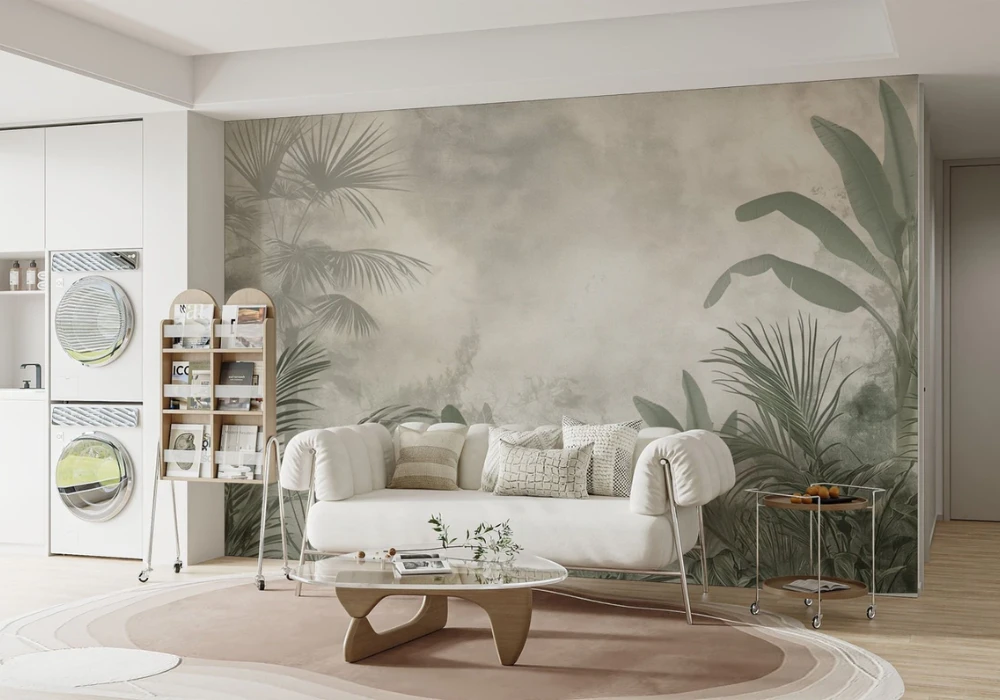
1. Tropical Palm Leaf Wallpaper for a Fresh Green Look
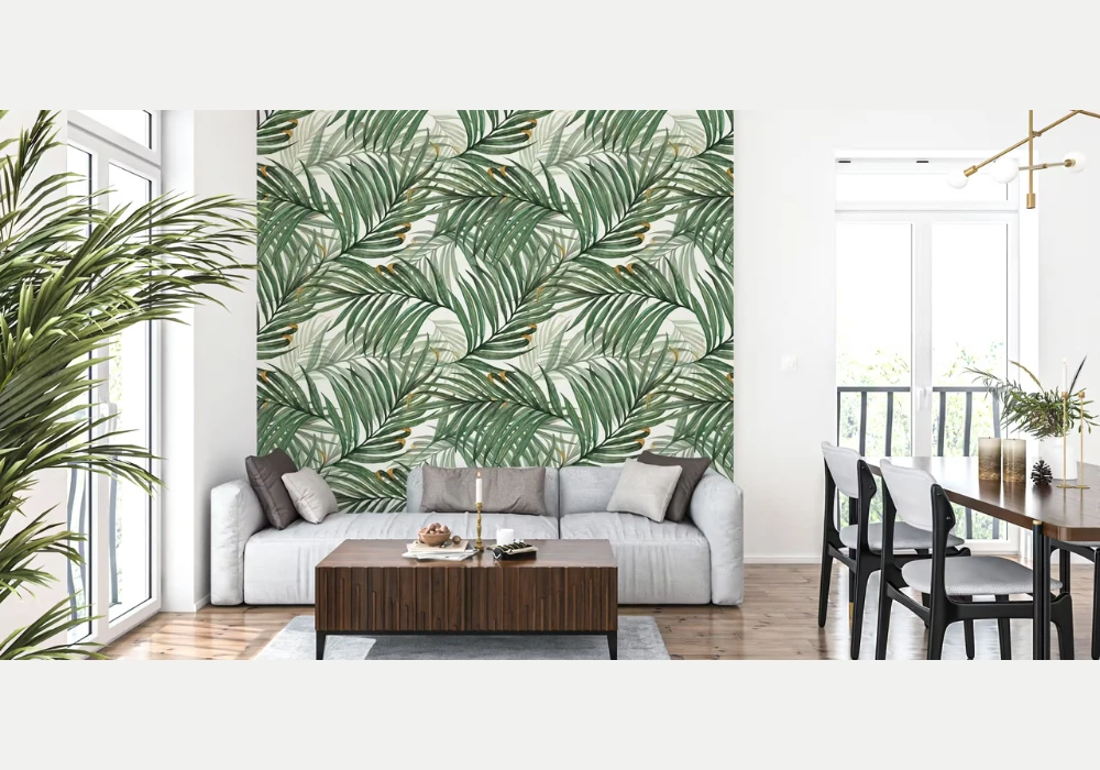
I find tropical palm leaf wallpaper brings instant freshness with bold green patterns. It creates a lively vibe that feels connected to nature.
I usually use this style in living rooms or accent walls for a strong visual effect. It works well with neutral furniture and wooden textures.
I notice this wallpaper suits both small and large spaces when balanced properly. Light backgrounds help keep the room open and bright.
I personally like pairing palm prints with indoor plants to enhance the theme. It creates a simple but refreshing summer environment.
2. Soft Pastel Wallpaper for a Light and Calm Feel
I prefer pastel wallpaper when I want a calm and relaxing summer space. Soft shades like mint, peach, and lavender feel light on the eyes.
I often suggest this for bedrooms because it supports a peaceful environment. It helps reduce visual stress during hot weather days.
I notice pastel designs work well with minimal decor and simple furniture. They create a clean and airy look without effort.
I usually combine pastel walls with white or beige accents for balance. This keeps the room looking fresh and uncluttered.
3. Beach Theme Wallpaper for a Coastal Summer Vibe
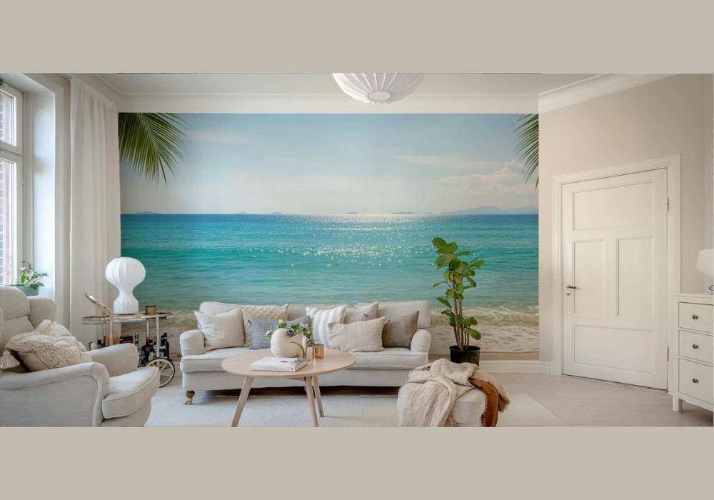
I always recommend beach theme wallpaper for a relaxed coastal feel. Designs with waves, sand, and seashells bring a vacation mood indoors.
I like using this idea in bedrooms or lounges to create a calm setting. It reminds me of peaceful seaside moments.
I see that light blue and sandy tones make the space feel cooler instantly. These colors reflect natural summer elements.
I prefer simple beach prints instead of busy patterns for better results. It keeps the space soft and visually comfortable.
4. Floral Summer Wallpaper for a Bright and Cheerful Space
I believe floral wallpaper is one of the easiest ways to add summer charm. Bright flowers instantly lift the mood of any room.
I often use this in dining areas or bedrooms for a lively touch. It creates a welcoming and cheerful environment.
I notice large floral prints work well as accent walls. Smaller prints are better for full room coverage.
I usually pair floral wallpaper with simple furniture to avoid clutter. This keeps the focus on the design without making it overwhelming.
5. Citrus Pattern Wallpaper for a Fun and Energetic Look
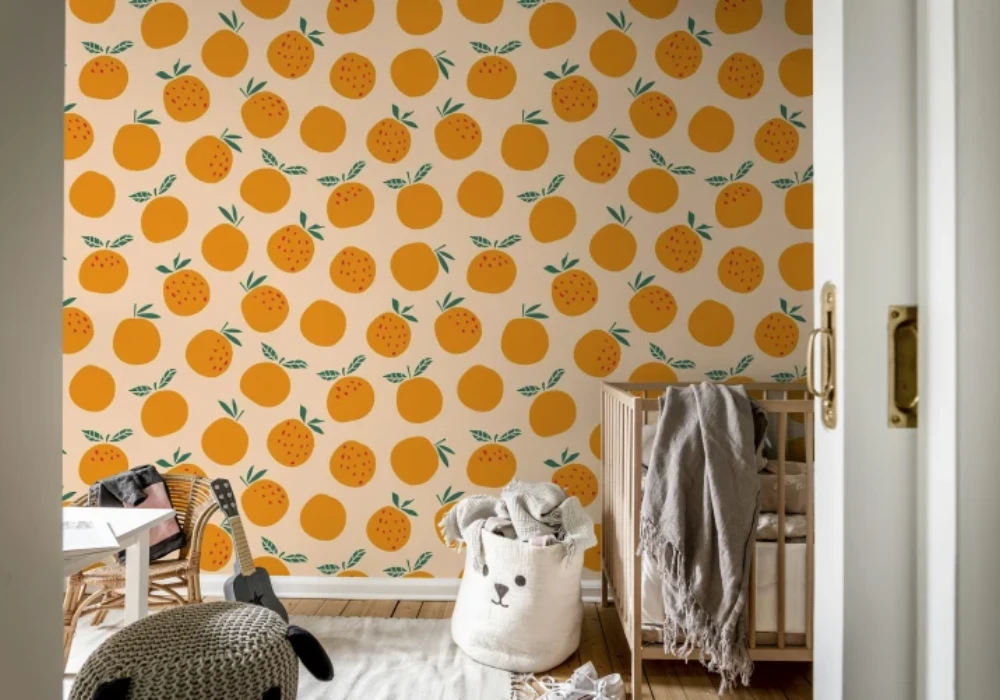
I enjoy citrus wallpaper because it adds energy to any dull space. Patterns with lemons and oranges feel playful and bright.
I recommend this for kitchens or dining areas where you want a fresh vibe. It creates a lively and inviting atmosphere.
I notice yellow and orange tones reflect sunlight beautifully. This makes the room feel warm but not heavy.
I personally like mixing citrus wallpaper with white cabinets or light wood. It balances the bold colors perfectly.
6. Minimal White Texture Wallpaper for a Clean Summer Style
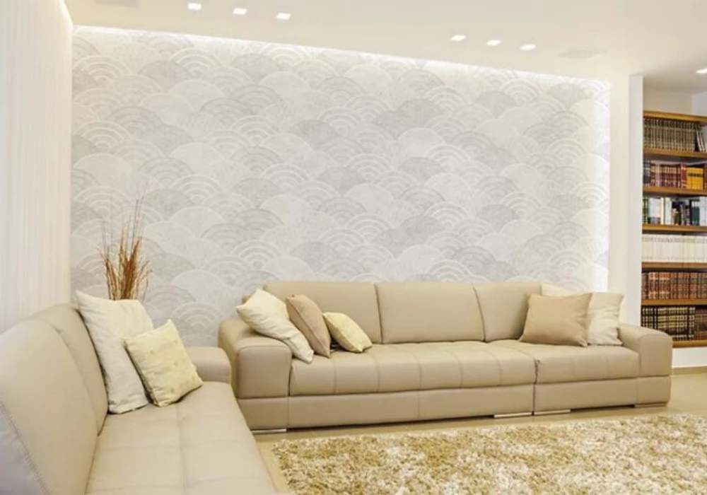
I prefer minimal white textured wallpaper when I want a simple summer look. It keeps the space bright without adding visual noise.
I use this style in small rooms to make them appear larger. Light colors always help open up tight spaces.
I notice subtle textures add depth without making walls look busy. This keeps the design modern and neat.
I often combine this wallpaper with soft fabrics and light decor. It creates a calm and comfortable environment.
7. Sky and Cloud Wallpaper for an Open and Airy Feel
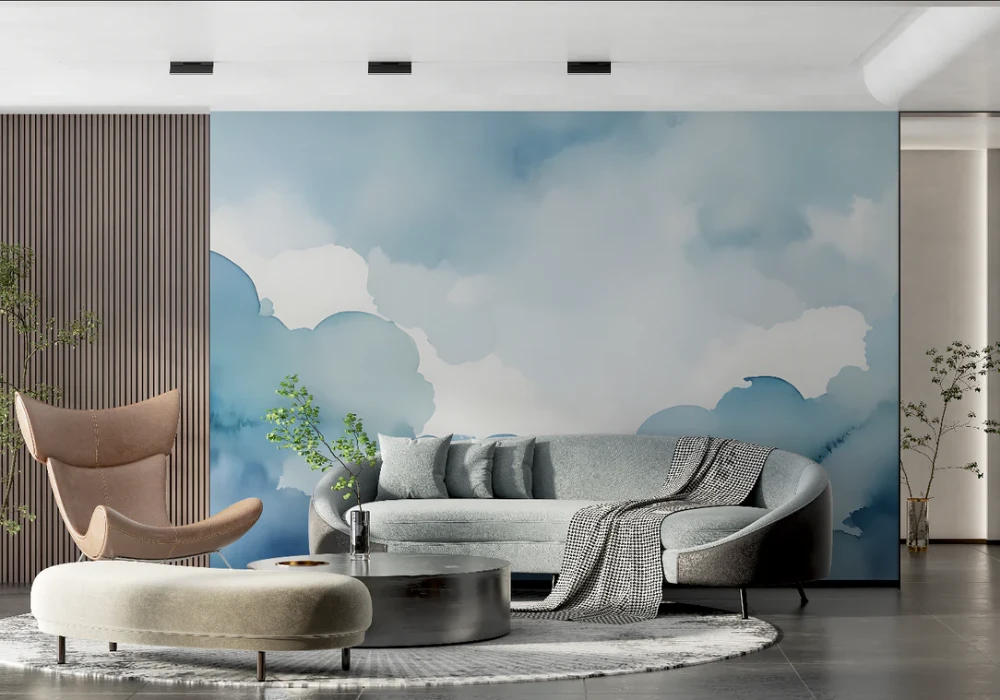
I love sky and cloud wallpaper because it makes ceilings and walls feel limitless. It adds a sense of openness to any room.
I recommend this idea for bedrooms or kids’ rooms for a dreamy effect. It creates a peaceful and relaxed setting.
I notice light blue tones help reduce heat perception visually. This makes the space feel cooler.
I usually keep furniture simple when using this wallpaper. It allows the sky theme to stand out clearly.
8. Geometric Summer Patterns for a Modern Touch
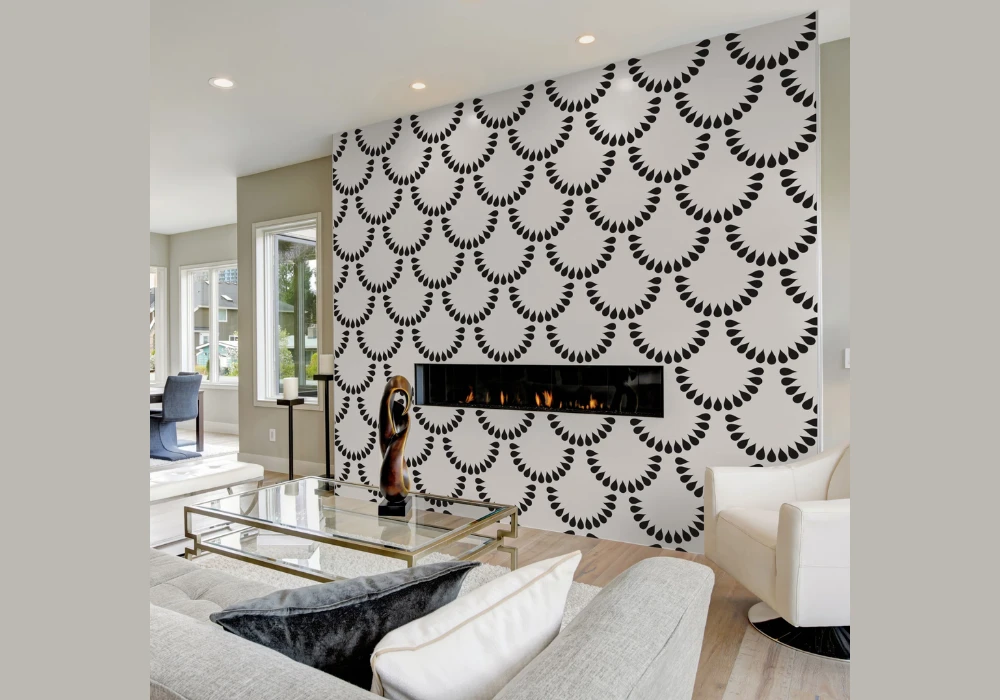
I suggest geometric wallpaper for a modern summer update. Clean shapes and lines add structure without feeling heavy.
I often use light color combinations to keep the design seasonal. Soft yellows and blues work really well.
I notice this style fits best in living rooms or workspaces. It keeps the environment stylish and organized.
I personally prefer simple patterns over complex ones. It keeps the room balanced and easy to maintain.
9. Botanical Garden Wallpaper for a Natural Look
I like botanical wallpaper because it brings nature indoors in a detailed way. Leaves, vines, and plants create a fresh environment.
I use this style when I want a relaxing and grounded space. It works well in bedrooms and reading corners.
I notice green tones help create a cooling effect during summer. It feels natural and refreshing.
I often pair this wallpaper with wooden furniture and neutral decor. It enhances the natural theme without effort.
10. Light Striped Wallpaper for a Spacious Effect
I recommend striped wallpaper for making rooms look bigger and cleaner. Vertical stripes help create height visually.
I prefer light-colored stripes to maintain a summer feel. Soft combinations keep the design simple and elegant.
I notice this works well in small bedrooms or hallways. It improves the overall space perception.
I usually combine stripes with minimal decor to avoid clutter. This keeps the room looking neat and open.
Practical Tips to Choose the Best Summer Wallpaper for Your Space
I always choose wallpaper based on room size because it directly affects how the design looks. Small rooms need light tones to feel open and breathable.
I focus on color temperature because cool shades like blue and green feel more comfortable in summer. Warm tones work only when balanced properly.
I check lighting conditions before finalizing wallpaper because natural light enhances soft patterns better. Dark rooms need brighter designs for balance.
I prefer peel-and-stick wallpaper for easy updates because it saves time and effort. It also allows quick seasonal changes without damage.
Quick Selection Guide Table
| Room Type | Best Wallpaper Style | Recommended Colors | Pattern Type |
|---|---|---|---|
| Bedroom | Pastel or Floral | Light pink, mint | Soft patterns |
| Living Room | Tropical or Botanical | Green, beige | Medium to bold |
| Kitchen | Citrus or Minimal | Yellow, white | Small patterns |
| Small Room | Stripes or Light Texture | White, light blue | Simple patterns |
| Kids Room | Sky or Fun Patterns | Blue, soft colors | Playful designs |
Common Mistakes to Avoid When Choosing Summer Wallpaper
I avoid dark and heavy designs because they make rooms feel smaller and warmer. Summer spaces should always feel light and open.
I never mix too many bold patterns because it creates visual clutter quickly. One statement wall usually works better.
I do not ignore furniture matching because wallpaper must complement the overall decor. Mismatch can ruin the look.
I also avoid low-quality materials because they fade quickly in the heat. Good quality wallpaper lasts longer and looks better.
Conclusion
I believe summer wallpaper ideas help refresh any space without major changes. Small updates can create a big visual difference.
I always choose light, breathable designs because they improve comfort during hot weather. The right colors matter a lot.
I suggest focusing on balance because too many patterns can overwhelm the room. Simple choices often work best.
I recommend trying one idea at a time because gradual changes feel more natural and manageable.
FAQs
I recommend light colors like white, blue, green, and pastel tones because they reflect light and keep spaces cool.
I use bold wallpaper only for accent walls because it prevents the space from feeling heavy or crowded.
I prefer peel-and-stick wallpaper because it is easy to apply and remove without damaging the walls.
I suggest light striped or textured wallpaper because it makes small rooms look bigger and more open.
I match wallpaper with neutral furniture to maintain balance and avoid overwhelming the space.
I see floral designs remain popular because they add brightness and a natural summer feel.