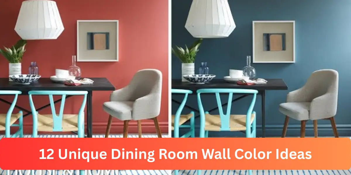
Dining room wall color ideas have the power to redefine a space without changing the furniture or layout. I have seen how the right shade can instantly shift the atmosphere from dull to inviting.
Wall color influences how light moves across the room and how textures and finishes appear throughout the day. Instead of choosing paint based on trend alone, I focus on balance, undertones, and how the shade interacts with existing elements.
When selected thoughtfully, the right wall color creates depth, warmth, and a dining environment that feels intentional and refined.
How Wall Color Influences Dining Room Design
Wall color shapes the entire character of a dining room before décor even enters the picture.
I treat it as the backdrop that defines how light reflects, how furniture stands out, and how intimate the space feels. A thoughtful color choice can visually expand the room or make it feel more grounded and cozy.
When I evaluate a dining space, I always consider ceiling height, natural light exposure, and flooring undertones. The right wall shade strengthens these elements rather than competing with them.
1. Warm Off White Elegance
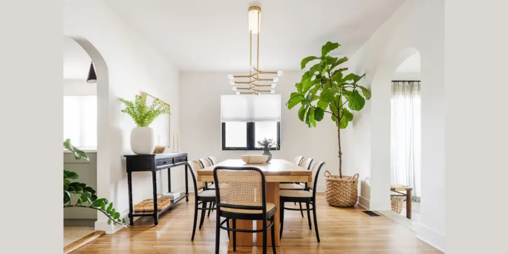
Warm off white offers a timeless and flexible foundation for a dining room. I prefer creamy undertones over stark white because they soften the light and create a welcoming atmosphere. This shade keeps the room bright while adding subtle warmth.
It works beautifully in both small and large dining areas. In compact spaces, it enhances openness. In larger rooms, it allows statement lighting and artwork to take center stage.
I often pair warm off white walls with natural wood furniture and textured fabrics. The combination feels layered without appearing busy or overdesigned.
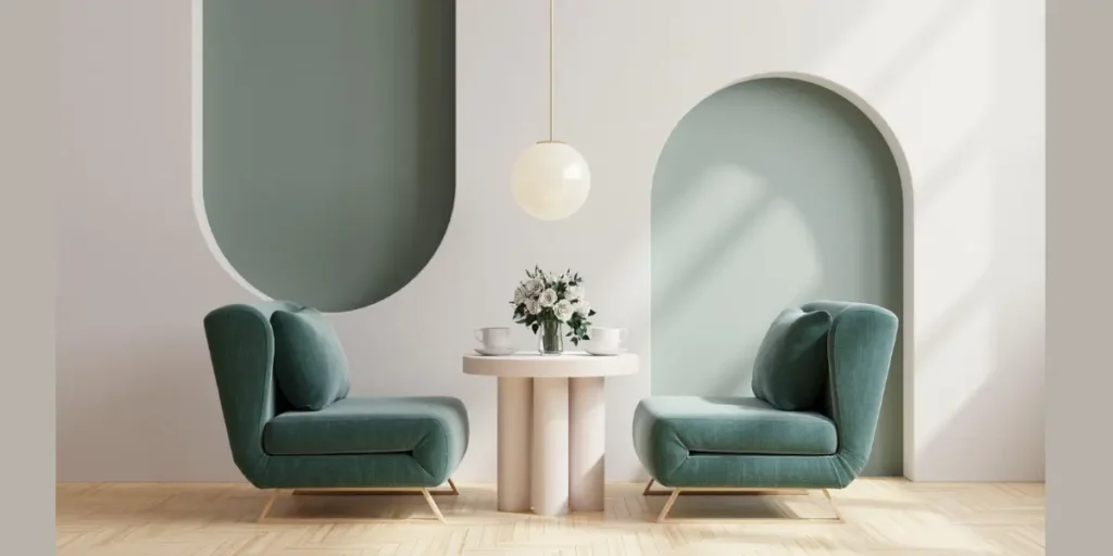
2. Deep Emerald Green
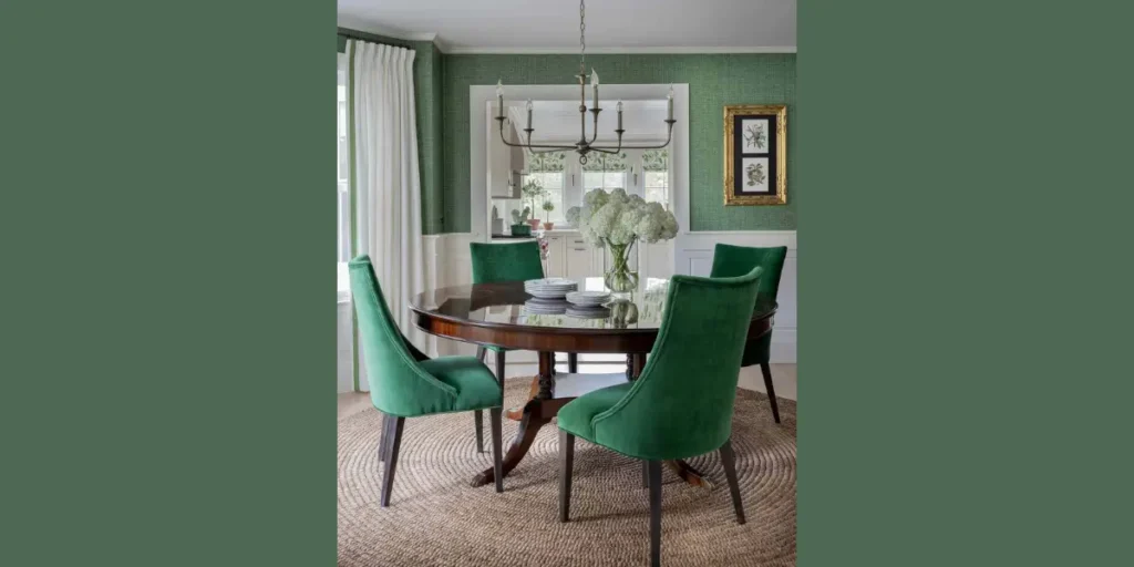
Emerald green introduces richness and visual depth instantly. I use it when I want to create a bold yet refined dining environment. The saturated tone draws attention while maintaining elegance.
This shade pairs exceptionally well with brass lighting and velvet seating. Metallic accents reflect softly against the darker background, enhancing sophistication.
Proper lighting plays a crucial role with emerald walls. I incorporate layered fixtures to ensure the room remains inviting rather than overly dramatic.
3. Moody Charcoal Gray
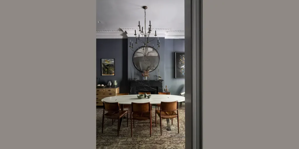
Charcoal gray creates a modern and confident dining space. I rely on this color when I want depth without committing to pure black. Its versatility allows it to adapt across contemporary and transitional interiors.
This shade benefits from warm lighting. I choose bulbs with softer tones to prevent the walls from feeling flat. The contrast between dark walls and lighter trim adds structure.
Charcoal also highlights artwork and decorative elements effectively. The darker backdrop sharpens visual details while maintaining balance.
4. Soft Taupe Neutral
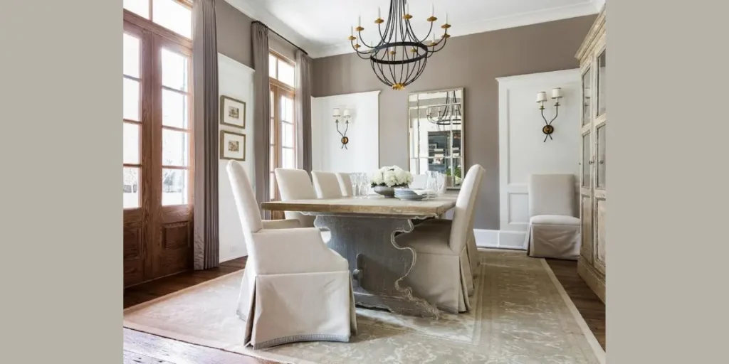
Taupe blends warm and cool undertones seamlessly. I often recommend it for dining rooms where flexibility matters. This shade adapts easily to evolving décor and furniture updates.
Taupe provides warmth without the heaviness of darker colors. It complements both light oak and deep walnut finishes.
In spaces with mixed materials, taupe acts as a stabilizing backdrop. It keeps the room cohesive while allowing accent pieces to stand out.
5. Classic Navy Blue
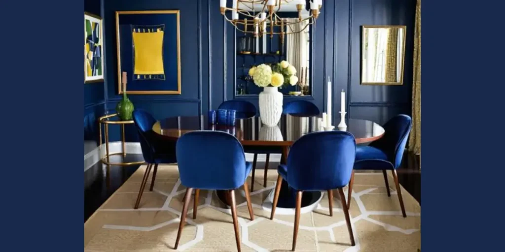
Navy blue delivers timeless sophistication. I use it to ground the dining room and create contrast against lighter ceilings and trim. Its depth enhances architectural features.
This color performs best in rooms with adequate natural light. It absorbs brightness during the day and creates intimacy at night.
I balance navy walls with lighter upholstery and metallic accents. The combination ensures the room feels elegant rather than heavy.
6. Earthy Terracotta Tone
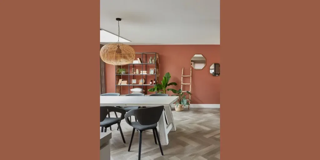
Terracotta walls introduce warmth inspired by natural clay hues. I choose this tone when designing spaces that feel relaxed and inviting. Its earthy presence adds personality without overpowering the room.
This shade pairs well with textured materials such as linen, woven rugs, and wooden tables. The natural synergy strengthens the dining atmosphere.
To maintain balance, I keep surrounding décor simple. Terracotta stands confidently on its own when supported by subtle accents.
7. Soft Dusty Blue
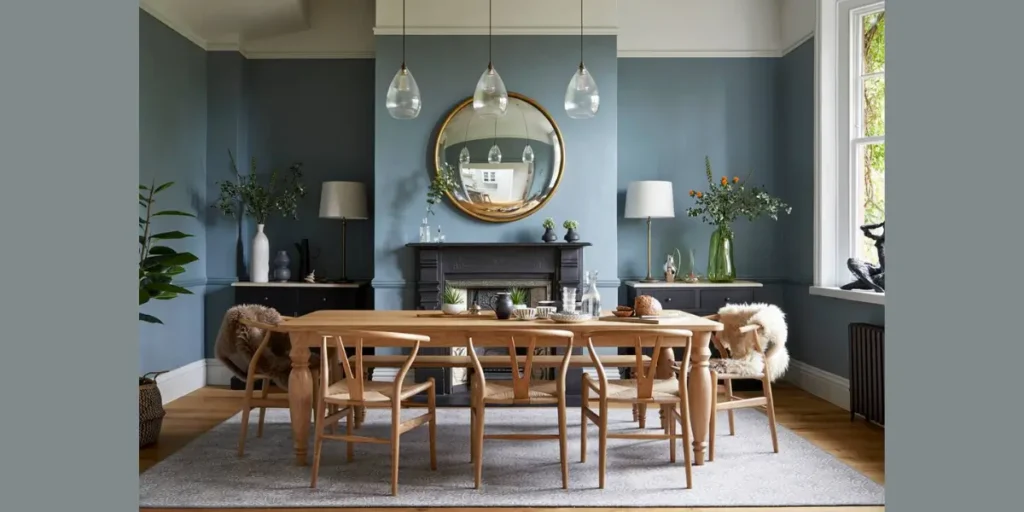
Dusty blue offers calm refinement. I often apply it in dining rooms where I want softness without sacrificing character. The muted tone prevents the space from appearing overly bright.
This shade enhances natural light and creates a serene environment. It pairs beautifully with brushed metal finishes and neutral textiles.
I use white trim to create contrast and maintain clarity. The result feels balanced and refreshing.
8. Rich Burgundy Accent
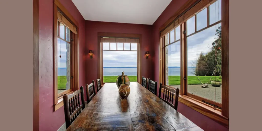
Burgundy creates a dramatic and intimate dining setting. I use it selectively on feature walls to avoid overwhelming the room. Its depth adds warmth and personality.
This color complements dark wood furniture and traditional décor elements. The richness strengthens formal dining spaces.
Balanced lighting remains essential. I incorporate layered illumination to ensure burgundy walls maintain elegance without appearing too dark.
9. Olive Green Warmth
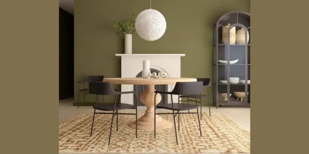
Olive green delivers a grounded and mature look that feels both modern and timeless. I often use this shade when I want the dining room to feel connected to nature without leaning too bold. Its muted undertone keeps the space calm while still adding personality.
Olive works exceptionally well with walnut or oak furniture. The earthy combination creates warmth and visual depth without heavy contrast. I balance it with lighter upholstery to maintain openness.
This color adapts beautifully to natural light. Throughout the day, it shifts subtly, giving the dining room a layered and dynamic character.
10. Matte Black Statement Wall
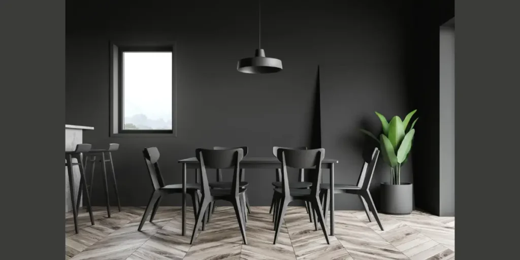
A matte black wall makes a confident and dramatic statement. I typically use this shade on a single wall to create a focal point behind the dining table. It instantly defines the space and enhances architectural features.
Black highlights artwork and metallic finishes with clarity. I rely on layered lighting and reflective accents to prevent the room from feeling too enclosed. Warm bulbs soften the intensity.
When applied strategically, matte black feels sophisticated rather than overpowering. It works especially well in modern or minimalist interiors.
11. Blush Beige Sophistication
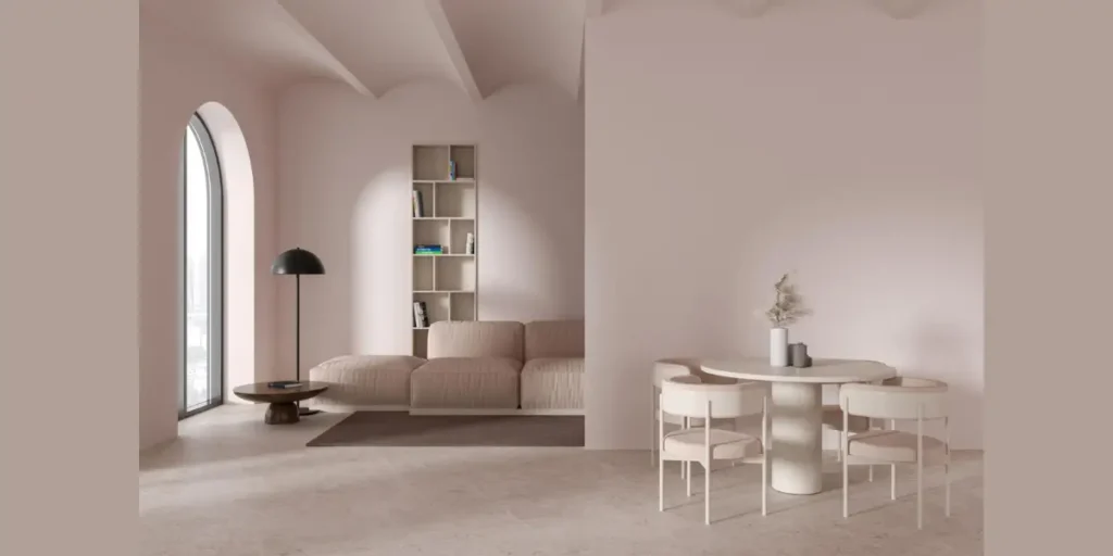
Blush beige blends subtle warmth with refined softness. I choose this shade when I want the dining room to feel inviting without introducing strong color. It adds depth while maintaining neutrality.
This tone pairs beautifully with brass lighting and neutral upholstery. The warmth enhances comfort while keeping the overall design cohesive.
Blush beige reflects light gently, which makes it ideal for smaller spaces. It brightens the room while preserving a sophisticated atmosphere.
12. Two Tone Wall Combination
A two tone wall design introduces structure and dimension. I often divide the wall horizontally, using a darker shade below and a lighter one above. This technique enhances proportion and adds architectural interest.
The contrast creates visual balance without overwhelming the space. I ensure both colors share similar undertones to maintain harmony.
Two tone walls work particularly well in dining rooms with molding or paneling. When applied thoughtfully, the effect feels intentional and refined.
How to Select the Perfect Dining Room Wall Shade
Selecting the perfect wall shade requires more than choosing a color you like. I always begin by evaluating the room’s natural light, ceiling height, and the undertones of flooring and furniture. These elements directly influence how a paint color appears once applied.
A well chosen shade should support the dining table, lighting, and décor rather than compete with them. When the wall color aligns with existing finishes, the entire room feels cohesive and thoughtfully designed.
Evaluate Natural Light and Ceiling Height
Natural light changes how a color looks throughout the day. I observe the space in both morning and evening conditions before making a decision. Rooms with low ceilings often benefit from lighter shades to create a sense of height.
Test Paint Samples in Real Conditions
I always apply sample swatches directly on the wall instead of relying on small paint cards. Viewing the shade in actual lighting reveals subtle undertones and prevents unexpected results after full application.
Coordinate Undertones With Flooring and Furniture
Every wood stain and fabric carries an undertone. I compare wall color samples against these finishes to ensure they complement each other. Balanced undertones prevent the room from feeling mismatched.
Choose the Right Paint Finish
The finish affects both durability and appearance. I typically recommend eggshell or satin finishes for dining rooms because they resist stains while maintaining a subtle sheen.
Use Accent Walls Strategically
Accent walls can introduce depth without overwhelming the space. I select one focal wall and apply a deeper shade while keeping surrounding walls lighter. This approach maintains balance and visual clarity.
FAQs
Lighter shades such as warm off white, soft beige, or muted blue often work best in smaller spaces. These tones reflect light and make the room feel more open. However, a carefully balanced darker accent wall can also add depth without reducing visual space.
There is no strict rule, but I prefer maintaining harmony between connected spaces. The dining room can be slightly darker to create intimacy, especially if the living room uses lighter tones. Balance between both areas ensures smooth visual flow.
Yes, dark colors can work if paired with adequate artificial lighting. I incorporate layered lighting such as chandeliers and wall sconces to prevent the room from feeling dull. Proper illumination keeps darker shades elegant rather than heavy.
I examine the undertones of the wood before selecting paint. Warm woods pair well with earthy or creamy shades, while cooler woods complement gray or muted blue tones. Coordinated undertones create cohesion.
Conclusion
The right wall color can quietly redefine your entire dining experience. I have found that when tone, light, and proportion align, the room immediately feels more intentional and inviting.
Wall color sets the emotional backdrop for gatherings, conversations, and everyday meals.
Instead of selecting a shade based solely on trend, focus on how it interacts with your furniture, lighting, and architecture.
A thoughtfully chosen wall color does more than refresh the space, it creates depth, balance, and a dining room that feels complete for years to come.