
Bathroom tile colors play a much bigger role than most people expect. When I plan a bathroom, color is always one of my first decisions because it directly affects light, space, and overall comfort.
The right tile color can make a small bathroom feel open, add warmth to a cold space, or bring calm into a busy home.
Trends change, but smart color choices remain timeless when they’re based on function and balance.
In this article, I’ll share carefully selected bathroom tile color ideas backed by real design experience, showing how each shade influences mood, brightness, and long-term appeal without overwhelming the space.
1. White Bathroom Tiles
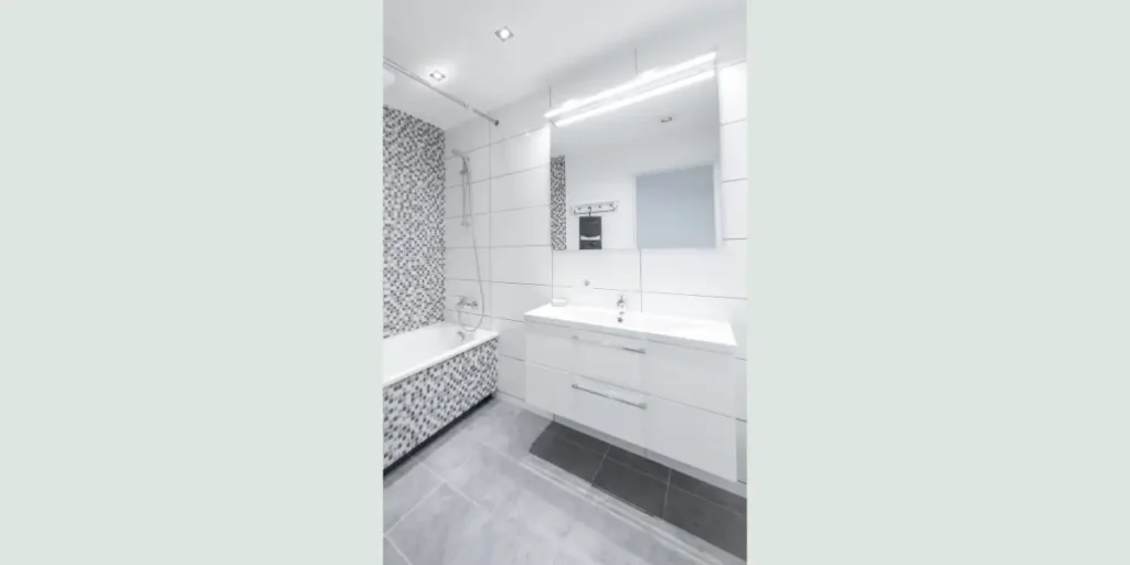
When I want a bathroom to feel instantly brighter and more open, I rely on white tiles.
White reflects light better than any other color, which helps small or low-light bathrooms feel more spacious.
This color also creates a clean foundation that works with almost any design style.
I often use white tiles to balance bold fixtures or textured elements. Matte white feels soft and modern, while glossy white adds extra brightness. Choosing the right finish prevents the space from feeling flat.
From a long-term perspective, white tiles never feel outdated. With proper grout selection and lighting, they maintain a fresh, adaptable look for years.
2. Soft Grey Bathroom Tiles
Soft grey tiles are my go-to option when white feels too sharp or clinical.
Grey offers a calmer, more modern alternative while still keeping the bathroom light and neutral. It creates balance without demanding attention.
I like using light grey tiles in bathrooms that need warmth without color saturation. They pair well with wood vanities, black fixtures, and chrome hardware. This flexibility makes styling easy.
Grey tiles also age well. They hide minor wear better than white and maintain a refined appearance. For homeowners seeking subtle sophistication, grey is a reliable and versatile choice.
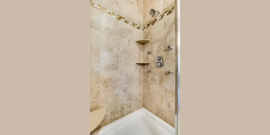
3. Beige and Cream Tiles
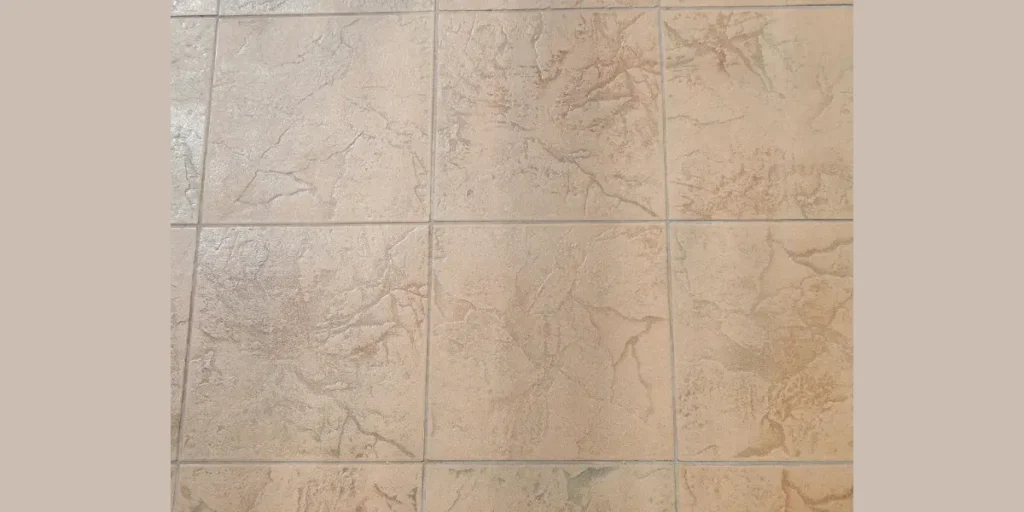
When a bathroom feels cold or unwelcoming, beige and cream tiles immediately soften the space.
These warm neutrals add comfort without darkening the room. I often recommend them for bathrooms with limited natural light.
I prefer beige tones with slight variation rather than flat shades. This adds depth while keeping the look natural. Cream tiles work especially well with brass or warm metal finishes.
From a usability standpoint, beige and cream tiles create a relaxed atmosphere that feels timeless.
They support both traditional and modern designs while keeping the bathroom comfortable and visually balanced.
4. Blue Bathroom Tiles
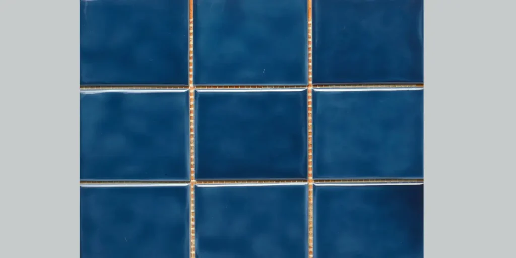
Blue tiles bring a natural sense of calm that I often use in bathrooms designed for relaxation.
Light blue shades feel airy and fresh, while deeper blues add depth and character. This color naturally connects to water and cleanliness.
I usually recommend lighter blues for small bathrooms and navy or deep blue for accent walls.
Keeping the palette controlled prevents the space from feeling heavy. Pairing blue with white enhances brightness.
Blue tiles also support spa-like design goals. With proper lighting and finish selection, they create a peaceful environment that feels intentional rather than themed.
5. Green Bathroom Tiles
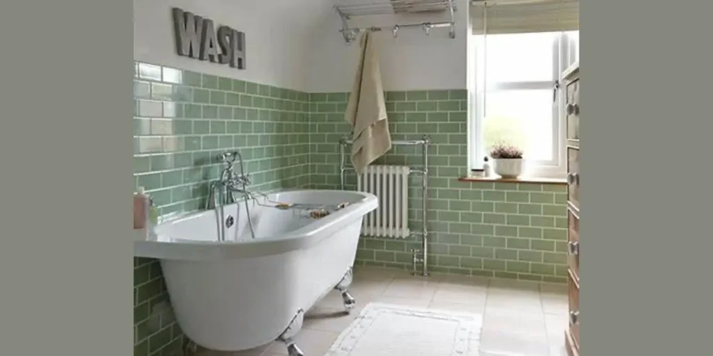
Green bathroom tiles help me introduce a connection to nature without overwhelming the space.
Shades like sage and olive feel grounded and calming, making them ideal for everyday bathrooms. This color promotes balance and relaxation.
I prefer softer green tones for walls and deeper greens for accent areas. Green pairs beautifully with wood textures and matte black fixtures, creating a modern organic look.
From a design perspective, green tiles feel refreshing yet timeless. They work especially well in bathrooms meant to feel restorative, offering visual comfort without overpowering the room.
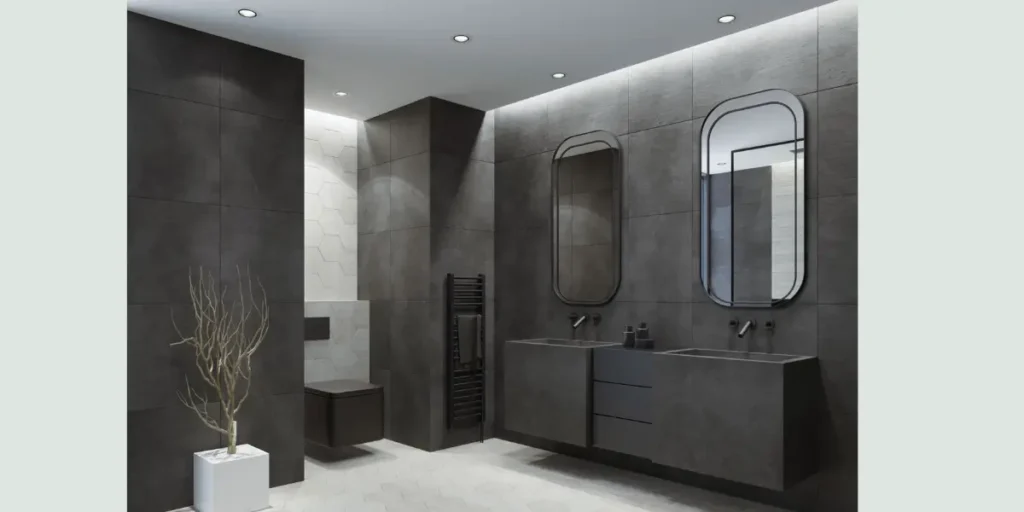
6. Black Bathroom Tiles
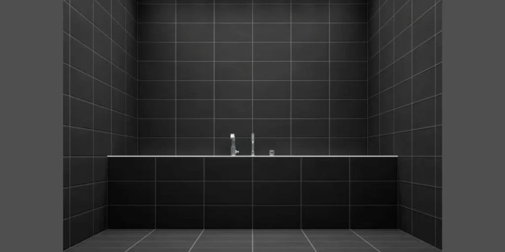
Black tiles allow me to create strong visual impact when used carefully.
Rather than covering the entire bathroom, I often use black as an accent to add depth and contrast. This approach keeps the space elegant, not heavy.
I pair black tiles with strong lighting and lighter elements to maintain balance. Matte finishes feel more refined and reduce glare. Proper placement makes all the difference.
Black tiles add sophistication and drama when controlled. Used thoughtfully, they elevate the bathroom and create a high-end feel without shrinking the space visually.
7. Marble-Tone Tiles
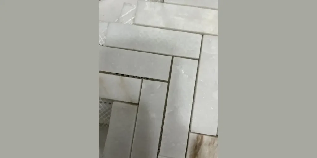
Marble-tone tiles give me the elegance of stone with more flexibility and control. Soft veining adds interest without overwhelming small bathrooms.
I often choose marble-look tiles to introduce subtle luxury.
I prefer light marble tones with gentle contrast. Strong veining can dominate a small space, so restraint matters. Large-format marble-effect tiles enhance continuity.
These tiles also perform well long term. They resist moisture and wear better than natural marble while maintaining a refined appearance. This makes them both practical and visually appealing.
8. Earth-Tone Bathroom Tiles
Earth-tone tiles like terracotta, clay, and warm brown help me create bathrooms that feel grounded and welcoming.
These colors bring warmth and depth without relying on bold patterns.
I usually balance earth tones with lighter surfaces to prevent the room from feeling enclosed. Natural textures work best with these shades, enhancing their organic feel.
Earth-tone tiles support relaxed, lived-in design styles. When paired with simple fixtures and good lighting, they create bathrooms that feel cozy, natural, and thoughtfully designed.
9. Pastel Bathroom Tiles
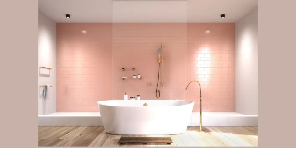
Pastel tiles allow me to introduce color gently. Shades like blush pink, mint green, and soft lavender add personality without overpowering the space. This makes them ideal for small or modern bathrooms.
I keep pastel use controlled, often pairing it with neutral elements.
This ensures the bathroom feels fresh rather than playful. Matte finishes help maintain sophistication.
Pastel tiles also adapt well to changing styles. They add character while remaining subtle, making them a smart choice for homeowners who want color without commitment.
10. Two-Tone Bathroom Tile Colors
Two-tone tile designs help me define space and add structure.
Using lighter tiles on upper walls and darker tiles below creates visual balance and practical contrast. This layout feels intentional and organized.
I often apply this approach in small bathrooms to anchor the space visually. Keeping both tones within the same color family prevents harsh separation.
Two-tone tile schemes offer flexibility and timeless appeal. When planned carefully, they enhance depth, improve proportions, and make the bathroom feel thoughtfully composed.
How Bathroom Tile Colors Influence Light, Space, and Mood
When I choose bathroom tile colors, I always think beyond appearance and focus on how color changes the way a space feels.
Light colors reflect more light and help small or low-lit bathrooms appear open and airy.
Darker tones absorb light, which adds depth and drama when used in controlled areas.
Color temperature also affects mood, cool shades feel calm and fresh, while warm tones create comfort.
By aligning tile color with lighting, room size, and daily use, I can shape the bathroom’s atmosphere without altering its layout.
Conclusion
Bathroom tile color is more than a visual choice, it directly shapes how a bathroom feels, functions, and ages over time.
From my experience, the most successful bathrooms use color with intention, balancing light, warmth, and contrast rather than following trends blindly.
The right tile color can brighten a dark space, calm a busy household, or add depth without overwhelming the room.
When color selection aligns with lighting, size, and daily use, the bathroom feels comfortable and well-designed for years.
Thoughtful tile color choices turn an ordinary bathroom into a space that feels cohesive, practical, and genuinely inviting.
FAQs
Light tile colors like white, soft grey, and pale beige make bathrooms look bigger. They reflect light and reduce visual boundaries. I often use them in small bathrooms to create openness and clarity.
Yes, dark tiles work well when used thoughtfully. I usually limit them to accent walls or lower sections and balance them with good lighting. This prevents the space from feeling closed in.
Mixing tile colors works best when the palette stays controlled. I recommend using one main color and one supporting shade. This keeps the design cohesive rather than visually busy.
In low-light bathrooms, I prefer light and warm-toned tiles. Cream, soft white, and light grey reflect artificial light better. These colors prevent the bathroom from feeling dull or shadowed.