
I know exactly how it feels to walk into your living room and realize your fireplace looks like a relic from another decade. It is often the largest feature in the room yet it usually gets the least amount of creative attention from homeowners.
You can completely change the mood of your entire house just by picking up a brush and choosing a fresh new shade. I have personally seen a simple weekend project turn a boring wall into a high-end focal point that everyone notices.
Choosing the Perfect Shade for Your Focal Point
I know you are probably staring at that outdated fireplace right now wondering how it got so ugly. Most people ignore their hearth for years until the soot and 1980s beige finally become too much to handle.
Choosing a new color is the easiest way to make your room look like you actually hired an interior designer. I have seen simple paint jobs turn a depressing pile of bricks into the star of the whole house.
You need to think about how much light your room gets before you commit to a specific bucket of paint. A dark room might feel like a cave if you go too heavy on the charcoal tones without a plan.
I always suggest looking at your existing furniture so you do not end up with a clashing mess of colors. My goal is to help you pick a shade that makes your neighbors jealous of your fireplace.
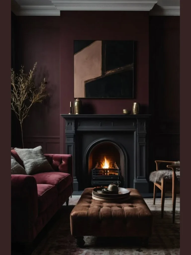
1. Matte Black for a Modern Statement
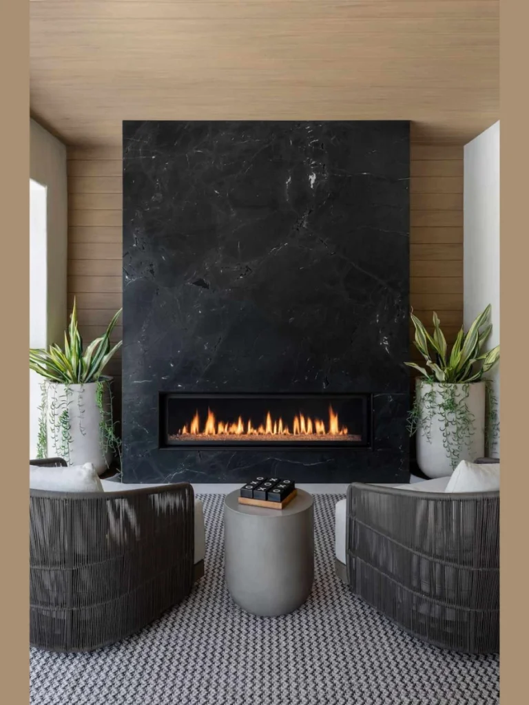
I think matte black is the king of fireplace colors because it hides every bit of soot and grime perfectly. You can stop worrying about those little ash stains because they just disappear into the dark and moody finish.
This color works incredibly well if you want a sleek look that makes your television or artwork pop. I have noticed that black creates a deep focal point that draws people in as soon as they walk inside.
You should consider this if your room has plenty of natural light to balance out the heavy dark tones. It adds a certain weight to the room that makes the space feel grounded and very expensive without much effort.
I often tell my friends that black is the best choice for hiding old and damaged brick textures. The flat finish smooths out the visual noise of bumpy surfaces and creates a clean and very uniform appearance.
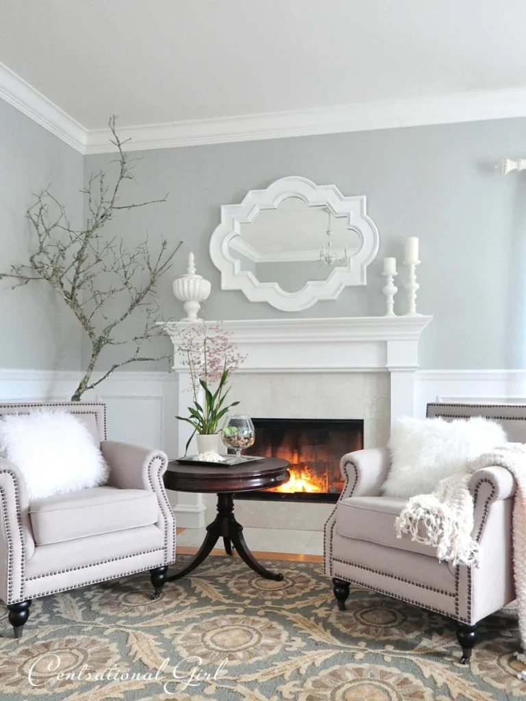
2. Crisp Alabaster White for a Fresh Look
White is the classic choice if you want your living area to feel three times larger and much brighter. I love how it reflects the light around the room and makes everything feel clean even on a rainy day.
You can use a bright white to contrast against dark wood floors or colorful rugs for a balanced style. It acts as a blank canvas that allows you to change your mantel decor every single season without clashing.
I suggest using a high-quality heat resistant paint so your white stays bright instead of turning a nasty yellow. Proper prep work is the only way to ensure the soot does not ruin your hard work within a week.
Many homeowners choose this shade to achieve that popular farmhouse look that never seems to go out of style. It softens the room and creates an inviting atmosphere that feels cozy and very high end at the same time.
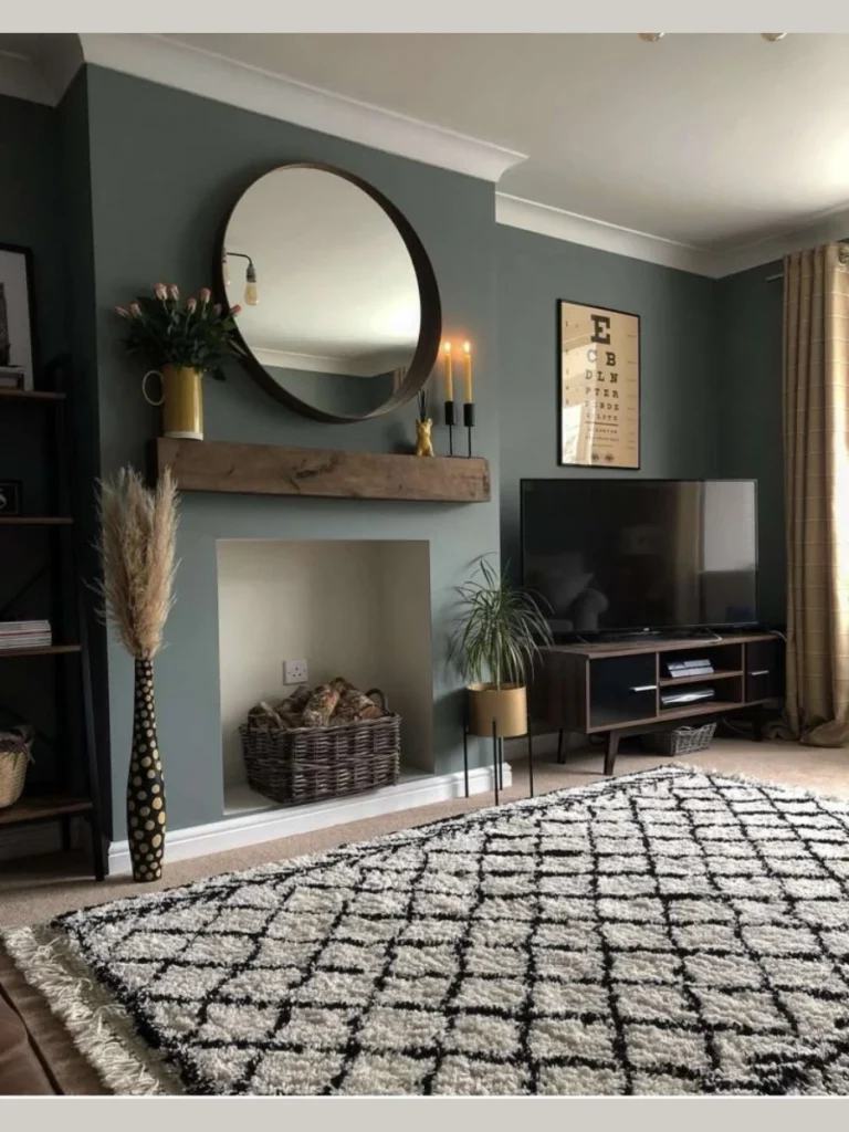
3. Sophisticated Charcoal Gray Tones
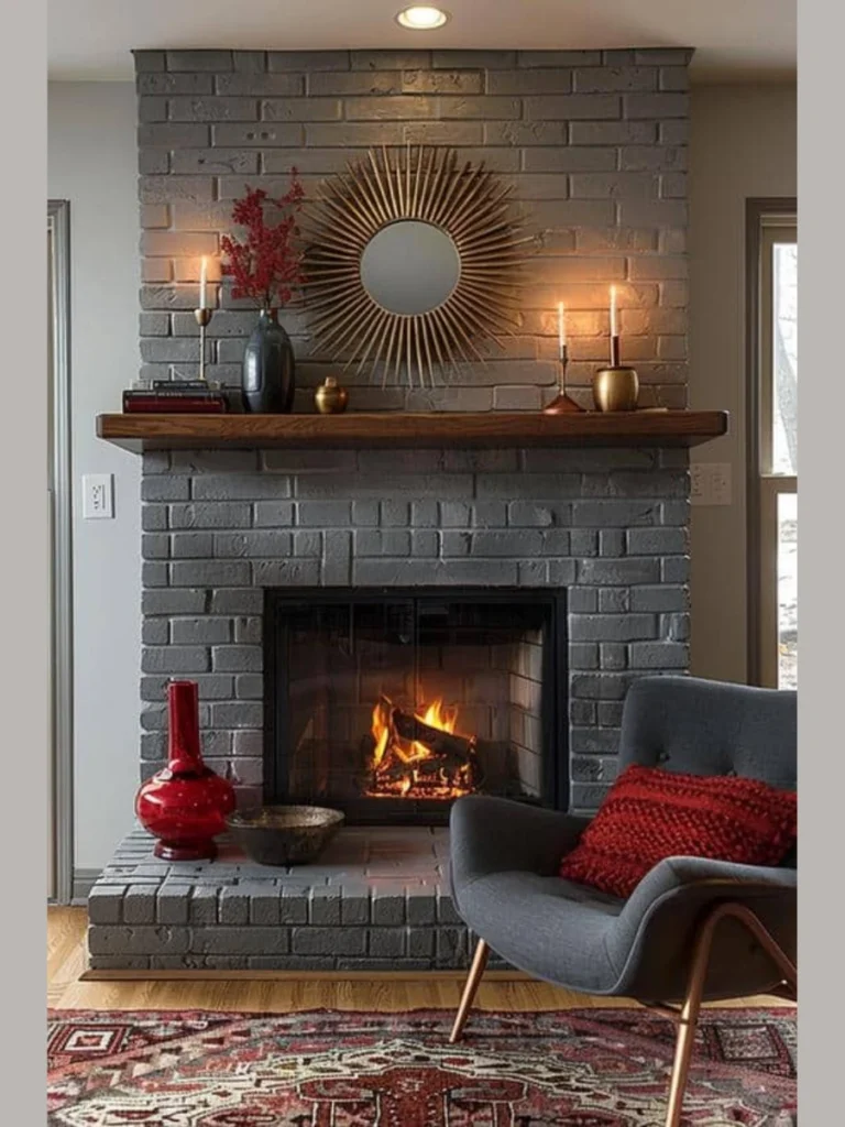
Charcoal gray is the perfect middle ground for those who find black too scary but think white is boring. I find that it offers a sophisticated vibe that pairs beautifully with cool blue or green wall colors in most homes.
This shade brings out the natural shadows in stone or brick which adds a lot of depth to your wall. It looks professional and polished without feeling as heavy as a true black might feel in a small room.
I have used gray in several projects where the owner wanted a contemporary feel that still felt very warm. It masks dust better than almost any other color which is a huge win for people who hate cleaning daily.
You will find that gray works with almost any mantel material from reclaimed oak to modern white marble slabs. It is a safe bet that still looks incredibly stylish and updated for a modern family home in the city.
4. Warm Greige for a Subtle Touch
Greige is that magical mix of gray and beige that seems to match every single piece of furniture ever made. I recommend this color if you want a neutral look that feels a bit warmer than a standard cold gray.
It creates a very calm environment that does not scream for attention but still looks very intentional and neat. I think it is the best choice for open concept living rooms where you need colors to flow naturally.
This tone works wonders with brass or gold accents if you want to add a little bit of luxury. I have seen it transform old red brick into something that looks like it belongs in a high end magazine.
You should pick this if you are worried about the fireplace looking too stark against your existing tan or cream walls. It provides just enough contrast to be noticeable without being a jarring change to your current home decor style.
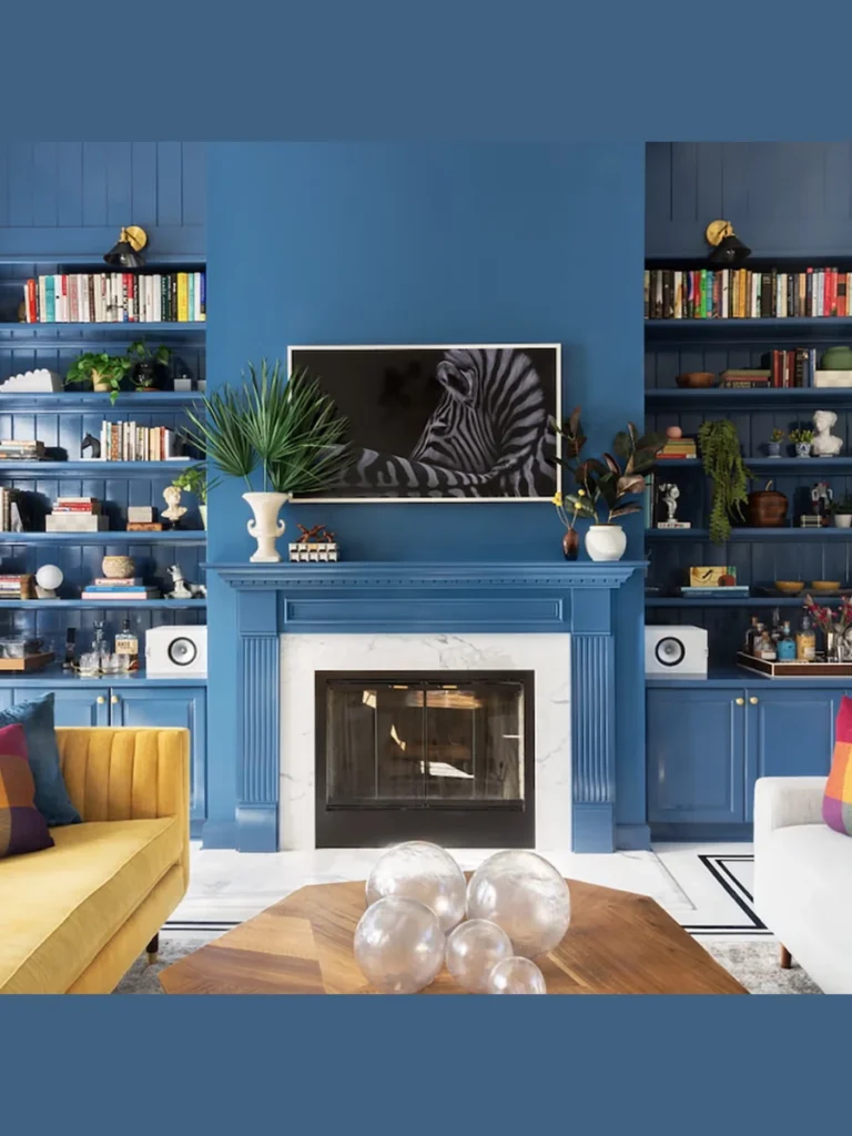
5. Navy Blue for a Bold Character
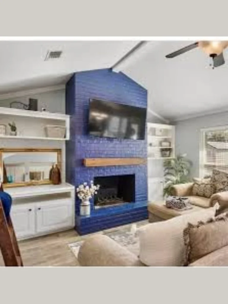
Navy blue is a fantastic choice if you are brave enough to move away from the world of neutral colors. I think it adds a regal and cozy feeling to a den or a library that other colors just cannot provide.
This deep blue acts like a neutral while still providing a punch of personality that tells guests you have style. It looks amazing when paired with white trim or a light oak mantel to break up the dark surface.
I suggest this for anyone who wants their fireplace to stand out as a unique architectural feature in the house. It feels very intimate during the winter months when the orange flames dance against the dark blue backdrop of the brick.
You need to be careful with the finish and stick to a satin or matte to keep it looking classy. Glossy blue can look a bit like a plastic toy so I always tell people to check their paint samples twice.
6. Deep Sage Green for a Natural Vibe
I think sage green is the best way to bring a bit of the outdoors into your cozy living room space. It creates a very relaxing atmosphere that makes you feel like you are sitting in a quiet garden retreat.
This earthy tone pairs beautifully with natural wood mantels and potted plants scattered across the nearby floor area. I have noticed that green tones help to lower stress levels after a long day at the office or school.
You should choose a muted sage if you want a color that looks sophisticated rather than looking too bright. It works as a soft neutral that still offers a refreshing change from the usual grays and whites found everywhere.
I often suggest this shade for homes with plenty of wooden furniture or large windows that look out into trees. It bridges the gap between your interior decor and the natural world outside your window in a very seamless way.
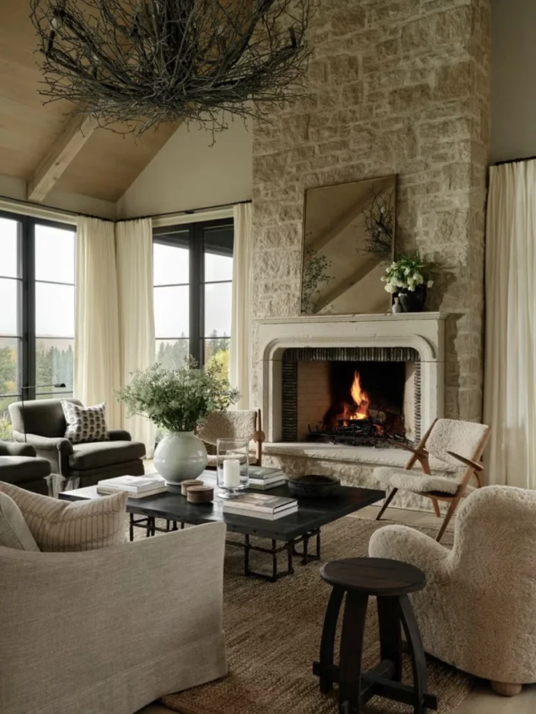
7. Soft Creamy Beige for Timeless Elegance
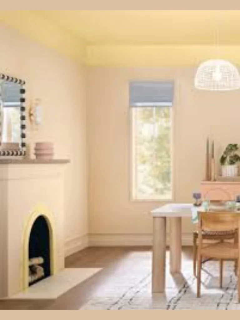
Creamy beige is the go-to solution for anyone who wants a warm and inviting hearth without using stark white paint. I find that it adds a layer of softness to a room that makes guests feel immediately at home and relaxed.
This color is famous for its ability to hide light layers of dust while still making the room feel bright. It provides a subtle glow when the fire is lit which enhances the overall warmth of your evening relaxation sessions.
I recommend this shade for traditional homes where you want to maintain a sense of history and classic architectural style. It never feels dated because it mimics the natural color of high quality limestone and expensive polished travertine surfaces.
You can easily pair beige with dark bronze accessories to create a look that feels both grounded and very expensive. It is a safe investment for your home value because almost every buyer loves a clean and neutral fireplace area.
8. Terracotta Red for a Rustic Feel
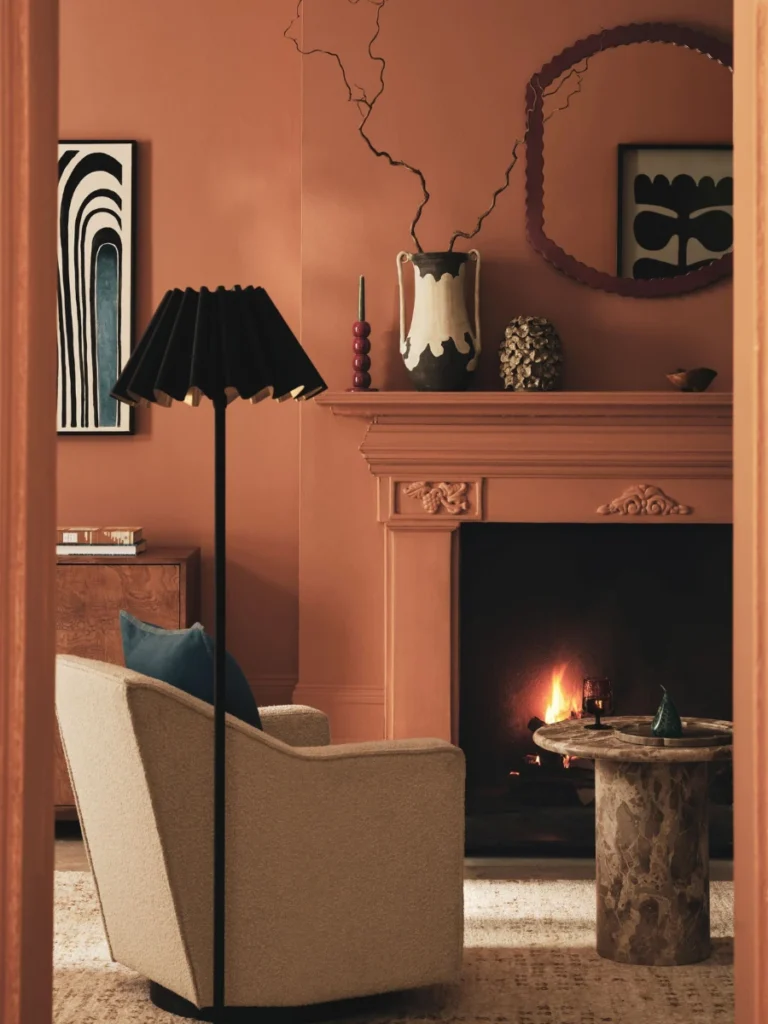
Terracotta is a bold choice that pays homage to traditional clay and Mediterranean styles that feel very warm and sun-drenched. I think it adds a lot of energy to a room that might otherwise feel a bit too cold or clinical.
This color works best in homes with a rustic or bohemian style where texture and warmth are the main goals. I love how it looks when the flickering orange flames highlight the deep reddish-orange pigments in the matte paint finish.
You should consider this if you have a large fireplace that needs to feel a bit more intimate and approachable. It shrinks the visual scale of a massive wall and makes the seating area feel like a tight-knit family space.
I usually suggest keeping the surrounding walls very neutral to allow the terracotta to be the main star of the show. It is a conversation starter that shows you are not afraid to use color to express your personal home style.
9. Slate Blue for a Cool Aesthetic
Slate blue offers a dusty and muted appearance that feels much more subtle than a bright or deep navy blue option. I find that it brings a sense of calm and order to a busy household with its cool undertones.
This shade works perfectly in coastal homes or any space where you want to create a breezy and light feeling. It looks stunning next to light gray walls and white trim which creates a very professional and cohesive look.
I have seen slate blue work wonders on smooth stone fireplaces where you want to emphasize the clean and modern lines. It provides a pop of color that still feels very grown-up and sophisticated for a formal living room area.
You will appreciate how this color changes throughout the day as the natural sunlight moves across the surface of the brick. It can look like a soft gray in the morning and a deep blue as the sun sets.
10. Moody Espresso Brown for Richness
Espresso brown is a fantastic alternative to black if you want a dark look that feels a little more organic. I think it provides a richness that reminds me of high-end chocolate or expensive dark walnut wood furniture pieces.
This color is excellent at masking old stains and soot marks while adding a massive amount of depth to the room. It creates a very masculine and sturdy appearance that works well in dens or basement man-cave setups for relaxing.
I suggest using this shade if you have leather furniture or gold accents that need a dark background to truly shine. It feels incredibly cozy during the winter months and makes the fireplace feel like a solid anchor for the home.
You should use a flat or eggshell finish to ensure the brown looks modern rather than looking like an old 1970s relic. When done correctly it looks like a custom architectural feature that was built specifically for your luxury home.
11. Olive Green for an Organic Look
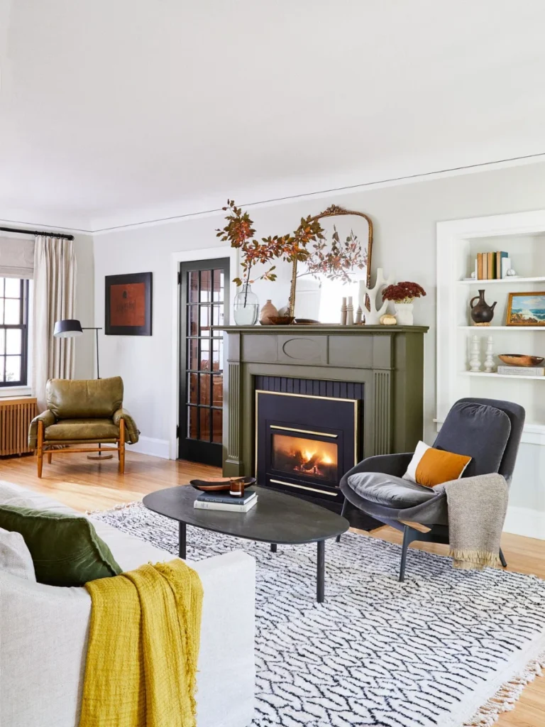
Olive green is a slightly darker and more serious version of sage that adds a layer of heritage to your home. I love how it looks in older houses with crown molding and traditional hardwood floors that have a lot of character.
This shade feels very grounded and works well with colors like burnt orange, mustard yellow, or even a deep burgundy. It is the ultimate choice for a moody and academic vibe that feels like a vintage library or study.
I find that olive green hides imperfections in old masonry better than almost any other mid-tone color on the market today. It creates a textured look that feels expensive and custom-made without requiring a massive budget for expensive new materials.
You should try this if you want a “forever” color that will grow with your changing style over the next decade. It is trendy enough to be cool now but classic enough to stay relevant for many years to come.
12. Pewter Silver for a Metallic Edge
Pewter is a unique choice that gives your fireplace a slightly metallic and industrial edge without being too shiny or distracting. I think it is the perfect solution for modern lofts or homes with a lot of stainless steel.
This color reflects light in a very interesting way that adds a sense of motion to the surface of your fireplace. It looks clean and sharp which is great for people who prefer a minimalist and highly organized living environment.
I recommend this for fireplaces with very straight lines and simple mantels to emphasize the architectural shape of the unit. It pairs exceptionally well with glass accents and cool-toned LED lighting that many modern homeowners prefer these days.
You will find that pewter is very easy to clean and maintains its look much longer than lighter and more porous colors. It gives your room a high-tech feel while still providing the warmth of a traditional wood-burning or gas fire.
13. Deep Burgundy for a Traditional Glow
Burgundy is a classic fireplace color that screams luxury and high-end traditional design from the moment you see it. I think it adds a sense of drama and importance to a room that needs a very strong focal point.
This color is perfect for dining rooms or formal parlors where you want to create a sophisticated and moody dinner atmosphere. It looks incredible under the warm glow of a chandelier or when surrounded by antique gold-framed oil paintings.
I suggest this for anyone who wants their home to feel like a historic estate or a very fancy hotel. It provides a deep and rich backdrop that makes the yellow and orange flames of the fire look absolutely spectacular.
You need to make sure your lighting is adequate so the red does not turn into a muddy brown in the shadows. When the light hits it correctly the color is vibrant and adds a huge amount of character to your home.
14. Soft Dove Gray for a Neutral Backdrop
Dove gray is the lighter cousin of charcoal and offers a very airy and open feeling for smaller living room spaces. I find that it is one of the most popular colors because it is impossible to mess up the styling.
It works with both warm and cool color palettes which makes it a very versatile choice for a growing family home. I love how it makes the room feel updated without making a statement that is too loud or distracting.
I recommend this for people who like to change their throw pillows and rugs frequently to keep the room feeling fresh. The gray acts as a silent partner that supports whatever other colors you decide to bring into the living area.
You should use this shade if you are planning to sell your house in the near future and want to impress. It is a universal crowd-pleaser that helps potential buyers imagine their own furniture in your beautifully updated and modern space.
Comparison of Fireplace Finish Types
| Finish Type | Visual Effect | Best For |
| Matte | No shine, hides bumps | Old Brick, Industrial looks |
| Satin | Subtle glow, easy clean | Family rooms, Modern stone |
| Glossy | High shine, reflects light | Contemporary, Bold statements |
| Whitewash | Transparent, shows grain | Rustic, Farmhouse styles |
Expert Selection Guide for Your Hearth
Choosing the right color is only half the battle when you are trying to fix a boring or ugly fireplace. I always tell people to look at the fixed elements in the room like the flooring and window frames.
If your floors have a warm red undertone you should avoid colors that are too cool as they will fight each other. You want the fireplace to look like it has always been there rather than looking like a random DIY accident.
I suggest buying three different samples and painting them on large pieces of cardboard to move around the room. This lets you see how the color interacts with your sofa and your favorite chair before you open the paint.
Do not forget to think about the mantel color because it acts as the frame for your new fireplace paint job. A white mantel on a black fireplace creates a crisp look while wood on green feels very organic and natural.
Conclusion
I hope this list of color ideas has given you the confidence to finally pick up a brush and start. Changing your fireplace is a small project that yields massive results for the overall vibe of your entire living area.
You do not need a huge budget to make your home look like a million bucks if you choose the right shade. I have seen simple color changes completely shift the energy of a house from dated to totally modern.
I think the best color is always the one that makes you feel happy when you sit down with a book. Trust your gut and do not be afraid to go bold if that is what your heart is telling you.
Your fireplace is the heart of your home so treat it with the respect and the creative attention it deserves. I cannot wait to hear which color you picked to transform your space into something truly special and unique.
FAQs
Currently matte black and charcoal gray are leading the trends because they offer a modern and very sleek appearance. These colors are excellent at hiding soot and creating a strong focal point that works with almost any furniture style.
Yes you can absolutely paint your fireplace as long as you use the correct high-heat primer and specialized masonry paint. I always tell people that the prep work is more important than the painting itself to ensure a long-lasting finish.
Generally a professional looking paint job in a neutral color will increase your home value by making the space look updated. You should only worry if you use a very strange color that might turn off potential buyers in the future.
You must use a specific high-temperature paint if you plan on painting the actual firebox where the flames are located. Standard wall paint will peel and release dangerous fumes if it gets too hot so please check the labels carefully.
It depends on the look you want but usually a contrasting mantel helps to break up the color and add visual interest. I think a natural wood mantel looks amazing on almost any painted surface because it adds a touch of warmth.