The colors used in a kitchen can quietly shape the mood of the entire home. I often notice that a thoughtful color combination can make the space feel brighter, calmer, and more inviting without changing the layout.
Many homeowners focus on cabinets and appliances, yet color plays an equally important role in how comfortable the kitchen feels every day. Choosing the right shades can highlight natural light and create visual balance.
In this guide, I will share practical kitchen color ideas that help bring warmth, character, and harmony into the space.
Stylish Kitchen Color Ideas That Refresh the Entire Space
Choosing the right colors can completely transform the way a kitchen looks and feels. I often notice that a well-balanced color scheme can make even an older kitchen appear fresh and modern.
Colors influence brightness, warmth, and the overall mood of the space. When homeowners select colors carefully, the kitchen becomes more comfortable and visually appealing.
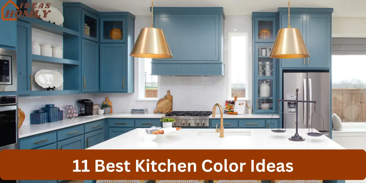
1. Classic White Kitchen Color
White remains one of the most dependable color choices for kitchens. I often recommend it because it reflects natural light and helps the room feel open and spacious. Many homeowners choose white when they want a clean and timeless look.
This color works well with almost any cabinet material, whether it is natural wood, glossy modern finishes, or stainless steel appliances. White creates a neutral base that allows other design elements to stand out.
Another advantage I frequently notice is flexibility. White walls and cabinets make it easy to update kitchen decor over time. Small changes such as new hardware or colorful accessories can refresh the entire space.
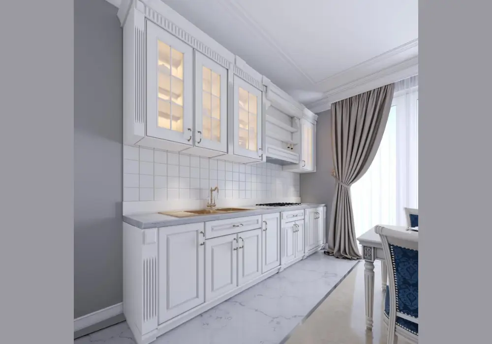
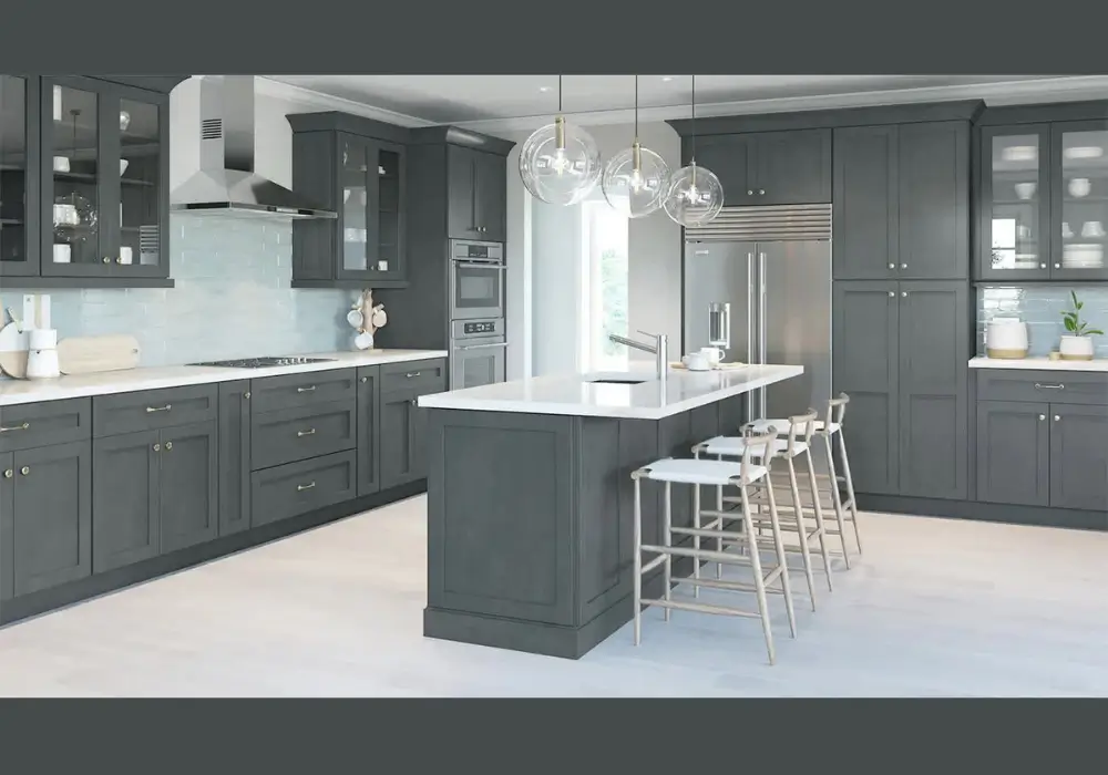
2. Soft Gray Kitchen Color
Soft gray offers a balanced alternative to bright white. I often suggest this color for homeowners who want a calm and modern kitchen without introducing darker tones.
Gray provides a subtle background that works well with many kitchen materials. It pairs especially well with white cabinetry, marble countertops, and brushed metal fixtures.
In many kitchens I have seen, soft gray walls create a sophisticated atmosphere while still keeping the space bright. The color adds depth without making the room feel heavy.
3. Warm Beige Kitchen Color
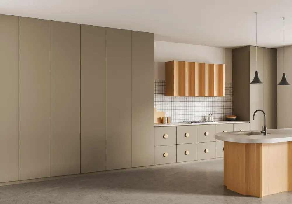
Warm beige creates a welcoming and comfortable kitchen environment. I often recommend it for homeowners who prefer a softer tone that still feels neutral and versatile.
This color blends beautifully with natural materials such as wood cabinets, stone countertops, and woven textures. Beige helps balance these elements and creates a cohesive look.
From my experience, beige also works well in kitchens with limited natural light. Its warm undertones prevent the room from feeling dull or overly shadowed.
4. Sage Green Kitchen Color
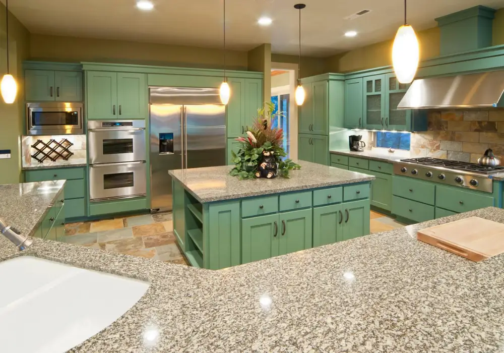
Sage green has become extremely popular in modern kitchen design. I often suggest this shade because it brings a gentle connection to nature without overwhelming the space.
This muted green tone works beautifully with wood accents, brass hardware, and neutral countertops. Together, these elements create a balanced and relaxing environment.
I frequently see sage green used on cabinets as well as walls. The color introduces personality while still maintaining a calm and comfortable atmosphere.
5. Navy Blue Kitchen Color
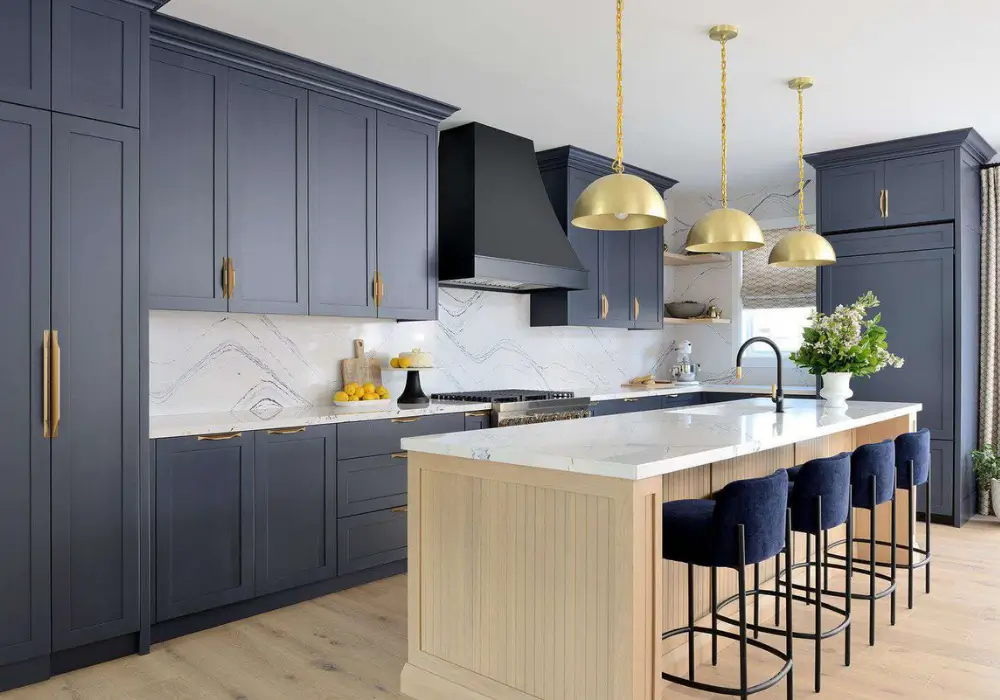
Navy blue adds depth and sophistication to kitchen interiors. I often recommend it when homeowners want a bold yet elegant color choice.
This shade works particularly well on cabinets or accent walls. When combined with white countertops or light backsplashes, navy creates a strong visual contrast.
In many kitchens I have observed, navy blue pairs beautifully with gold or brass hardware. The combination produces a refined appearance that still feels welcoming.
6. Light Blue Kitchen Color
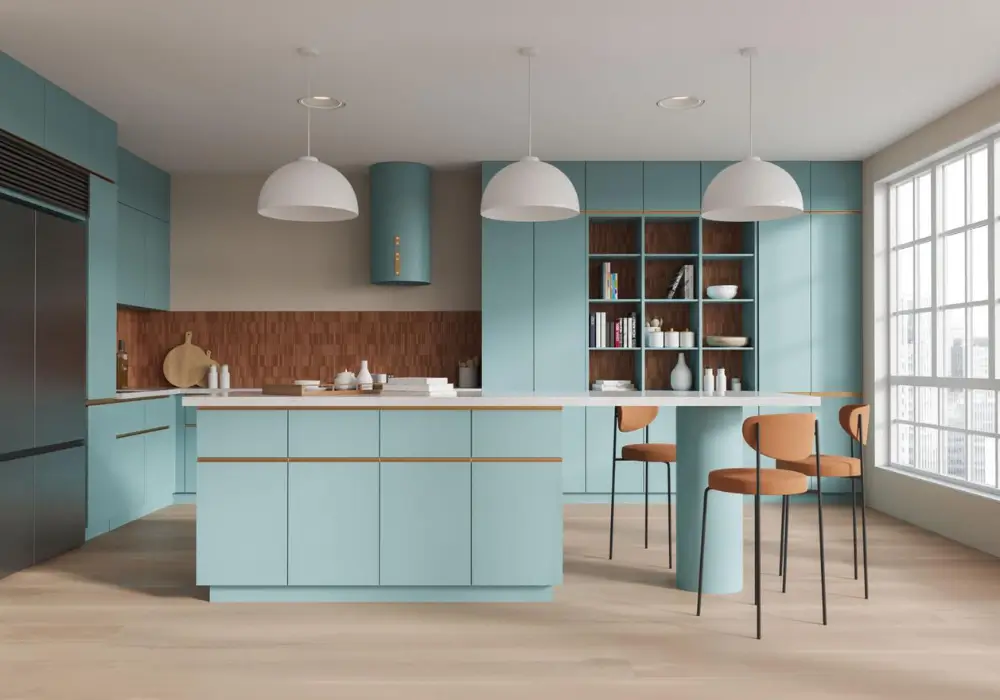
Light blue introduces a fresh and airy feeling into the kitchen. I often suggest this color for homes that want a relaxed and comfortable atmosphere.
The softness of light blue reflects natural light well, which helps the kitchen appear more open and peaceful. It works especially well in kitchens with large windows.
I frequently see this shade used in coastal or cottage-style kitchens. Paired with white cabinets and wooden accents, light blue creates a calm and refreshing design.
7. Cream Kitchen Color
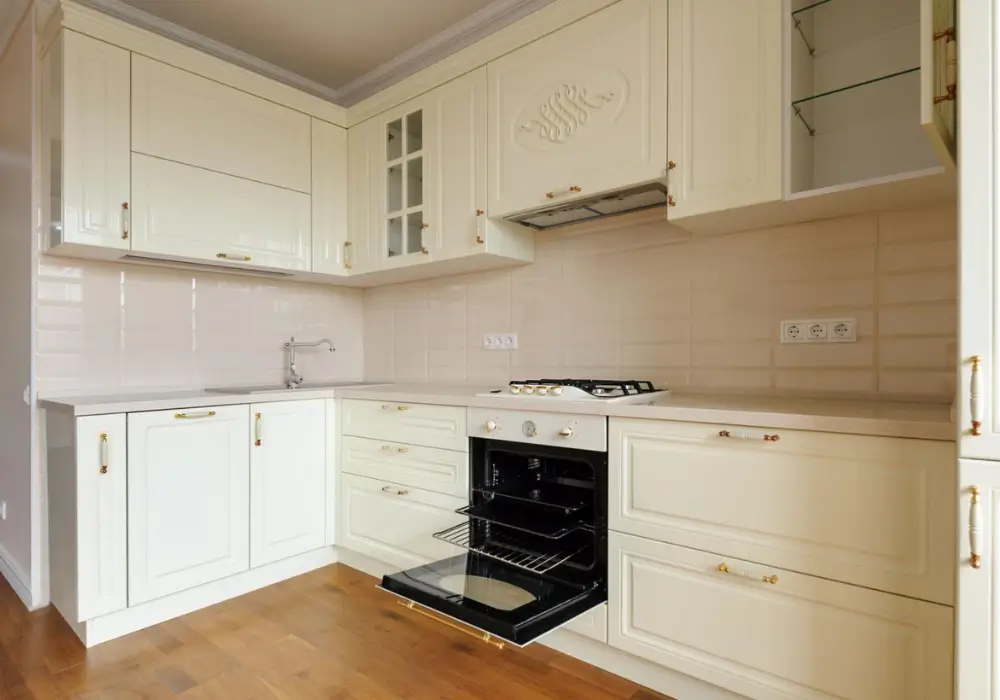
Cream offers a warmer version of white while maintaining brightness. I often recommend cream when homeowners want a softer and more inviting kitchen appearance.
Unlike pure white, cream includes subtle warm undertones that add comfort to the space. This makes it especially suitable for traditional kitchens.
Cream walls also complement wooden cabinets and natural stone countertops. The result is a kitchen that feels timeless and balanced.
8. Charcoal Gray Kitchen Color
Charcoal gray introduces bold contrast into a kitchen. I often suggest using this shade on cabinets or a feature wall to create depth in the design.
When paired with lighter elements such as white countertops or light flooring, charcoal gray produces a striking visual balance.
Many modern kitchens use charcoal gray to achieve a contemporary style. The darker tone adds drama without making the room feel overly dark when used thoughtfully.
9. Soft Yellow Kitchen Color
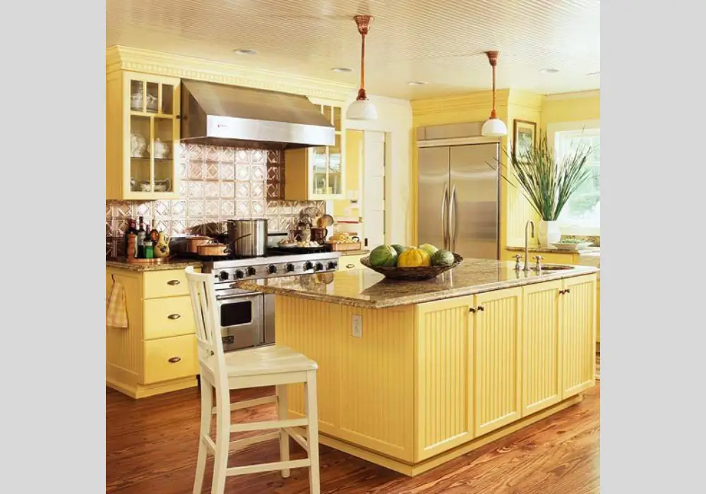
Soft yellow brings warmth and energy into the kitchen environment. I often recommend this color for homeowners who want a cheerful and welcoming space.
This gentle shade reflects light beautifully, which helps brighten the room. It works particularly well in kitchens that serve as gathering areas for family.
When combined with white cabinets or wooden furniture, soft yellow creates a comfortable and inviting atmosphere that feels lively yet balanced.
10. Olive Green Kitchen Color
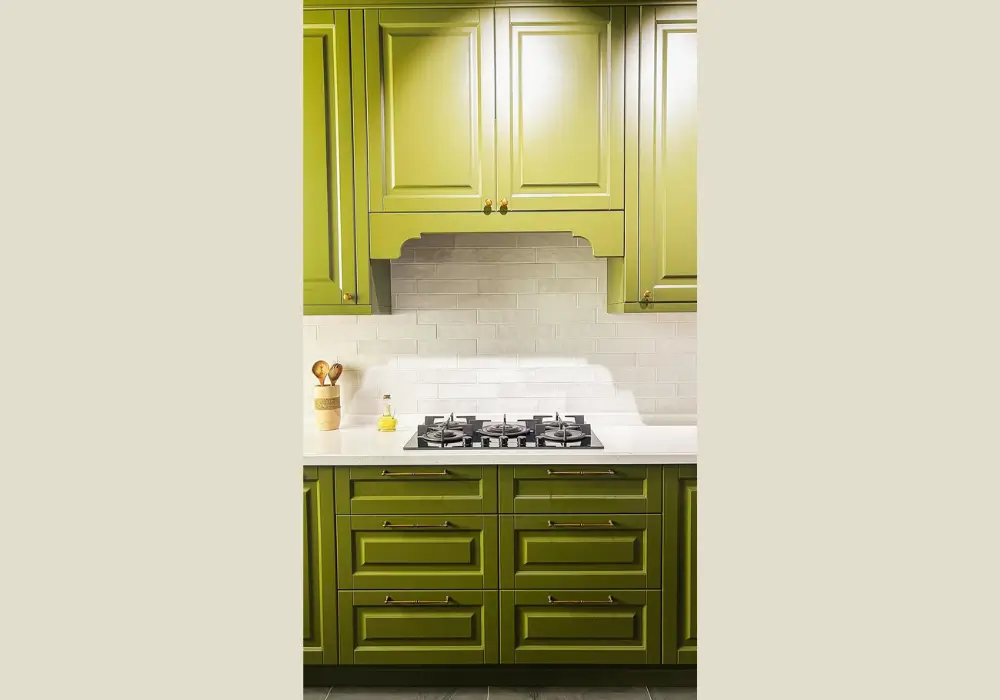
Olive green adds a grounded and natural feeling to kitchen interiors. I often suggest this shade for homeowners who appreciate earthy color palettes.
This deeper green tone pairs well with wood finishes, stone surfaces, and matte black hardware. These combinations create a rich and organic kitchen design.
In many kitchens I have seen, olive green introduces character while still feeling calm. The color brings warmth and depth without overpowering the room.
11. Two-Tone Kitchen Color Design
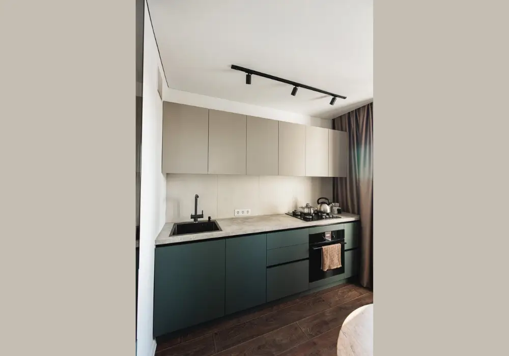
Two-tone kitchens combine two complementary colors to create contrast and visual interest. I often recommend this approach for homeowners who want a more dynamic kitchen design.
A common method uses lighter upper cabinets and darker lower cabinets. This arrangement keeps the kitchen feeling open while still adding depth.
Two-tone color schemes also allow homeowners to experiment with combinations such as white and navy or gray and wood. When balanced carefully, the result feels modern and visually engaging.
Tips for Choosing the Right Kitchen Color Scheme
Selecting the right color scheme can shape the entire atmosphere of a kitchen. I often recommend thinking beyond personal preference and considering how lighting, cabinets, and countertops interact with the wall color. A balanced palette can make the space feel brighter, cleaner, and more comfortable.
Another important step is observing how colors behave throughout the day. Natural light, artificial lighting, and surrounding materials can change how a color appears on the wall. When homeowners test colors carefully and choose shades that complement existing elements, the kitchen feels more cohesive and welcoming.
Consider Natural and Artificial Lighting
Lighting plays a major role in how colors appear in the kitchen. I usually suggest checking paint samples in both daylight and evening lighting. Kitchens with limited sunlight often benefit from lighter shades that reflect brightness.
Match Colors with Cabinets and Countertops
The kitchen color scheme should work well with cabinets and countertops. I often recommend selecting shades that complement these surfaces instead of competing with them. Balanced combinations help the kitchen look more organized.
Use Neutral Shades for a Balanced Look
Neutral colors such as white, gray, or beige create a flexible base for kitchen design. I frequently suggest these shades because they adapt well to different decor styles and allow easy updates later.
Add Accent Colors for Personality
Accent colors introduce character without overwhelming the space. I often recommend using deeper shades on a single wall, kitchen island, or cabinets to create contrast while keeping the overall palette balanced.
Test Paint Samples Before Final Choice
Testing paint samples is one of the most practical steps in choosing a kitchen color. Applying small patches on the wall helps homeowners see how each shade interacts with light and nearby surfaces.
Kitchen Color Scheme Comparison
| Color Option | Best For | Effect in Kitchen |
|---|---|---|
| Classic White | Small or dark kitchens | Creates brightness and openness |
| Soft Gray | Modern interiors | Adds calm and subtle depth |
| Warm Beige | Traditional kitchens | Brings warmth and comfort |
| Sage Green | Natural-inspired kitchens | Creates a fresh atmosphere |
| Navy Blue | Accent walls or cabinets | Adds contrast and elegance |
| Soft Yellow | Family kitchens | Introduces warmth and energy |
Conclusion
The colors used in a kitchen quietly shape how the space feels every day. I often notice that a thoughtful color choice can brighten the room, highlight design details, and make the kitchen more welcoming.
Whether homeowners prefer timeless neutrals or richer accent tones, the key is creating balance between walls, cabinets, and lighting. When colors complement each other, the kitchen feels more organized and visually comfortable.
Even a simple color update can refresh the entire space without major renovation. By choosing shades carefully, it becomes easier to create a kitchen that feels warm, practical, and enjoyable for everyday use.
FAQs
White and soft gray remain among the most popular kitchen colors. I often see homeowners choose these shades because they create a clean and timeless appearance. They also work well with many cabinet styles and countertop materials.
Light shades such as white, cream, pale gray, and soft blue help kitchens feel larger and brighter. These colors reflect natural light and reduce visual heaviness. I usually recommend them for smaller kitchens.
Kitchen walls do not always need to match cabinet colors exactly. In many cases, a gentle contrast works better. I often suggest choosing complementary shades that highlight the cabinets while keeping the space balanced.
Lighter tones typically work best for small kitchens because they reflect light and create a sense of openness. Colors such as white, cream, soft gray, or pale blue help the room feel larger and more comfortable.