The right color combination can completely change how a kitchen feels. I often notice that when colors work together thoughtfully, the space immediately looks more organized and welcoming.
Many homeowners focus on cabinets or appliances, but the overall palette quietly shapes the entire kitchen atmosphere. A balanced mix of light and deep tones can highlight natural light and add personality without overwhelming the room.
In this guide, I will share practical kitchen color scheme ideas that help create a kitchen that feels both stylish and comfortable for everyday use.
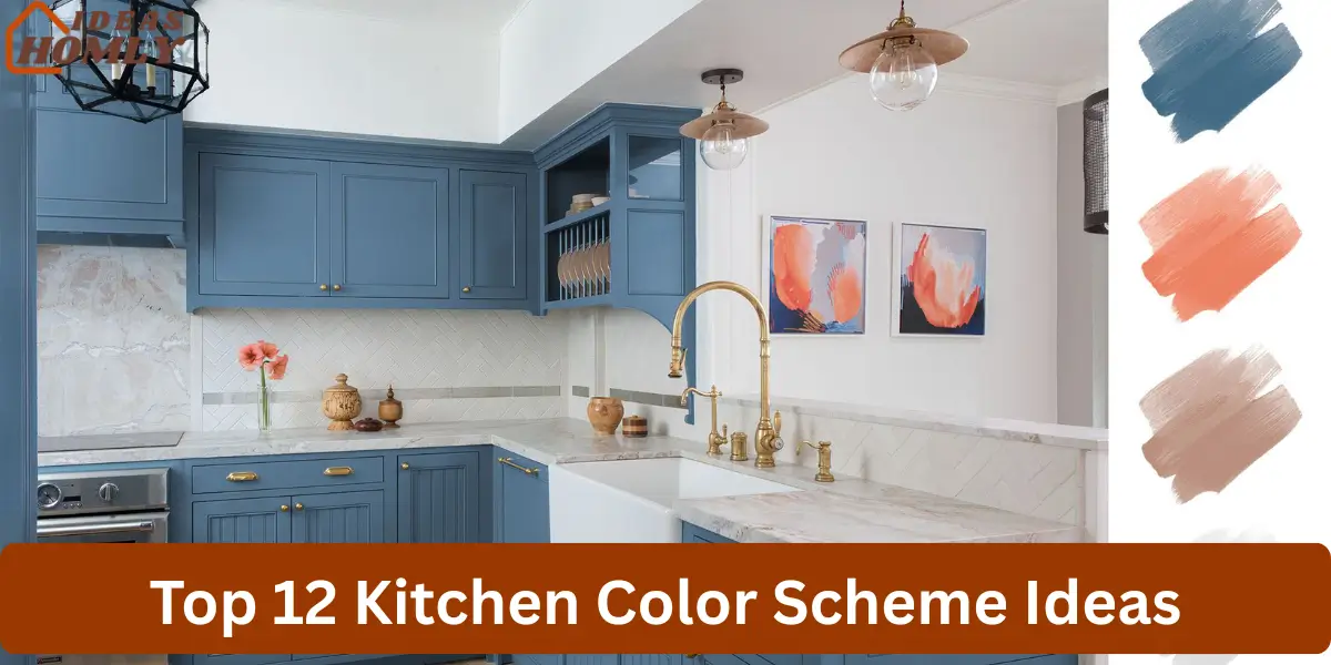
Beautiful Kitchen Color Schemes That Transform the Space
The right color scheme can bring balance and personality into a kitchen. I often notice that when colors complement each other, the entire space feels more organized and visually comfortable.
A thoughtful combination of tones can highlight cabinets, countertops, and natural light. When the palette works well together, the kitchen becomes both stylish and inviting.
1. White and Wood Kitchen Color Scheme

White and wood create one of the most balanced kitchen color schemes. I often recommend this combination because it blends brightness with natural warmth. White surfaces reflect light while wood textures introduce depth and character.
This scheme works particularly well in kitchens that aim for a calm and welcoming environment. The natural wood tones soften the brightness of white cabinets and walls.
From what I have seen, this palette adapts easily to different styles. Whether the kitchen follows a modern or farmhouse design, white and wood maintain a timeless appearance.
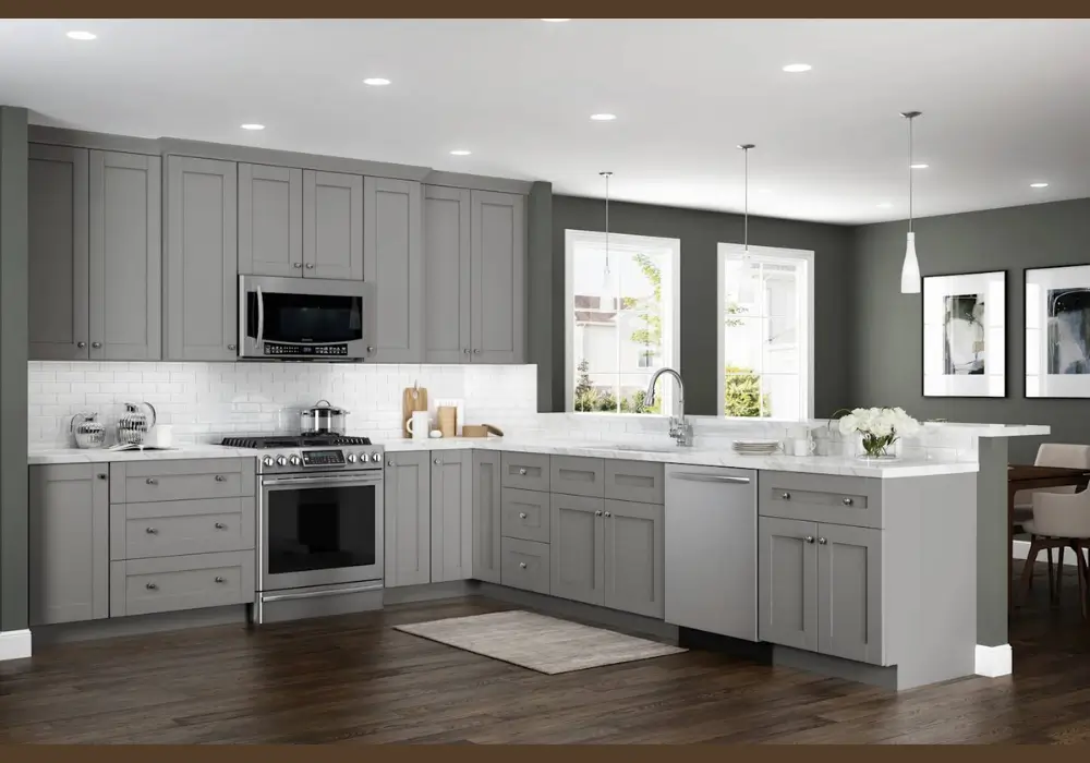
2. Gray and White Kitchen Color Scheme
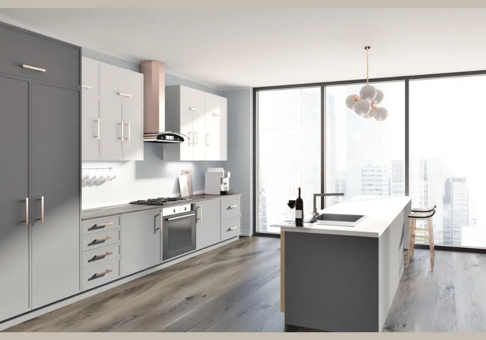
Gray and white offer a neutral and sophisticated kitchen palette. I often suggest this combination when homeowners want a modern look that still feels comfortable.
Soft gray cabinets or walls provide depth, while white surfaces keep the space bright and balanced. The contrast between the two shades creates a clean and organized appearance.
This color scheme also pairs well with stainless steel appliances and marble countertops. Together, these elements create a refined yet practical kitchen environment.
3. Navy Blue and Gold Kitchen Color Scheme
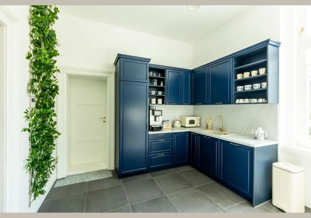
Navy blue and gold create a rich and elegant kitchen design. I often notice that navy cabinets immediately add depth and sophistication to the room.
Gold or brass hardware introduces warmth and highlights important design details. This contrast creates a strong visual impact while still feeling balanced.
In many kitchens I have observed, this scheme works especially well with white countertops or backsplashes. The lighter surfaces prevent the darker blue from making the room feel heavy.
4. Sage Green and Cream Kitchen Color Scheme
Sage green and cream form a calm and natural kitchen palette. I frequently suggest this combination for homeowners who prefer softer colors inspired by nature.
Sage green introduces gentle color without overwhelming the space, while cream tones provide warmth and brightness.
This palette works beautifully with wood shelves and stone surfaces. The combination creates a relaxed environment that feels both fresh and welcoming.
5. Black and White Kitchen Color Scheme
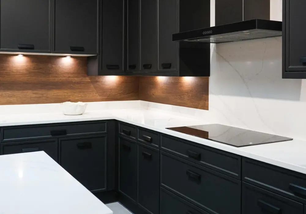
Black and white create a striking and timeless kitchen design. I often recommend this scheme when homeowners want a bold contrast that still feels classic.
Black cabinets or islands anchor the design, while white walls and countertops keep the space bright. The strong contrast adds visual energy to the kitchen.
Many kitchens use this palette to achieve a modern look. With the right lighting and materials, black and white create a balanced yet dramatic interior.
6. Blue and White Coastal Kitchen Scheme
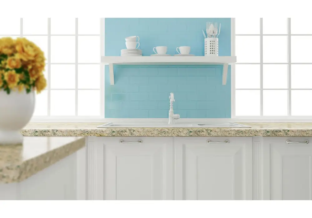
Blue and white bring a fresh and airy feeling to the kitchen. I often suggest this scheme for homes that want a relaxed and open atmosphere.
Light blue cabinets or walls reflect natural light and create a calm environment. White surfaces help maintain brightness and balance.
This combination often appears in coastal or cottage-style kitchens. When paired with natural wood accents, it creates a refreshing and welcoming design.
7. Beige and Brown Kitchen Color Scheme
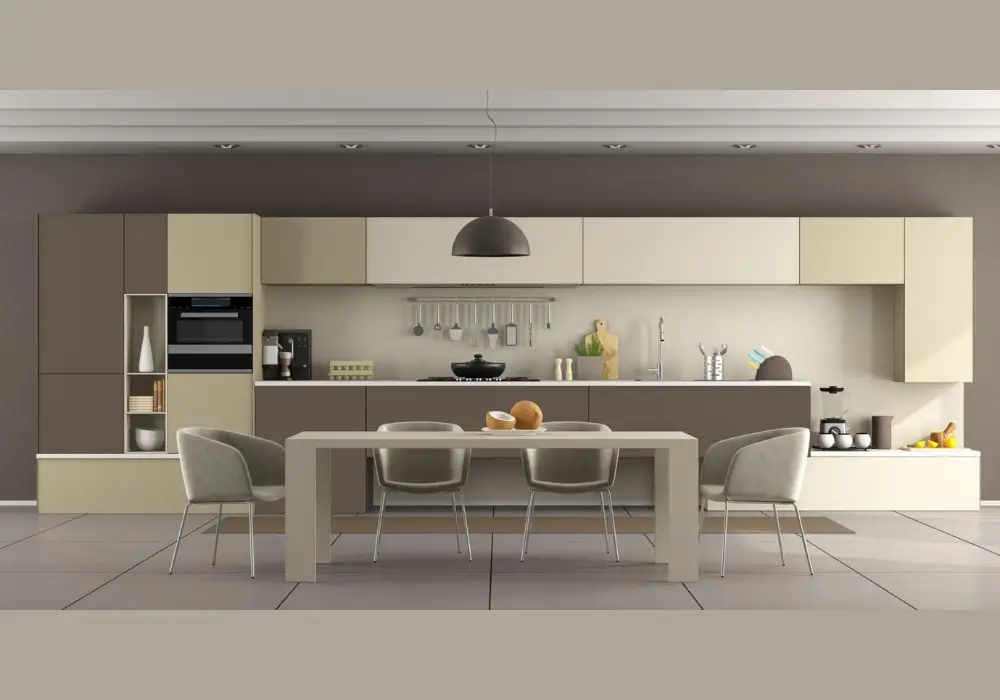
Beige and brown create a warm and comfortable kitchen environment. I frequently recommend this palette for homes that prefer natural and earthy tones.
Beige walls provide a neutral background while deeper brown cabinets or furniture add richness and depth.
From my experience, this scheme works well with stone countertops and wooden flooring. Together, these materials create a cohesive and inviting kitchen design.
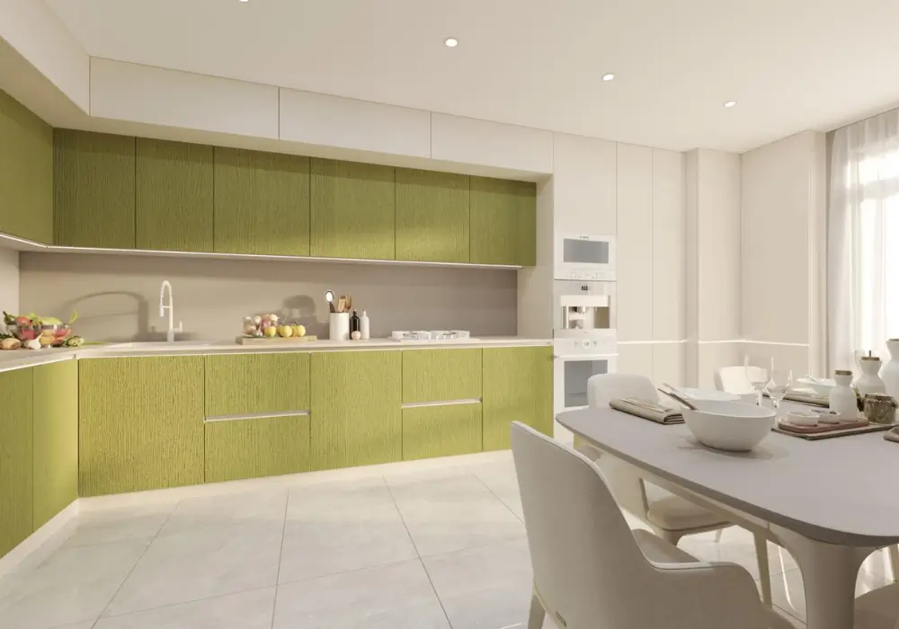
8. Olive Green and Wood Kitchen Scheme
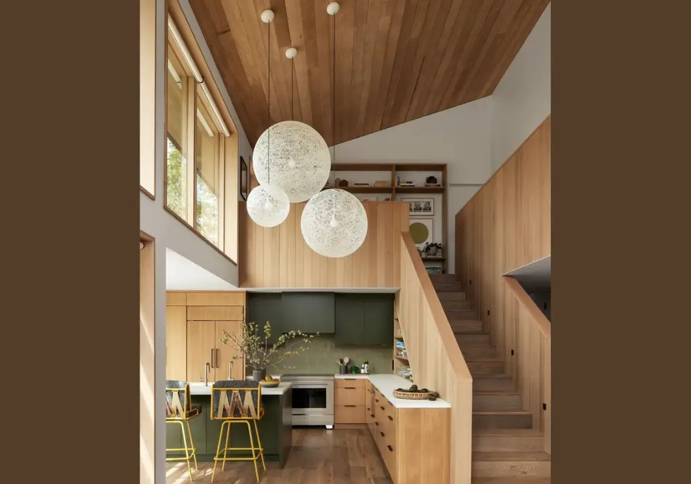
Olive green and wood tones create a grounded and organic kitchen palette. I often suggest this combination for homeowners who appreciate natural colors.
The deep green shade adds character while wood elements soften the overall look. Together, they create a balanced and calming environment.
This scheme works particularly well in kitchens that incorporate natural materials. Stone countertops and matte finishes enhance the earthy aesthetic.
9. Charcoal Gray and Light Wood Scheme
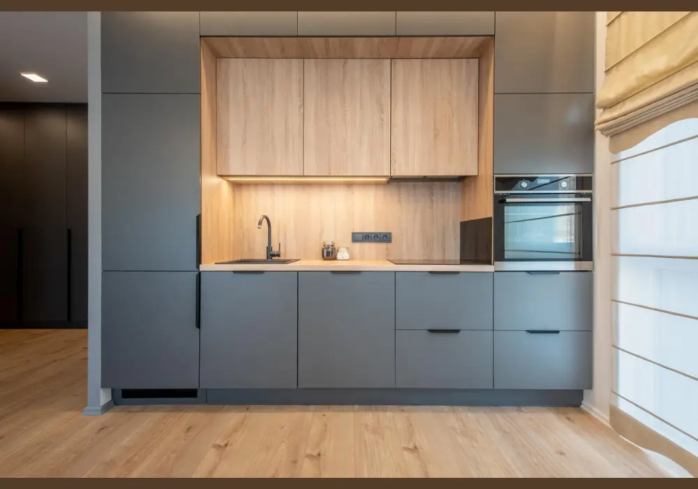
Charcoal gray paired with light wood creates a modern and balanced kitchen design. I often recommend this palette for contemporary interiors.
The darker gray tone adds depth, while the lighter wood prevents the space from feeling heavy.
In many kitchens I have seen, this combination creates a clean and sophisticated look. It works especially well with simple cabinetry and minimal decorative elements.
10. Yellow and White Kitchen Color Scheme
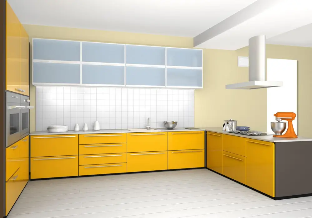
Yellow and white bring brightness and warmth into the kitchen. I often suggest this palette for homeowners who want a cheerful and welcoming atmosphere.
Soft yellow walls reflect light and create an energetic environment. White cabinets or countertops balance the color and keep the space fresh.
This combination works well in family kitchens where people gather often. The lively tones help the room feel comfortable and inviting.
11. Two-Tone Gray Kitchen Color Scheme
Two-tone gray kitchens use different shades of gray to create visual depth. I often recommend this design for modern kitchens that prefer subtle contrasts.
Lighter gray tones usually appear on upper cabinets while darker gray shades anchor the lower cabinets or island.
This layered approach creates interest without introducing strong colors. The result is a sleek and balanced kitchen design.
12. Terracotta and Cream Kitchen Color Scheme
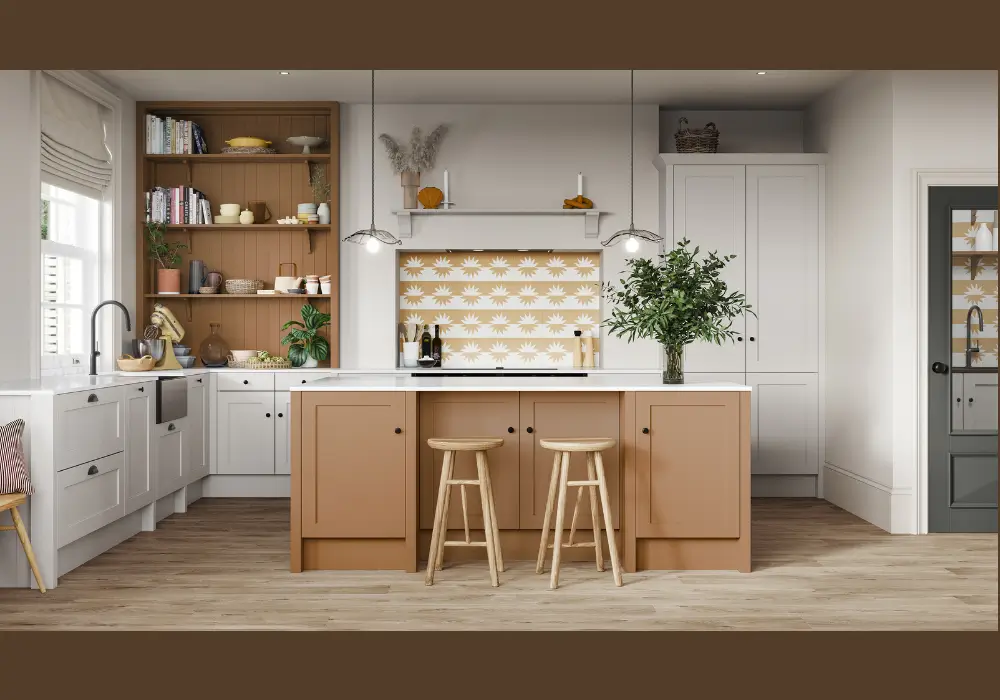
Terracotta and cream create a warm Mediterranean-inspired kitchen palette. I often suggest this scheme for kitchens that want a rich yet comfortable atmosphere.
Terracotta walls or accents introduce earthy warmth, while cream cabinets soften the overall look.
This color combination pairs beautifully with natural textures such as wood and stone. Together, they create a kitchen that feels both vibrant and welcoming.
How to Choose a Balanced Kitchen Color Scheme
Choosing the right kitchen color scheme requires careful planning because several elements must work together.
I often suggest observing how wall colors interact with cabinets, countertops, and lighting. When the palette feels balanced, the kitchen naturally appears more organized and welcoming.
Another step I always recommend is considering the size of the kitchen and the amount of natural light available. Lighter color combinations can brighten smaller kitchens, while deeper tones may work better in larger spaces.
When homeowners test color combinations before painting or installing cabinets, they usually achieve a more harmonious result.
Understand the Kitchen’s Natural Lighting
Lighting greatly influences how colors appear in a kitchen. I usually suggest checking paint samples during different times of the day. Kitchens with strong sunlight can handle deeper tones, while darker spaces often benefit from lighter shades.
Coordinate Colors with Cabinets and Countertops
Cabinets and countertops form the visual foundation of the kitchen. I often recommend selecting colors that complement these surfaces rather than competing with them. A coordinated palette keeps the space balanced.
Use Neutral Base Colors for Flexibility
Neutral shades such as white, gray, or beige provide a flexible starting point for kitchen design. I frequently suggest these tones because they allow homeowners to add accent colors later without repainting the entire room.
Introduce Accent Colors Carefully
Accent colors help add personality to a kitchen, but they should appear in moderation. I often recommend using them on a kitchen island, backsplash, or decor pieces rather than across the entire room.
Test Color Combinations Before Finalizing
Testing small color samples is one of the most practical steps in choosing a scheme. Applying a few combinations on the wall helps homeowners understand how each color interacts with lighting and surrounding materials.
Conclusion
A well-planned kitchen color scheme can completely change how the space looks and feels. I often notice that when colors work together naturally, the kitchen becomes more comfortable, organized, and visually balanced.
Whether you prefer timeless neutral combinations or richer contrasting tones, the key is choosing colors that complement cabinets, lighting, and countertops. Even small adjustments in the palette can refresh the entire room without major renovations.
By carefully selecting colors that suit both the kitchen layout and personal style, it becomes much easier to create a space that feels welcoming, functional, and enjoyable for everyday cooking and gatherings.
FAQs
Modern kitchens often use neutral combinations such as gray and white or black and white. I frequently see homeowners choose these palettes because they create a clean and contemporary appearance. These color schemes also pair easily with stainless steel appliances and minimalist cabinetry.
Start by identifying the dominant tone of your cabinets. I usually recommend selecting wall colors that complement the cabinet finish instead of matching it exactly. Balanced contrast often produces a more visually appealing kitchen.
Two-tone kitchens can add depth and personality to the space. I often suggest using lighter colors on upper cabinets and darker shades below. This approach maintains brightness while introducing visual interest.
Light combinations such as white and wood or gray and white can make kitchens appear larger. These palettes reflect natural light and prevent the room from feeling crowded. I usually recommend them for compact kitchens.