The color you choose for your kitchen can completely change how the space feels. I often notice that the right paint color can make a kitchen look brighter, cleaner, and more welcoming without any major renovation.
Many homeowners focus on cabinets and appliances, but wall color quietly shapes the entire atmosphere of the room. When chosen carefully, it can highlight natural light and complement existing materials.
In this guide, I will share practical kitchen paint color ideas that help create a balanced and inviting kitchen environment.
Popular Kitchen Paint Color Ideas That Transform the Space
The right paint color can completely change the atmosphere of a kitchen. I often see kitchens look brighter and more welcoming simply by choosing a thoughtful color palette.
Color influences how spacious, warm, or modern a kitchen feels. When you select the right shade, the entire space starts to feel more balanced and inviting.
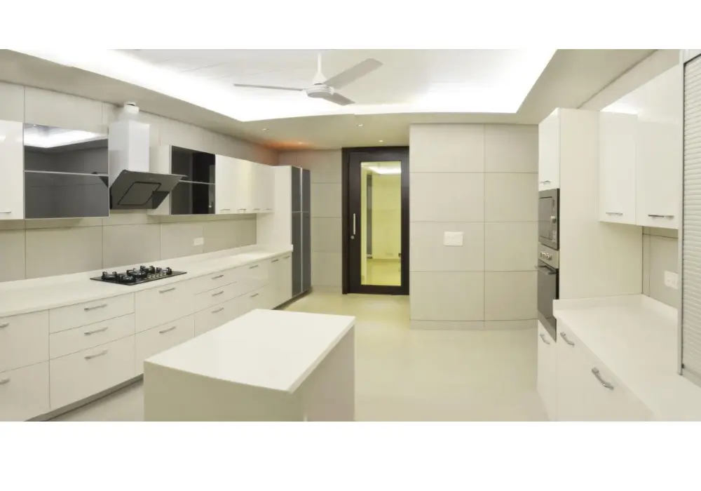
1. Classic White Kitchen Paint
White remains one of the most reliable kitchen paint choices. I often recommend it because it instantly makes the kitchen look brighter and more open. When natural light reflects off white walls, the space feels larger and cleaner.
This color also works well with almost any cabinet style. Whether the kitchen includes wooden cabinets, modern glossy finishes, or stainless steel appliances, white walls create a neutral background that highlights other design elements.
Another advantage is flexibility. Homeowners can easily update decor, hardware, or accessories without repainting the walls. White acts as a timeless base that adapts well to changing kitchen styles.
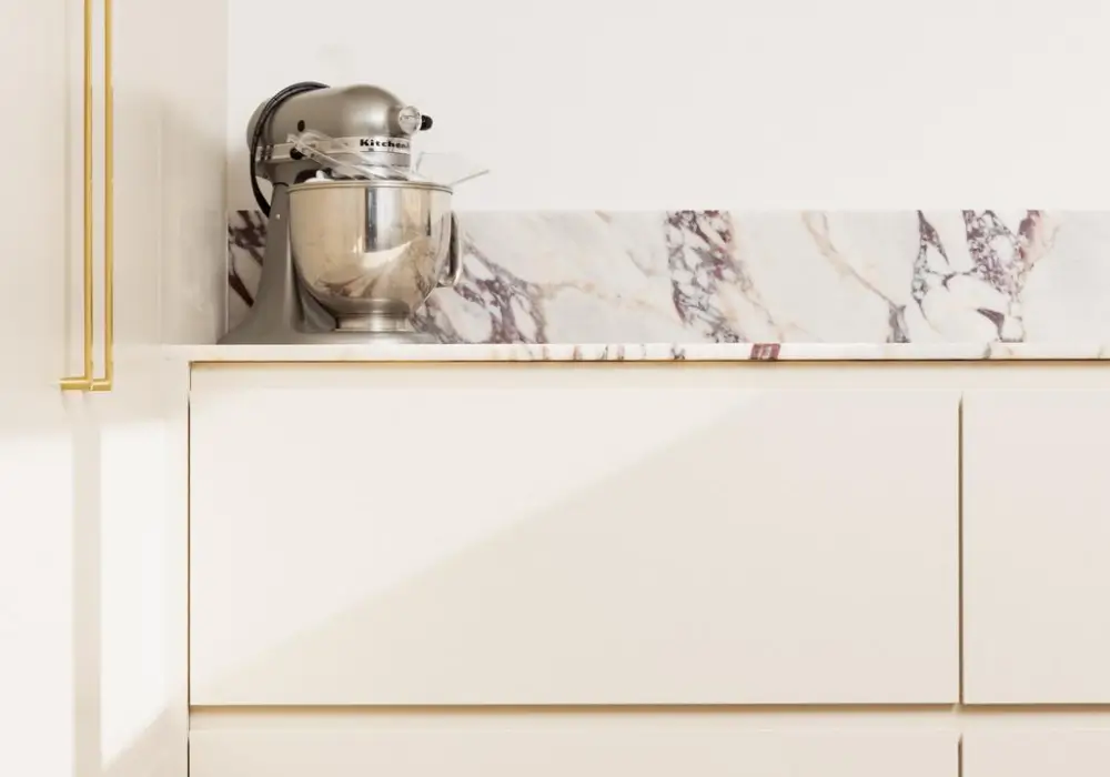
2. Soft Gray Kitchen Walls
Soft gray has become a favorite in modern kitchen interiors. I often suggest this shade when homeowners want something neutral but slightly more sophisticated than white. Gray creates a calm and balanced atmosphere.
This color pairs beautifully with white cabinets and stainless steel appliances. The subtle contrast adds depth without making the kitchen feel dark or heavy.
In many kitchens I have seen, soft gray walls also help highlight textures such as stone countertops or tile backsplashes. The color quietly supports the design without overpowering it.
3. Warm Beige Kitchen Color
Warm beige creates a comfortable and welcoming kitchen environment. I usually recommend this color for homeowners who prefer a softer alternative to bright white.
Beige works particularly well in kitchens with wooden cabinets or natural materials. The warm undertone complements wood textures and creates a harmonious look.
From my experience, beige also works well in kitchens with limited natural light. The warmth of the color helps the space feel cozy rather than dull or shadowed.
4. Sage Green Kitchen Paint
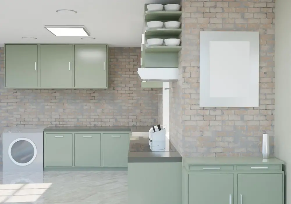
Sage green has recently become one of the most popular kitchen colors. I often suggest it for homeowners who want a natural and relaxing atmosphere in the kitchen.
This muted green tone pairs beautifully with wood shelves, brass hardware, and marble countertops. The color adds character while still feeling soft and balanced.
I have noticed that sage green works especially well in kitchens that receive plenty of natural light. It creates a calm environment that makes the kitchen feel fresh and inviting.
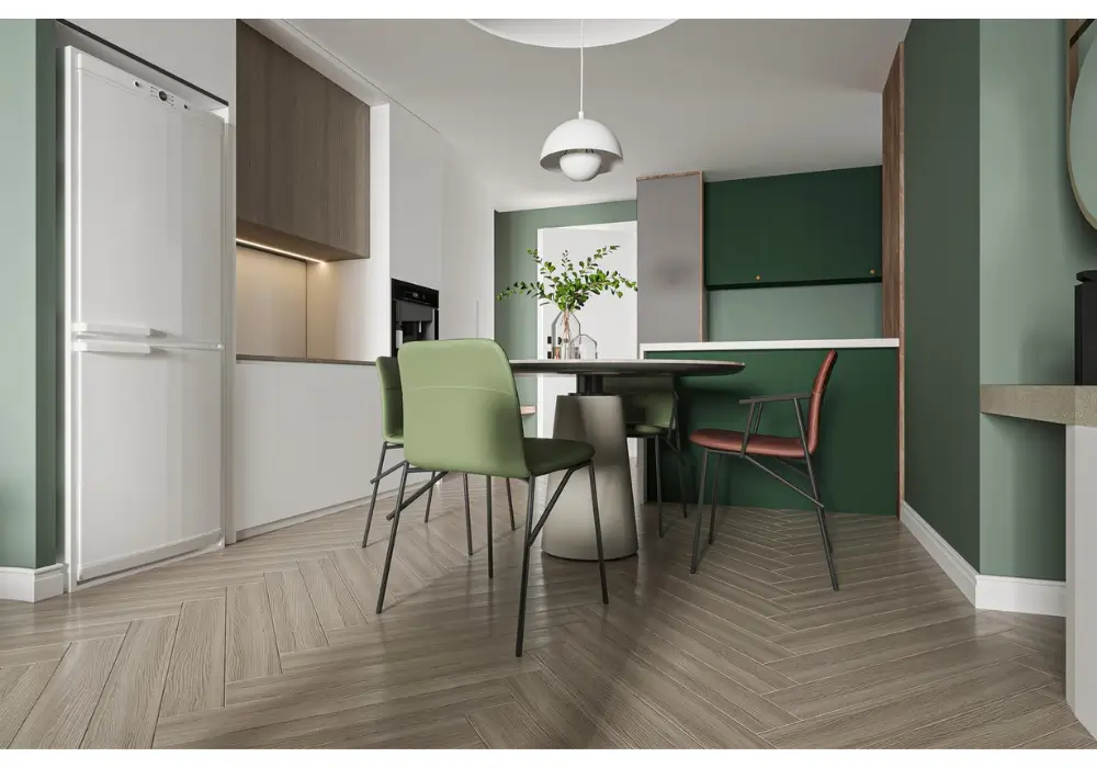
5. Navy Blue Kitchen Accent Color
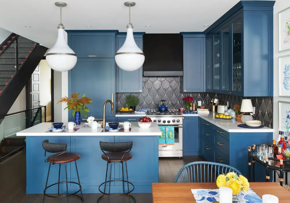
Navy blue adds depth and elegance to kitchen spaces. I often recommend using it on one accent wall or in specific areas rather than covering the entire room.
When paired with white cabinets or light countertops, navy creates a striking contrast that feels sophisticated. It also works well with metallic finishes such as brass or gold.
Many modern kitchens use navy blue to add personality without overwhelming the design. The rich tone creates visual interest while maintaining a refined look.
6. Light Pastel Blue Kitchen
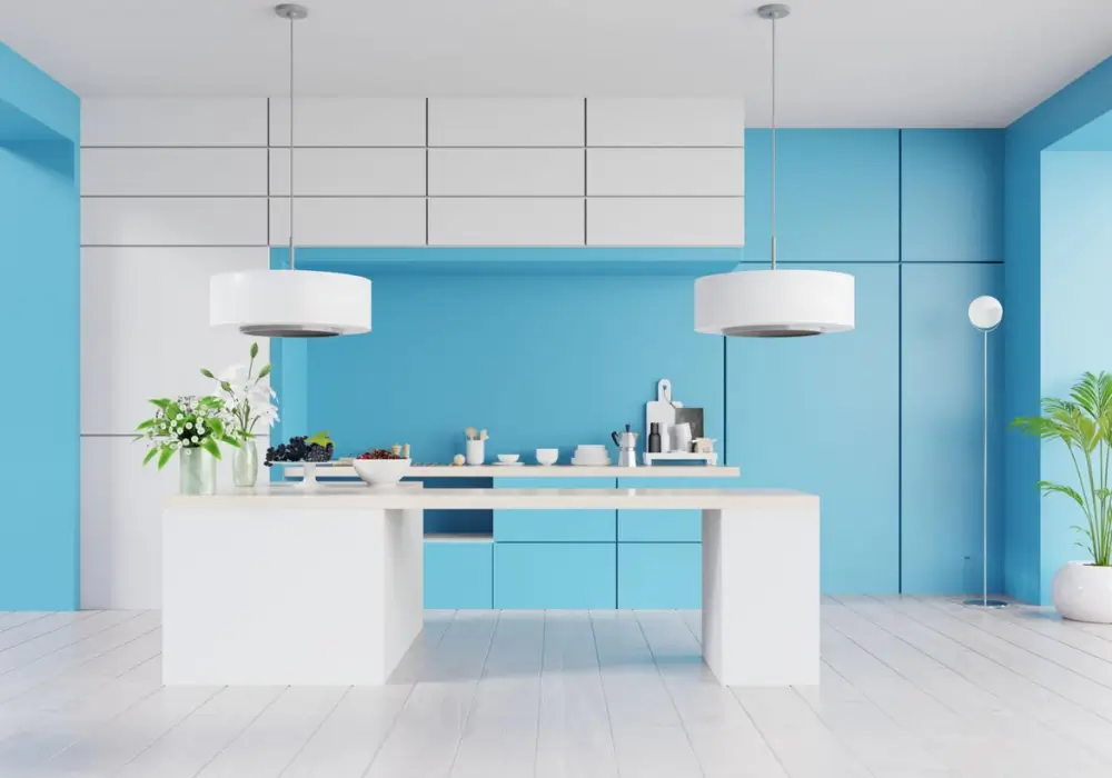
Light pastel blue introduces a fresh and airy feeling into the kitchen. I often suggest this color for homes that want a relaxed and comfortable atmosphere.
This shade reflects light gently, which helps the kitchen feel open and peaceful. It also works well in coastal or cottage-style interiors.
From what I have seen, pastel blue pairs beautifully with white cabinets and natural wood accents. Together, these elements create a calm and refreshing environment.
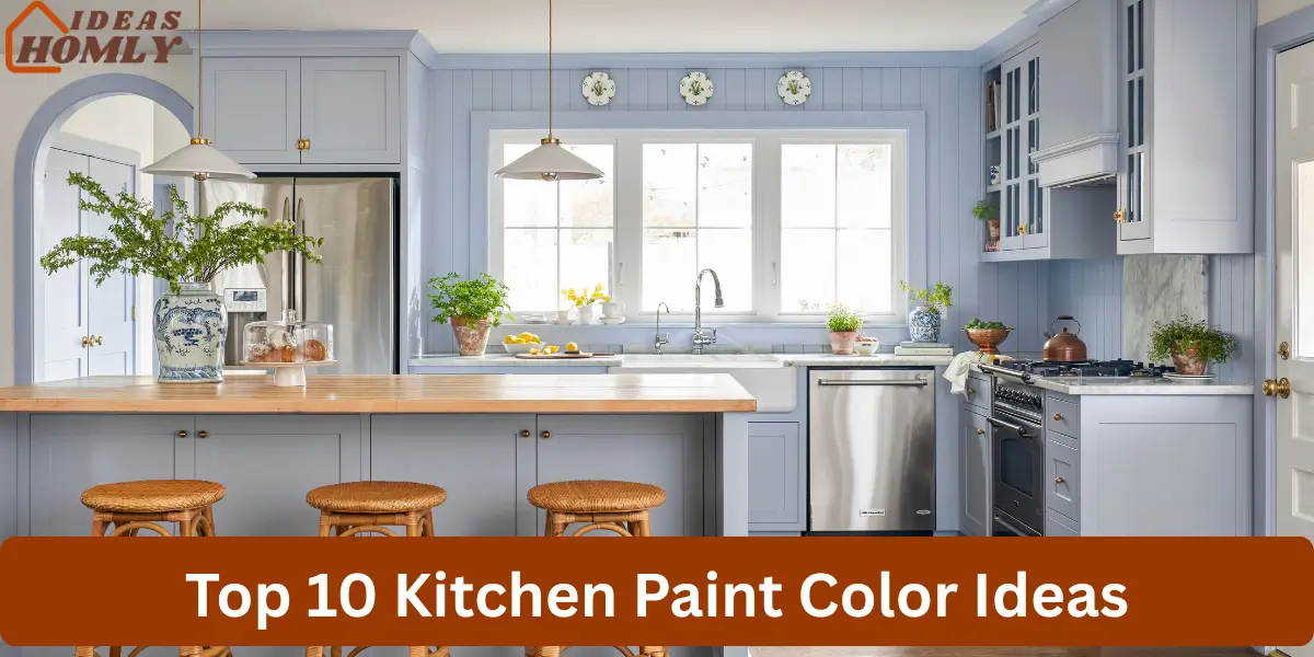
7. Creamy Off-White Kitchen Color
Creamy off-white offers the brightness of white with a warmer tone. I usually recommend this color when homeowners want a softer and more welcoming look.
Unlike pure white, cream includes subtle warm undertones that create a comfortable atmosphere. This makes it particularly suitable for traditional or transitional kitchens.
Cream walls also complement wooden cabinets, stone countertops, and classic tile designs. The result is a kitchen that feels timeless rather than overly modern.
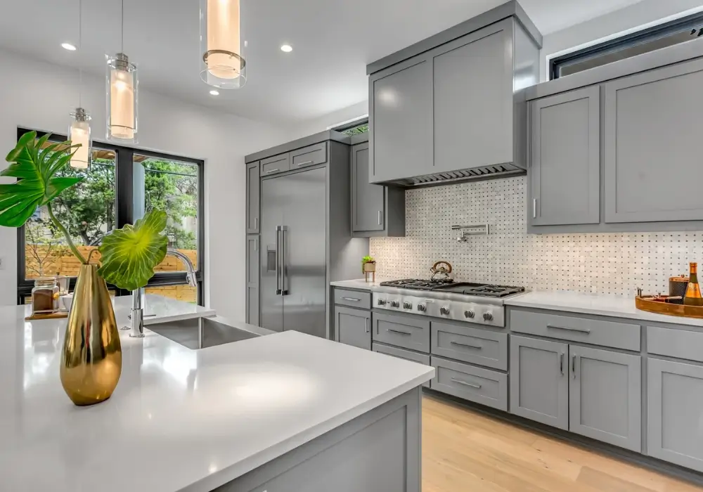
8. Charcoal Gray Accent Kitchen
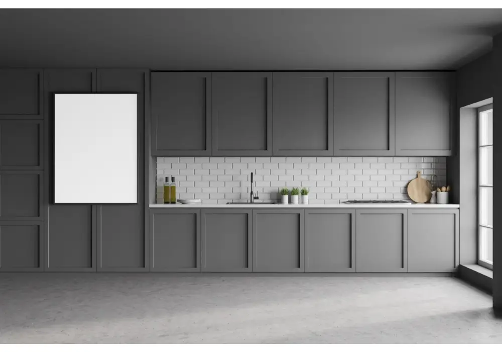
Charcoal gray creates a bold and modern kitchen appearance. I often recommend using this darker shade on a feature wall or behind open shelving.
The deep color adds contrast and visual depth to kitchens with lighter cabinets or countertops. It creates a balanced composition without dominating the space.
In many kitchens I have seen, charcoal gray works best when combined with lighter tones. This combination prevents the kitchen from feeling too dark.
9. Soft Yellow Kitchen Paint
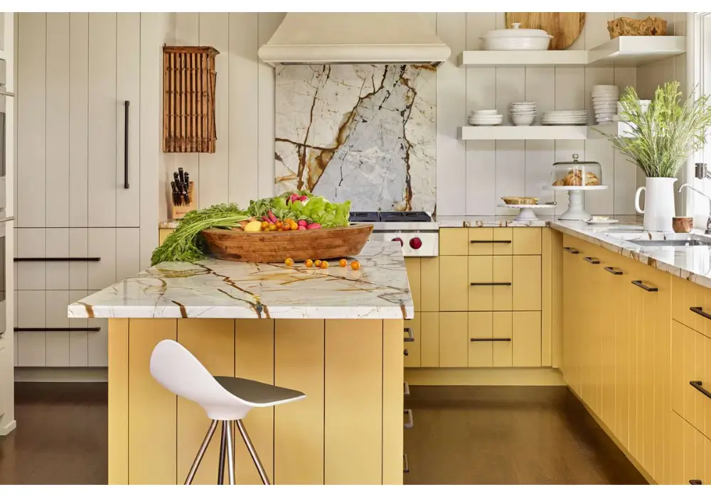
Soft yellow brings warmth and energy into the kitchen. I often suggest this color for homeowners who want a cheerful and welcoming environment.
The gentle brightness of yellow reflects natural light and helps the space feel lively. It works particularly well in kitchens that serve as gathering areas for family and friends.
When paired with white cabinets or wooden elements, soft yellow creates a friendly atmosphere. The color encourages a warm and comfortable cooking space.
10. Earthy Olive Green Kitchen
Olive green adds a natural and grounded feeling to the kitchen. I often recommend this color for homeowners who enjoy earthy tones and organic design elements.
This shade pairs beautifully with wooden cabinets, stone countertops, and matte black hardware. Together, these elements create a balanced and sophisticated interior.
In many kitchens I have observed, olive green brings personality without overwhelming the room. The color feels rich and calming while still maintaining a modern appeal.
How to Choose the Right Kitchen Paint Color
Choosing the right paint color for a kitchen requires more than selecting a shade that simply looks attractive. I often recommend thinking about how lighting, cabinets, and countertops will interact with the wall color. A thoughtful color choice can improve brightness, highlight textures, and create a balanced kitchen environment.
Another important step is testing colors before painting the entire room. Small paint samples allow homeowners to see how a shade looks during different times of the day. This simple step helps avoid choosing a color that appears different once applied across the kitchen walls.
Consider Natural and Artificial Lighting
Lighting strongly affects how paint colors appear in a kitchen. I usually suggest observing how natural sunlight enters the room during the day. Kitchens with limited natural light often benefit from lighter shades that reflect brightness.
Match Paint Color with Cabinets and Countertops
Paint should complement the existing elements in the kitchen. I often recommend choosing wall colors that balance cabinet finishes and countertop materials so the space feels visually cohesive.
Use Neutral Colors for Small Kitchens
Neutral shades such as white, cream, or light gray can make smaller kitchens feel larger and more open. These colors reflect light effectively and prevent the space from feeling crowded.
Add Accent Colors for Visual Interest
Accent colors allow homeowners to introduce personality without overwhelming the kitchen. I usually suggest using deeper shades on one wall or near dining areas to create contrast.
Test Paint Samples Before Final Decision
Testing paint samples is one of the most practical steps in choosing a color. Applying small swatches on the wall allows homeowners to see how each shade reacts to lighting and surrounding materials.
Kitchen Paint Color Comparison
| Paint Color | Best For | Effect in Kitchen |
|---|---|---|
| Classic White | Small or dark kitchens | Makes space feel bright and open |
| Soft Gray | Modern kitchens | Creates calm and balanced atmosphere |
| Warm Beige | Kitchens with wood cabinets | Adds warmth and comfort |
| Sage Green | Natural or modern interiors | Creates fresh and relaxing feel |
| Navy Blue | Accent walls | Adds depth and contrast |
| Soft Yellow | Family kitchens | Brings warmth and cheerful energy |
Conclusion
Choosing the right paint color can completely refresh a kitchen without changing the layout or furniture. I often notice that even a simple color update can make the space feel brighter, cleaner, and more inviting.
The key is selecting shades that complement cabinets, countertops, and lighting. Neutral tones create a timeless base, while accent colors add personality and depth.
When homeowners carefully test colors and consider how the room is used daily, the final result feels balanced and comfortable. A thoughtful paint choice not only improves the kitchen’s appearance but also creates a space that feels welcoming every time you walk in.
FAQs
White remains one of the most popular choices for kitchens because it reflects light and creates a clean appearance. I often see homeowners choose white since it works well with many cabinet and countertop styles. It also makes the kitchen feel larger and brighter.
Light colors such as white, soft gray, cream, and pale blue help create the illusion of more space. These shades reflect natural light and reduce visual heaviness. I usually recommend them for smaller kitchens that need a brighter and more open feeling.
Dark colors can work well when used carefully. Shades like navy or charcoal gray add depth and sophistication, especially on accent walls. However, I usually recommend balancing them with lighter cabinets or countertops to keep the kitchen from feeling too dark.
A satin or semi-gloss finish usually works best for kitchen walls. These finishes resist moisture and are easier to clean than flat paint. Kitchens experience frequent splashes and cooking activity, so a durable finish helps maintain the wall appearance.