
We know how much character a thoughtfully painted fifth wall brings to a formal or casual eating area. Selecting an intentional overhead color layout that complements your main lighting fixture keeps your dining room looking beautifully custom.
Why Custom Overhead Paint Finishes Work Best For Family Eating Areas
We love how permanent overhead paint choices solve your design worries by adding gorgeous architectural depth without cluttering your floor plan. This clever layout choice ensures your room feels custom and complete while keeping your walking paths open.
Our team noticed that applying a distinct color to your flat drywall surface establishes a stunning focal point effortlessly. This setup gives you total control over the room proportions and enhances the beauty of your crystal chandelier.
We find that an intentional ceiling finish offers incredible functional versatility since you can alter spatial perceptions instantly. You can make a tall cold room feel intimate or lift a low ceiling using basic paint rollers.
This decoration style simplifies your long term home maintenance because modern matte paints hide minor drywall surface flaws easily. It streamlines your home improvement routine while providing an exceptional Approachable and memorable background for hosting dinner parties.
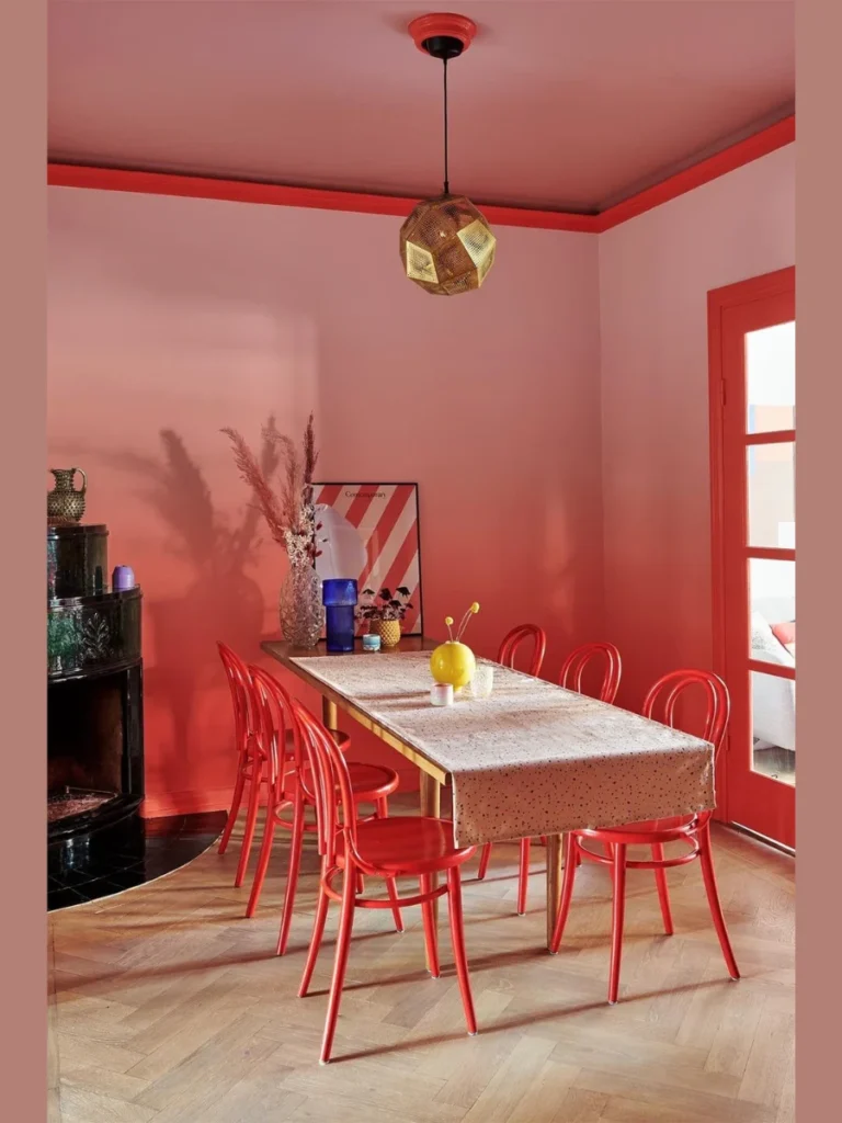
1. Cozy Dramatic Charcoal Gray Mattes
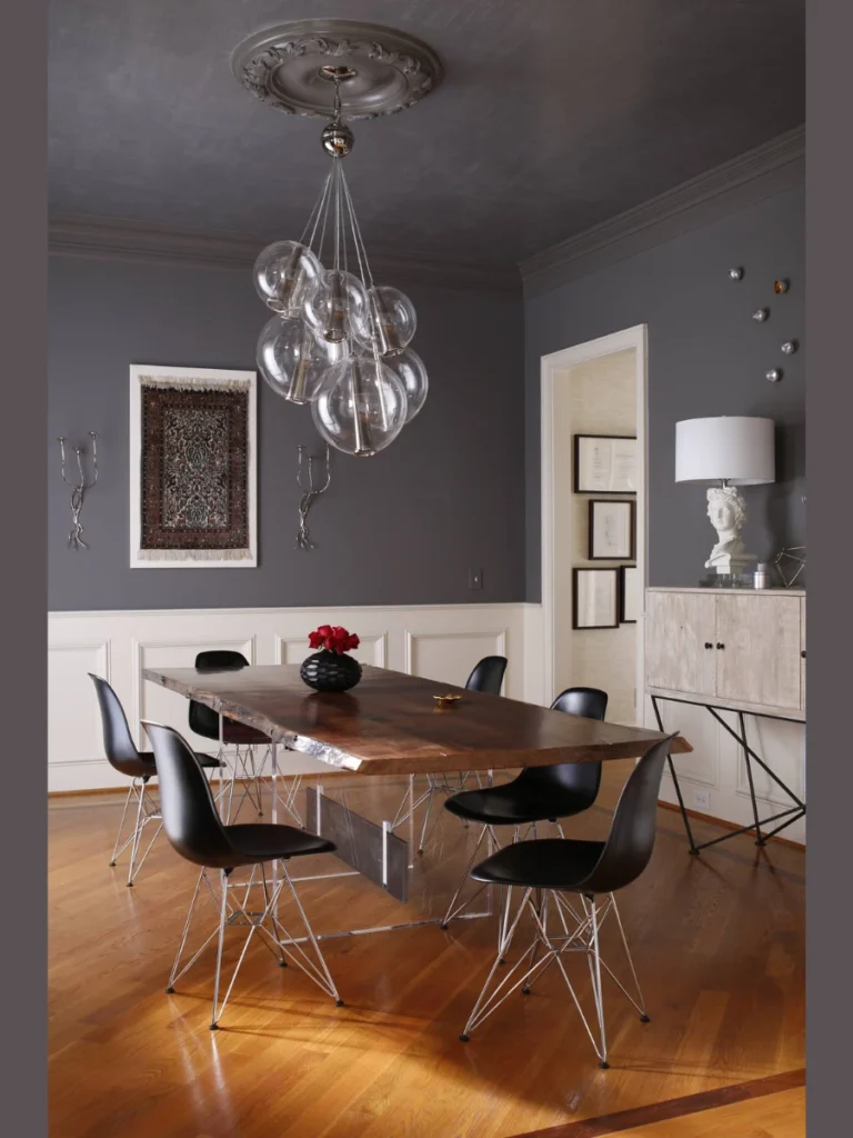
We love rolling a flat matte charcoal gray paint across a tall dining room ceiling to build an intimate lounge atmosphere. This moody dark color choice draws the high ceiling down visually making evening candlelit dinner parties feel exceptionally exclusive.
Our experience shows that pairing charcoal drywall with crisp white crown molding boards blocks out a stunning architectural frame. The sharp contrast anchors your seating area beautifully while emphasizing the full structural scale of your room layout boards.
We recommend selecting an ultra flat paint sheen to ensure that your overhead light bulbs do not create harsh glare. Flat dark grays absorb light waves smoothly preventing distracting reflections from bouncing off the plaster while family members eat.
Choosing a deep neutral tone instead of a basic builder white updates your home style with minimal effort and cost. It adds a sophisticated polished edge to your kitchen plan while respecting the physical boundaries of a standard floor plan.
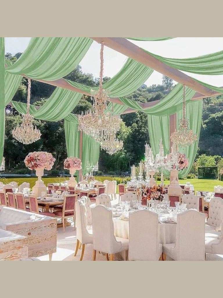
2. Airy Minimalist Sky Blue Illusions
Our favorite trick for small enclosed dining spaces is applying a soft pale sky blue paint to the ceiling. This classic color choice mimics the natural open atmosphere of the outdoors making your ceiling feel higher than it is.
We find that pairing a light blue top with clean white walls keeps your room looking bright and open. You can easily expand the visual boundaries of a tight apartment layout without undertaking messy expensive structural wall removals.
You can hang a polished brass pendant light fixture against the blue backdrop to catch beautiful sunny daytime reflections. The warm golden metal looks stunning against the cool blue background building an interesting color layer that feels fresh.
This approach works exceptionally well for homes that receive limited natural sunlight through their existing side windows during winter. It delivers high aesthetic value while keeping your room upgrade project straightforward fast and completely stress free to finish.
3. Luxurious High Gloss Jet Black Mirrors
We suggest choosing a premium high gloss jet black paint finish to create a striking dramatic mirror effect overhead. This bold reflective design style bounces your chandelier lighting across the room turning your ceiling into a stunning art feature.
Our design testing shows that high gloss finishes require an absolutely perfect skim coat of smooth drywall mud before painting. You must sand the plaster completely flat because shiny dark paint will highlight every minor bump or tape seam.
You can contrast the shiny black lacquer top with soft matte cream colored walls to balance the room light. The reflective overhead surface makes your dining area look twice as tall by acting like a dark clear pool.
Pairing this modern look with polished silver flatware and white china plates keeps your overall room layout looking clean. It offers an incredible design statement that turns a standard boxy dining room into a highly custom luxury space.
4. Sophisticated Color Drenched Forest Greens
We recommend selecting a rich forest green paint to cover your walls trim boards and ceiling surfaces exactly matching. This color drenching technique eliminates all sharp visual boundaries making your entire dining room feel like a cozy sanctuary.
Our team noticed that matching your overhead paint to your side walls makes standard eight foot rooms look taller. The eye flows up the walls and onto the ceiling continuously without any white trim lines stopping the movement.
You can install a warm wood dining table and woven rattan chairs to complement the natural forest green paint. This material choice brings a wonderful organic texture mix that keeps the dark monochromatic room looking friendly and inviting.
The deep green paint choice ensures your dining space coordinates beautifully with outdoor backyard views through your glass doors. It provides a fresh clean contemporary aesthetic that makes your family holiday dinners feel highly intentional styled and beautiful.
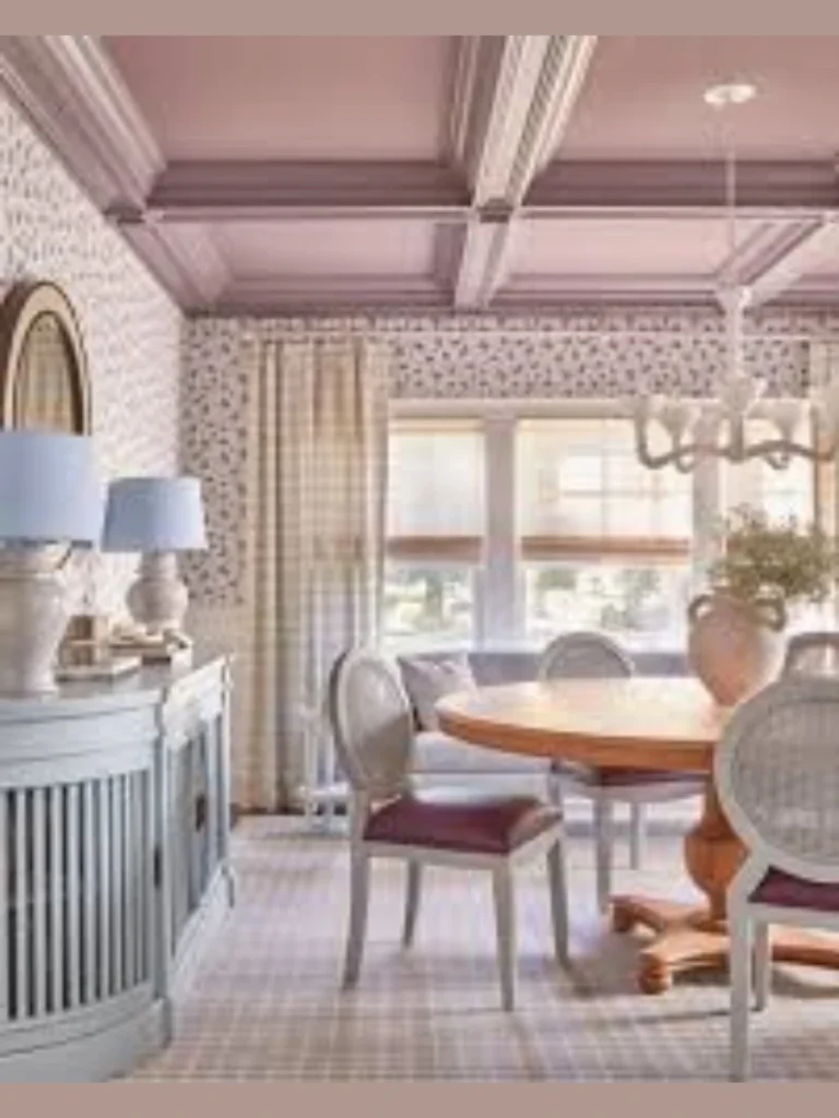
5. Gentle Romantic Blush Pink Glows
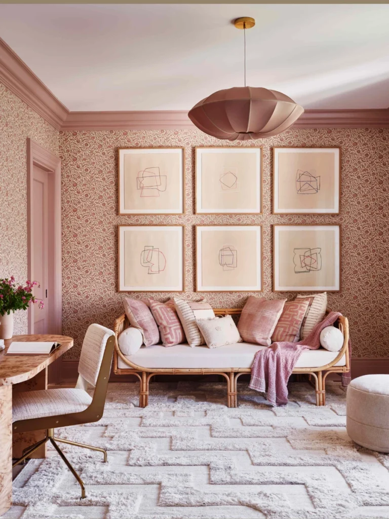
We love applying a soft romantic blush pink paint to the dining ceiling to create a beautiful warming environment. This delicate pastel shade acts like a permanent rosy filter softening the light from your overhead chandelier bulbs cleanly.
Our testing reveals that blush pink casts an incredibly flattering warm reflection down onto your guests faces during dinner. It builds a comforting friendly atmosphere that encourages family members to relax and linger longer over their home meals.
You can border the pink ceiling with a thick band of dark charcoal or navy blue wall paint. This strong dark boundary frames the soft pastel top beautifully preventing the pink color from looking childish or sugary.
The soft pink hue works exceptionally well in older traditional homes that feature historic plaster details and built ins. It represents a practical hard working design choice that improves your home atmosphere while keeping decorations affordable and sustainable.
6. Elegant Warm Terracotta Clay Earths
We suggest applying a warm earthy terracotta clay paint color across your dining room ceiling to build comfort. This rich desert tone introduces a beautiful Mediterranean energy that makes large dining spaces feel instantly grounding and rustic.
Our experience shows that terracotta paint tones look their best when the afternoon window sunlight streams directly across the room. The orange clay hues glow with an authentic warmth that pairs beautifully with natural wood floors and cabinets.
You can hang a matte black iron chandelier in the center of the terracotta ceiling to add structure. The heavy black metal lines contrast sharply against the warm clay paint building a traditional look that feels solid.
This method allows you to utilize natural southwest colors that reflect your personal love for classic organic home styling. It delivers a beautiful high end look that turns your holiday dinner table into an inviting sunny masterpiece.
7. Classic Crisp Navy Blue Night Skies
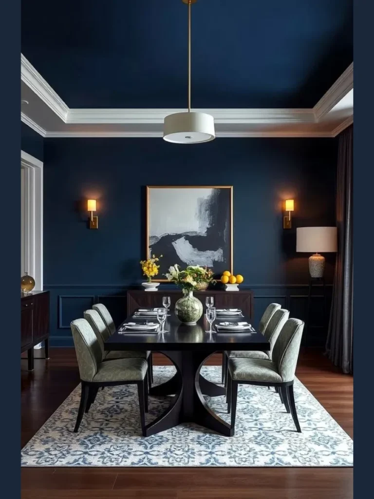
We recommend painting your dining room ceiling in a classic crisp navy blue tone to mimic a night sky. This deep royal shade brings a formal majestic grace that elevates your evening dinner hosting routine instantly and beautifully.
Our personal experience proves that navy ceilings look incredibly high end when you install crisp white crown molding frames. The bright white wood boards pop sharply against the dark blue paint keeping the room looking clean and structured.
You can hang a glittering crystal chandelier directly in the center of the navy blue overhead drywall surface. The clear glass crystals catch the light from the bulbs throwing beautiful shimmering patterns against the dark blue backdrop.
This sophisticated theme matches perfectly with traditional formal dining rooms that feature dark mahogany wood tables and silver accessories. It offers an elegant cozy statement that turns your seasonal gathering into an incredibly special trendy and memorable event.
8. Sunny Buttery Yellow Morning Brights
We love rolling a sunny buttery yellow paint color across a low ceiling to inject instant morning energy. This cheerful shade brightens up dark windowless dining nooks making your breakfast table feel like a breezy open porch.
Our design team noticed that a soft yellow top works beautifully when paired with simple bright white walls. The yellow paint reflects your light fixture output cleanly increasing the overall ambient brightness of your small apartment layout.
You can mix in light washed oak furniture and green potted plants to enhance the cheerful spring theme layout. This combination builds an approachable comfortable environment that makes your family holiday breakfast feel incredibly cozy and welcoming.
The durable latex paint finish requires zero high maintenance care and easily wipes clean with a damp soft sponge. It combines high daily utility with an adaptable styling solution that respects the tight layout limits of your home.
9. Modern Urban Matte Concrete Grays
We suggest selecting a cool matte concrete gray paint finish for your modern dining room ceiling layout project. This industrial color choice introduces a sleek contemporary polish that coordinates perfectly with minimalist urban apartment design styles.
Our team discovered that flat gray paint is exceptionally forgiving on old uneven ceiling drywall surfaces with minor flaws. The neutral tone absorbs light without casting dark shadows keeping your overhead zone looking perfectly smooth clean and flat.
You can pair the gray concrete ceiling with modern black track lighting and raw steel furniture frames for contrast. This texturized look balances clean geometric interior lines with a rugged street art edge that feels fresh and trendy.
The neutral gray colors ensure that your ceiling coordinates beautifully with any existing home decor theme you choose later. It provides a fresh clean contemporary aesthetic that makes your spring family dinners feel highly intentional styled and beautiful.
10. Glamorous Metallic Champagne Golds
We love using a specialty metallic champagne gold paint to cover the central tray section of a ceiling. The shimmering metallic particles catch your chandelier light rays creating a beautiful glamorous glow that feels incredibly luxurious and custom.
Our experience reveals that metallic paints look best when applied with a high quality microfiber roller to prevent lines. You must apply two thin even coats to build a solid reflective finish that looks smooth and professional.
You can frame the golden metallic center with a thick border of dark chocolate brown or espresso paint. This dark frame anchors the shimmering gold section beautifully making your ceiling look like a piece of framed gallery art.
Pairing this luxury top with shiny gold flatware adds a bright contemporary polish that elevates your entire apartment layout. It offers an incredible design statement that turns your standard boxy eating area into an unforgettable festive entertainment showcase.
11. Deep Rich Espresso Brown Welcomes
We recommend selecting a deep rich espresso brown paint color to build a cozy rustic ceiling look. This warm dark shade brings a wonderful residential comfort that makes your formal dining room feel like a cabin.
Our testing proves that dark brown paint tones help lower the visual height of awkwardly tall cold ceilings. It establishes a balanced comfortable volume that makes your family lunch gatherings feel tight knit intimate and completely relaxed.
You can pair the espresso brown ceiling with soft cream walls and brass hardware pieces to balance the light. This color combination mimics a cozy coffee shop environment relaxing your guests as soon as they sit down to eat.
The dark brown paint choice ensures your ceiling coordinates beautifully with natural walnut or oak dining table surfaces below. It provides an authentic curated look that helps you build a stunning room setting on a very limited budget.
12. Bright Crisp Gloss White Reflektor Lines
We suggest choosing a high gloss bright white paint for your ceiling to maximize your room natural light. The shiny white surface acts like a giant overhead mirror bouncing window sunlight deep into dark basement dining rooms.
Our team found that high gloss white finishes visually clean up the look of low ceilings cleanly and safely. The reflective sheen makes the physical drywall boundary seem to disappear creating an airy open feeling across your floor plan.
You can install recessed LED spotlights around the perimeter to double the clean modern look of the white ceiling. The light bars hit the gloss finish at a sharp angle building a bright sleek contemporary polish overhead.
This clean structured approach looks exceptionally clean trendy and modern in urban apartments or open concept loft dining layouts. It provides a fresh clean background that keeps your holiday table looking completely uncluttered organized and beautiful all day.
13. Soft Sage Green Garden Canopies
We love painting a dining room ceiling in a soft muted sage green tone to bring nature inside. This calm organic color choice builds a peaceful garden canopy effect that connects your indoor space to backyard views.
Our design testing shows that sage green paint tones relax the eyes and create a soothing dining environment naturally. You can easily pair this green top with natural linen curtains and woven sweetgrass placemats for texture layers.
You can wrap your main light fixture chain with a light faux ivy vine to connect with the green. This small styling addition bridges the gap between raw outdoor forests and clean interior geometric design lines beautifully.
The soothing green hue works exceptionally well in homes that prioritize natural materials sustainability and comfortable farmhouse themes. It represents a practical hard working design choice that improves your home atmosphere while keeping decorations affordable and sustainable.
14. Dramatic Plum and Velvet Amethyst Statements
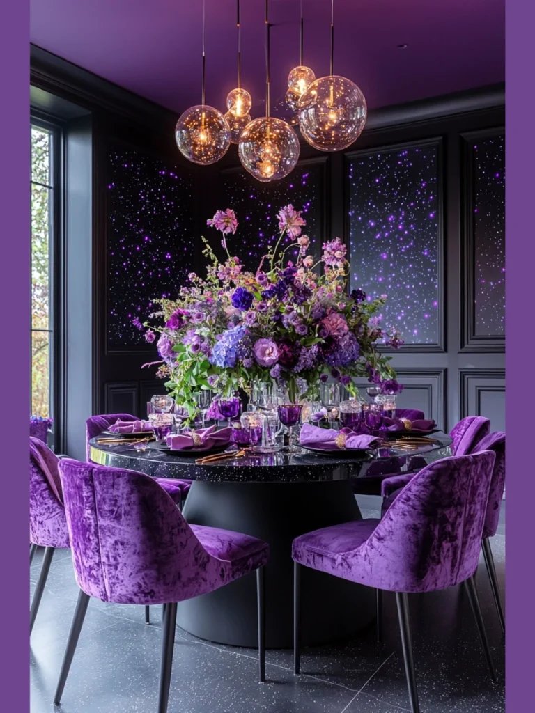
We recommend choosing a rich dark plum or amethyst purple paint color for a dramatic ceiling statement look. This regal moody tone features a beautiful deep polish that turns your ceiling into an unexpected artistic focal point.
Our experience shows that dark purple paint tones look stunning when you pair them with shiny silver light fixtures. The cool silver metal frames pop sharply against the warm plum paint building an interesting high contrast style mix.
You can add large velvet curtains in a matching purple tone to tie the whole room design together. This color coordination ties the separate wall spaces into your main overhead paint theme seamlessly and beautifully for guests.
This bold approach looks exceptionally beautiful in dining rooms that prioritize sharp lines clean styling and elegant architectural details. It provides a stunning high contrast feature that turns your holiday meal into an unforgettable dining experience.
15. Warm Creamy Vanilla Butter Foundations
We suggest applying a soft warm creamy vanilla paint color to your ceiling instead of a cold white. This gentle buttery shade introduces a quiet historic charm that makes your eating space feel soft and welcoming.
Our team noticed that cream paint tones blend smoothly with warm wood furniture pieces like oak or cherry tables. You avoid the harsh clinical look of basic apartment white paint while keeping the ceiling bright and reflective.
You can hang a classic dark bronze or black iron chandelier against the cream ceiling to add structure. The dark metal lines stand out sharply against the soft paint layout creating a balanced and traditional look.
The neutral cream colors ensure that your ceiling coordinates beautifully with any changing seasonal holiday table decor themes. It provides a fresh clean background that keeps your hosting space looking completely uncluttered organized and beautiful always.
16. Moody Olive Green European Shates
We love rolling a dark olive green paint across the ceiling to establish a sophisticated European style look. This complex organic shade brings a wonderful artistic depth that makes your dining area feel historic and custom.
Our design team found that olive green paint pairs beautifully with natural leather chairs and dark walnut wood tables. It creates a stunning transitional style mix that balances traditional vintage comfort with clean modern interior design lines.
You can paint your window frame trim boards in the same olive green color to frame your views. This simple trick ties the separate architectural elements into your main overhead paint theme seamlessly and beautifully for family.
The rich green paint choice ensures your dining space coordinates beautifully with outdoor backyard views through your glass doors. It provides an authentic curated look that helps you build a stunning room setting on a very limited budget.
17. Vibrant Coral Sunset Energizers
We recommend selecting a vibrant coral orange paint color to inject a fun energetic splash overhead during spring. This bright tropical shade brings a cheerful summer energy that instantly beats winter blues inside dark northern rooms.
Our testing reveals that a coral ceiling works beautifully when paired with crisp light gray walls and trims. The cool gray borders frame the bright orange paint cleanly preventing the vibrant ceiling color from overwhelming your senses.
You can hang a modern white globe pendant light in the center of the coral ceiling for contrast. The clean white sphere stands out sharply against the orange paint building an interesting graphic look that feels fresh.
The durable latex paint finish requires zero high maintenance care and easily wipes clean with a damp soft sponge. It combines high daily hosting utility with an adaptable styling solution that enhances the overall contemporary functionality of home.
18. Elegant Cool Lavender Fog Clouds
We suggest choosing a pale muted lavender gray paint color to create a serene peaceful ceiling look overhead. This soft watercolor shade catches the natural morning window light with an enchanting subtle purple glow across the room.
Our team found that lavender tones work like a neutral paint while offering a unique artistic twist for homes. Your friends will appreciate the gorgeous subtle color choice which looks absolutely stunning in afternoon photos by the table.
You can pair the lavender ceiling with polished silver hardware pieces and white linen fabric napkins during brunch. This color coordination matches perfectly with fresh spring floral arrangements keeping your table looking clean and well organized.
The clean cool hue works exceptionally well for small apartment dining zones that double as quiet daytime workspaces. It provides a fresh clean background that keeps your holiday table looking completely uncluttered organized and beautiful always.
19. Rich Chocolate Truffle Warmths
We love rolling a thick coat of rich chocolate brown paint across a modern dining room ceiling surface. This delicious neutral tone introduces an incredible cozy warmth that makes large open concept homes feel private and comfortable.
Our personal testing shows that dark brown ceilings look best when you install warm yellow LED light strips. The hidden lighting sources illuminate the brown paint softly creating an enchanting evening environment that feels deeply special and ceremonial.
You can match the chocolate paint with cream colored linen curtains to balance the overall room light distribution. This texture contrast bridges the gap between heavy dark surfaces and light breezy fabrics beautifully and intelligently for families.
The dark brown paint choice ensures your ceiling coordinates beautifully with natural walnut or oak dining table surfaces below. It represents a practical hard working design choice that improves your home atmosphere while keeping decorations affordable.
20. Contemporary Matte Apricot Peaches
We recommend selecting a soft matte apricot peach paint color to give your dining room a modern lift. This warm inviting shade brings a breezy cheerful energy that makes your daily meal times feel light and celebratory.
Our design team found that peach paint tones complement modern blonde wood furniture and light oak floors perfectly. The continuous warm wood tones flow up the walls and connect with the peach ceiling seamlessly and beautifully.
You can add dark green potted plants around the room perimeter to contrast with the soft peach top. This simple color contrast makes the peach paint pop sharply against your walls building an interesting living visual layer.
Ensuring that your main ceiling paint matches your personal lifestyle preferences creates a deeply satisfying sense of design harmony. It delivers an approachable comfortable atmosphere that encourages everyone to relax and linger longer over their home cooked meals.
Dining Room Height Parameters And Ceiling Paint Sheen Guidelines
We know that choosing an overhead paint finish can feel like a stressful balancing act when you want to avoid a cramped or claustrophobic look. Keeping specific room height limitations and paint sheens in mind ensures your architectural space remains open and your family relaxes comfortably.
Our team gathered the exact design guidelines that help create a beautiful, balanced ceiling layout without sacrificing structural openness. These choices prevent your bold overhead accent colors from overwhelming your standard apartment footprint or formal eating areas.
| Ceiling Paint Finish Style | Recommended Room Height | Ideal Drywall Condition | Visual Impact On Dining Space |
| Ultra Flat Matte | 8 Feet tall or greater | Hides minor plaster flaws | Lowers high ceilings for intimacy |
| Satin or Eggshell | 9 Feet tall or greater | Requires standard smooth finish | Reflects a soft gentle ambient glow |
| High Gloss Lacquer | 10 Feet tall or greater | Requires perfect flawless skim | Bounces light like an overhead mirror |
Best Styling Guide For Painted Dining Room Ceilings
Our experience shows that successful overhead transformations rely on matching your paint sheen to your drywall quality and choosing appropriate color contrasts. You can use simple styling rules to make your central fifth wall look intentional, balanced, and beautifully organized.
- Assess Drywall Defects Early: Select an ultra flat paint sheen if your ceiling plaster features historic cracks, uneven textures, or tape seams.
- Balance Lights With Dark Tones: Pair deep moody charcoal or navy ceilings with crisp white crown molding boards to secure a clean architectural frame.
- Drench Space For Height Illusions: Paint your side walls, trim strips, and ceiling surfaces in the exact same color to make low rooms seem taller.
- Coordinate Lighting Fixture Metals: Hang a polished brass or gold chandelier against dark blue or forest green tops to generate an elegant glow.
Conclusion
We want to help you create a stunning architectural space that feels organized, spacious, and incredibly custom for your dining room layout. Our collection of twenty creative paint ideas demonstrates that you do not need to stick to basic builder white to keep a room looking open. By focusing on cozy dramatic charcoal grays, airy minimalist sky blues, and sophisticated color drenched forest greens, you can maximize your interior character easily.
We found that planning your paint sheens based on room height limits and prep work quality prevents that frustrating cave like feeling overhead. Repeating smart design choices like matching your window trim boards or incorporating warm metallic light fixtures keeps your layout looking clean and professional. A well planned ceiling project improves your home equity value and turns your everyday dinner table area into an inviting custom masterpiece.
We hope these practical home improvement rules give you the confidence to transform your home fifth wall into a beautiful and lasting feature. Remember to measure your room vertical spaces carefully and select durable premium latex materials that fit your active lifestyle design goals perfectly. Your painted dining room ceiling can look gorgeous and modern while supporting your eating working and relaxing routines every single day.
FAQs
We find that dark ceiling paint colors like charcoal gray or navy blue will not cause a cave effect if your room stands nine feet tall or higher. Pairing the dark overhead drywall with bright white walls and thick white crown molding strips keeps the spatial boundary looking clean open and beautifully structured.
We recommend using an ultra flat matte latex paint sheen because it absorbs incoming natural light waves rather than reflecting them sharply. This non reflective quality completely hides minor drywall bumps tape seams and plaster imperfections that shiny satin paints expose.
We love pairing warm polished brass or gold hanging pendants with deep contrasting colors like navy blue forest green or dark plum. The warm metallic tones of the light fixture stand out with dramatic intensity against a dark backdrop building a stunning luxury look.
We use the term color drenching when we apply the exact same paint color and sheen across your side walls window trims baseboard boards and ceiling surfaces. This layout choice removes all sharp horizontal lines making the room boundaries disappear so your dining area feels larger.
We suggest hiring a professional painter to apply a high gloss ceiling finish because it requires an absolutely flawless smooth drywall skim coat underneath. Any minor plaster wave or rough sanding texture will show up instantly under a shiny reflective lacquer coat.