
I start by choosing the calmest wall. I usually select the bed wall or the wall facing the window, because both allow the eye to rest. I also pull extra furniture off that surface, since even a lovely accent looks cluttered when blocked by tall pieces.
I manage contrast to protect visual space. I stay within the same color family and keep differences tight. I favor matte and eggshell paints because they diffuse light. I avoid high sheen, since shine can highlight every bump and corner.
I fit pattern scale to the room footprint. I reach for slim lines, small repeats, and gentle textures. I skip chunky molding that eats inches. I also stop accents at clean edges, because crisp transitions read organized and calm.
My quick guardrails for small rooms
I keep contrast within 10 to 20 LRV points when possible. I extend accents up to the ceiling line to fake height. I keep projections shallow, under 20 mm where I can. I measure twice, then edit once.
Contrast guide for compact rooms
| Contrast level | LRV difference | Visual effect | Suggested use |
|---|---|---|---|
| Very low | 5 to 10 | Soft depth | Very small bedrooms |
| Low | 10 to 20 | Clear focus | Most small spaces |
| Medium | 20 to 30 | Bold but tidy | Feature corners only |
1. Wall-to-wall curtains as a soft focal point
I turn an entire wall into a fabric backdrop when I need softness. Full-width curtains add texture, mute clutter, and hide awkward windows. The result feels curated and calm, not heavy.
I mount a ceiling track to stretch the room vertically. I run panels from corner to corner and let them skim the floor. I choose sheer or light linen in a tone close to the wall, which gives depth without harsh contrast.
I size the fabric for graceful folds. I use 1.5 to 2 times fullness for natural ripples. I keep the stack compact, about 10 to 15 cm on each side, which is roughly 4 to 6 inches. I steam the panels, because crisp pleats make the wall read intentional.
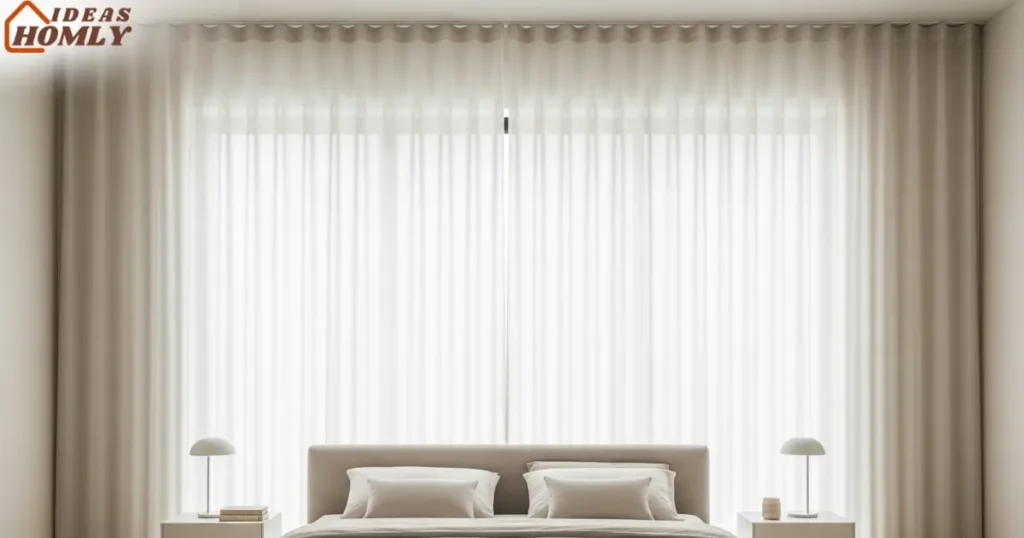
I plan around outlets and switches. I use a shallow return so cords still work. I also place the bed or console in front, since fabric loves simple silhouettes. The look feels hotel clean, yet friendly for daily life.
I set the track length equal to the wall width. I hang the track 2 to 4 cm from the ceiling for a neat reveal. I pick a lining only when I need blackout. I match hardware color to the wall for a quiet finish.
2. Slim vertical wood slats in the same tone as the walls
I use narrow vertical slats when I want texture with discipline. Vertical lines stretch the eye upward and add rhythm without shouting. Keeping the tone close to the wall color softens the shadows and calms the pattern.
I size the slats to suit a small room. I like slats around 12 to 18 mm thick and 20 to 30 mm wide. I keep gaps about 10 to 15 mm, which keeps the cadence light. I often cap the panel at the bed width to center the view.
I prep for a painted or stained finish. I prime MDF if I want a smooth painted surface. I seal timber edges to prevent dust lines later. I also use a spacer stick so the gaps stay dead even, because tiny errors show fast on tight walls.
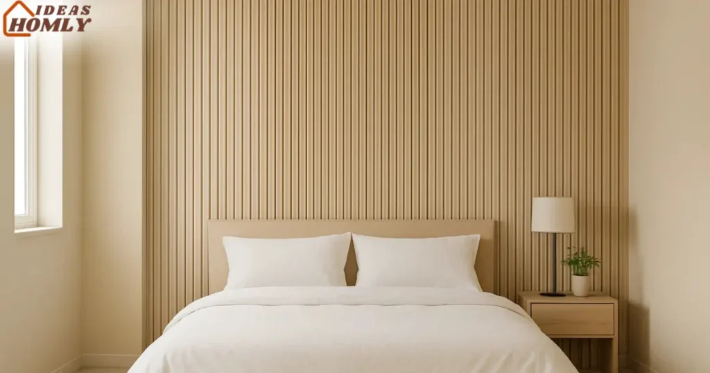
I install with cleanup in mind. I notch the panel for outlets instead of covering them. I hide light cables in the cavity where possible. I continue the wall color onto the ceiling line for a tidy stop, which helps the room feel taller.
I reach for tone-on-tone slats in tiny bedrooms, studio nooks, and narrow entries. I pair them with plain bedding or a simple console. I skip busy bedding or heavy art on top, since the texture already carries the feature.
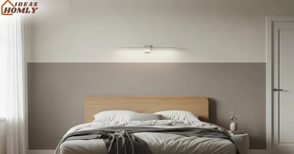
3. Low contrast two-thirds color block
I use a low contrast color block when I want calm depth. I paint the lower two thirds in a slightly deeper tone. I keep the top third lighter for lift. The room reads taller and tidier.
I measure the block so the line hits a natural break. I target headboard height plus a little extra. I stop near two thirds of the wall height. That height flatters most small rooms.
I pick colors from the same strip for harmony. I shift 1 to 2 steps deeper for the block. I keep finishes matte or eggshell. The wall stays soft and smooth.
I tape the line with care for a crisp edge. I press the tape firmly before paint. I run a light coat of the top color to seal the edge. I then roll the block color for a sharp line.
Two-thirds block height guide
| Ceiling height | Wall height cm | Block height cm | Block height in |
|---|---|---|---|
| 240 cm | 240 | 155 to 170 | 61 to 67 |
| 260 cm | 260 | 170 to 185 | 67 to 73 |
| 274 cm | 274 | 178 to 193 | 70 to 76 |
| 300 cm | 300 | 195 to 210 | 77 to 83 |
Simple paint math
I buy 1 liter for about 10 square meters. I add 20 percent for touch-ups. I keep rollers short nap for smooth results. I label cans with date and code.
I style the block with restraint for a bigger feel. I hang one small sconce or a slim shelf. I center the bed to anchor the line. I let the palette do the talking.
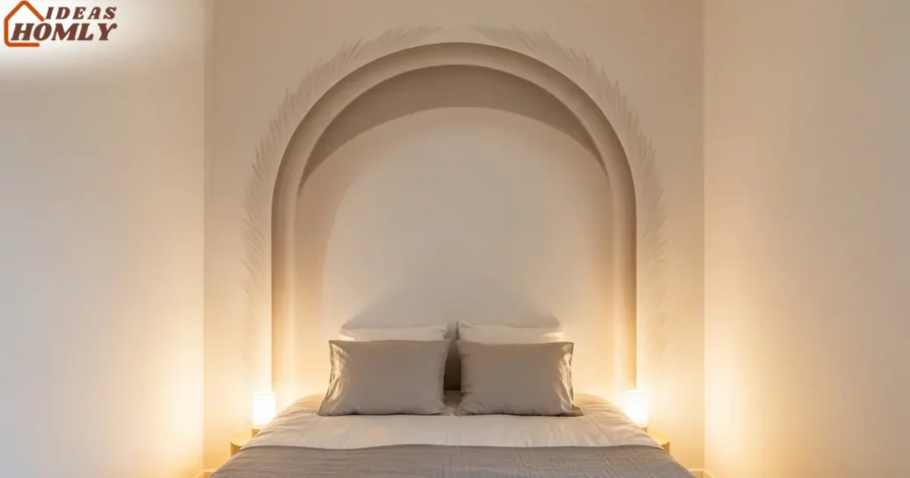
4. Trompe l’oeil mural or faux paneling
I use trompe l’oeil when I want space without depth. A soft arch, window effect, or shallow grid adds scale. The eye reads distance, even when the wall stays flat. That trick helps tiny bedrooms breathe.
I keep subjects simple and low contrast. I avoid heavy dark scenes or busy city views. I pick misty botanicals, airy skies, or subtle stone. The wall feels serene, not loud.
I choose peel and stick or a pro print for murals. I check repeat, alignment, and batch codes. I start from the center and work out. Seams sit tight when I take my time.
I paint faux paneling when I want texture on a budget. I grid the wall with tape and a laser. I shade lines slightly deeper than the base. The finish looks crafted but stays slim.
Illusion ideas for small rooms
| Illusion style | Visual effect | Best placement | Notes |
|---|---|---|---|
| Soft arch | Adds height | Behind bed | Keep edges feathered |
| Faux window | Adds distance | Opposite real light | Match horizon line |
| Light stone | Adds texture | Bed wall | Stay low contrast |
| Thin grid | Adds order | Any calm wall | Keep lines narrow |
Alignment checks I trust
I mark eye level first. I match the mural horizon to that line. I mirror the center with the bed center. I trim seams with a sharp blade only.
I style around the illusion so it stays the hero. I use plain bedding and simple lamps. I avoid gallery clusters near the mural. The wall needs air to work.
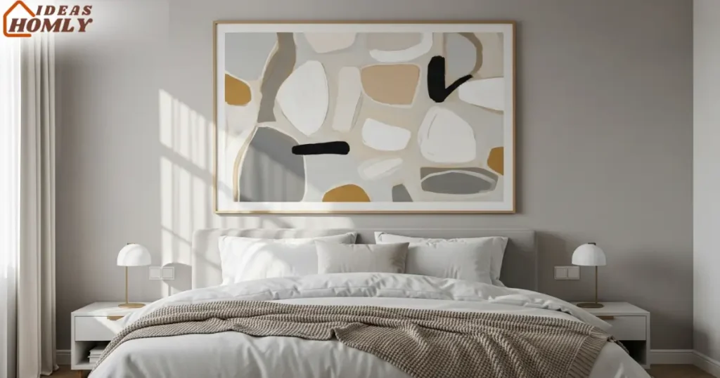
5. Single oversized art piece
I hang one large art piece when I want instant focus. One big shape calms the wall more than many small frames. The feature feels curated, not cluttered. My small room thanks me.
I size art to the furniture below for balance. I aim for 60 to 75 percent of bed width. I leave 15 to 20 cm above the headboard. The proportions feel steady and grown up.
I pick quiet palettes or soft abstracts for small rooms. I use texture or brushwork over loud contrast. I choose a slim frame in wood, white, or black. The frame outlines the feature cleanly.
I hang at eye level for comfort. I stand at about 145 to 155 cm from the floor. I adjust for tall or short users a little. I keep a tape measure nearby like a friend.
Art size guide by bed width
| Bed size | Bed width cm | Art width range cm | Art width range in |
|---|---|---|---|
| Twin | 99 | 60 to 75 | 24 to 30 |
| Full | 137 | 82 to 103 | 32 to 41 |
| Queen | 152 | 91 to 114 | 36 to 45 |
| King | 193 | 116 to 145 | 46 to 57 |
Frame choices that stay timeless
I use a thin profile for small rooms. I choose real glass for clarity if weight allows. I pick a mat for breathing room around art. I match frame tone to hardware for unity.
I style the area with one or two accents max. I place a slim sconce or a tiny plant. I keep the nightstands simple and tidy. The large art handles the spotlight alone.
How I Layer a Small Room Without Clutter
I start with one focal wall, then add tiny helpers. I keep every extra piece slim and calm. I repeat tones from the accent idea. I stop the second thing from shouting.
I limit layers to four parts. I use a base color that sets the mood. I add one feature for focus only. I let lighting and textiles handle the rest.
I scale decor to the wall plan. I place the largest element first. I test sightlines from the door and bed. I remove anything that breaks the rhythm.
I keep finishing soft and low sheen. I prefer matte paint and natural texture. I avoid thick frames and chunky shelves. I let air sit between objects.
My simple layering formula
| Layer | Purpose | What I use | Rule I follow |
|---|---|---|---|
| Base | Calm backdrop | Matte paint or fabric | One hue, low contrast |
| Feature | Clear focus | Slats, mural, block, art | One hero only |
| Support | Gentle depth | Sconce, shelf, plant | Thin lines, small scale |
| Sparkle | Soft lift | Warm bulb, small metal | One touch per wall |
I set lighting before the accessories. I pick warm lamps near 2700 K. I bounce light off the accent surface. I avoid spot glare on shiny frames.
I use storage to hide the extras. I pick nightstands with drawers. I stash remotes and chargers fast. I keep only one book and one plant visible.
I repeat shapes to tidy the view. I echo vertical lines from slats. I mirror arcs from a soft mural. I keep art mats and bedding in sync.
I remove bulky floor lamps first. I ditch deep shelves that steal inches. I skip tiny frame clusters. I donate anything I do not use weekly.
Skimmable checklist: Small room styling
- Choose one hero feature.
- Match tones within two steps.
- Add warm light, not bright glare.
- Leave breathing gaps around decor.
- Stop at four layers, max.
Conclusion
I keep accent walls easy, calm, and precise. I pick one feature that adds order, not chaos. I build support with light and texture, not clutter. I let clean edges and repeated tones carry the room.
I saw the biggest wins from five ideas. Wall to wall curtains soften and hide awkward bits. Slim vertical slats stretch height without weight.
A two-thirds color block adds calm structure. A light trompe l’oeil gives depth with no bulk. One oversized art piece delivers instant focus.
I choose only one hero and then stop. I keep contrast low and finishes matte. I layer storage and warm light with care. The space looks larger, and it feels restful.
If you plan affiliate products later, great. Curtain tracks, slim slats, and simple frames fit well. Keep picks practical and scale aware. Small rooms reward restraint every time.
FAQs
I choose the bed wall in bedrooms most times. That wall anchors the layout and frames the view. I pick the wall facing a window if the bed wall feels busy. I avoid walls chopped up by doors or closets.
I stand at the doorway and scan the room. I pick the surface my eyes land on first. I test with painter’s tape to preview height and width. I adjust until the proportions feel calm.
I stay inside one color family for safety. I choose a base and then shift one or two steps deeper. I keep sheen matte or eggshell to diffuse light. I avoid harsh black lines near the ceiling.
I compare swatches in morning and evening light. I check both warm and cool bulbs as well. I watch how fabrics read against the paint. I lock the palette only after those checks.
I use tension rods or ceiling tracks with minimal holes. I install peel and stick murals with care and a level. I try removable slats backed with thin strips. I style with one large framed print instead of clusters.
I patch tiny holes before moving out. I store trim paint for fast touch ups. I choose hardware that blends with wall color. I keep packaging in case I need to return parts.
I aim for 60 to 75 percent of bed width. I leave 15 to 20 cm above the headboard. I keep frames thin so the wall reads wider. I center the piece at comfortable eye level.
I test with craft paper before drilling. I tape the outline and step back to check. I tweak height in small moves, about 2 cm each time. I hang only when the sightline feels balanced.