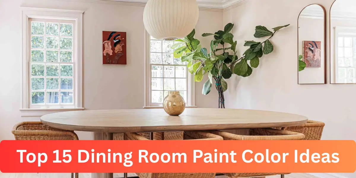
Dining room paint color ideas can completely change how a space feels, even before you update furniture or décor. I’ve seen rooms shift from dull to inviting simply by choosing the right tone and finish.
Color influences conversation, lighting, and even how spacious the room appears. Instead of selecting a shade based only on trends, I focus on how it interacts with natural light and surrounding materials.
When chosen thoughtfully, the right paint color creates balance, enhances architectural details, and gives the dining room a personality that feels intentional and lasting.
How Paint Color Shapes the Dining Room Atmosphere
Color does more than decorate walls. It influences how large or intimate a dining room feels and affects how lighting performs throughout the day. I always study how natural light enters the room before choosing a shade.
The right paint color can highlight architectural features, enhance furniture finishes, and create emotional warmth. When applied thoughtfully, it becomes the foundation that supports every other design element in the space.
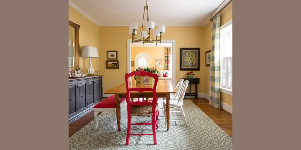
1. Classic Warm White
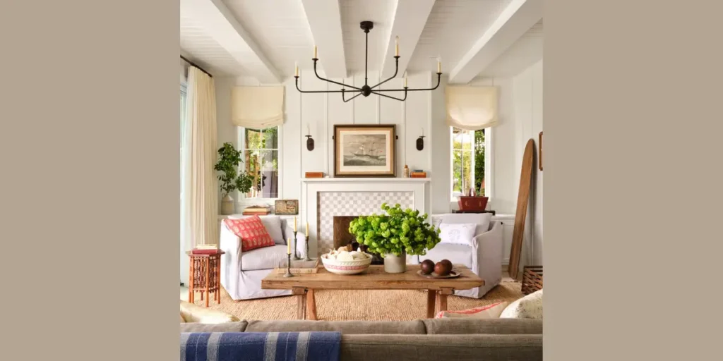
Warm white creates a bright yet inviting backdrop for any dining room. I prefer shades with subtle cream undertones because they prevent the space from feeling sterile. This tone reflects natural light beautifully and makes smaller rooms appear more open.
It pairs effortlessly with wood furniture, metal accents, and layered textures. I often use warm white when I want to highlight artwork or statement lighting without competing with it.
This color also offers flexibility. If you plan to update décor in the future, warm white adapts easily without requiring another full repaint.
2. Soft Greige
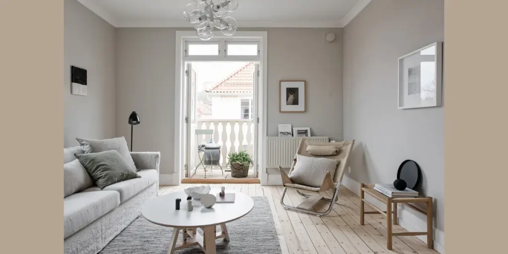
Soft greige blends gray and beige into a balanced neutral. I rely on this shade when I want sophistication without the coolness of pure gray. It creates a calm atmosphere that works well in both modern and traditional homes.
Greige complements wood flooring and upholstered chairs seamlessly. I choose it for dining rooms that need warmth but still require subtle contrast against white trim.
Because it shifts slightly under different lighting conditions, greige adds depth without feeling flat or overpowering.
3. Deep Navy Blue
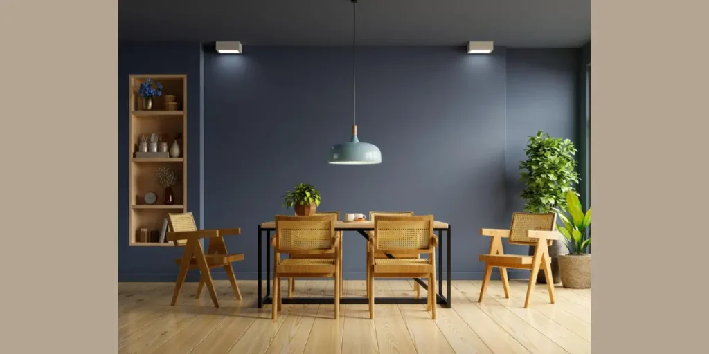
Deep navy introduces richness and depth to the dining room. I use it when I want to create a bold yet refined atmosphere. Navy works beautifully with brass fixtures and light colored tables.
It also frames artwork and mirrors effectively. I balance navy walls with lighter ceilings to prevent the room from feeling enclosed.
When paired with soft lighting, navy transforms into a sophisticated backdrop that feels elegant during evening gatherings.
4. Earthy Sage Green
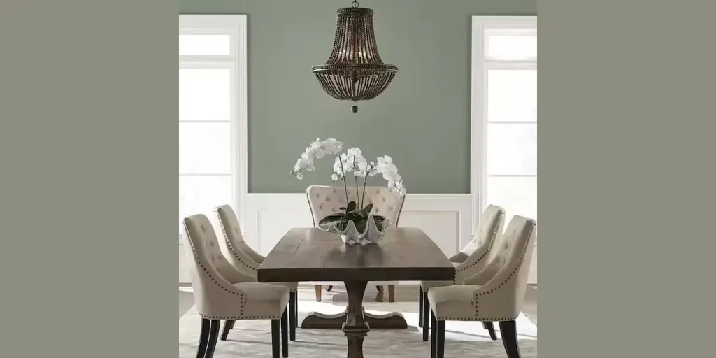
Sage green brings a grounded and organic presence into the space. I often recommend it for dining rooms with natural wood or woven textures. The muted tone feels calming and timeless.
This color enhances daylight without reflecting glare. It pairs beautifully with linen upholstery and matte black accents.
Sage works especially well in transitional interiors. It introduces subtle color while maintaining a neutral overall aesthetic.
5. Charcoal Gray
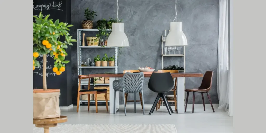
Charcoal gray creates drama while remaining versatile. I select this shade when I want to emphasize contrast against lighter furniture. It adds sophistication without relying on bright color.
Proper lighting is essential with darker tones. I incorporate layered lighting to prevent shadows from dominating the room.
Charcoal gray also enhances metallic finishes. It gives chandeliers and decorative pieces stronger visual impact.
6. Terracotta or Clay Tone
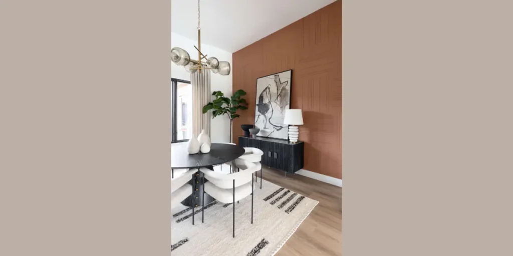
Terracotta adds warmth and character instantly. I use clay inspired hues when I want the dining room to feel welcoming and rich. This color complements wood tables and natural materials effortlessly.
Its earthy undertones create depth without feeling too bold. I balance terracotta with neutral furnishings to maintain harmony.
In well lit spaces, clay tones glow beautifully during evening meals. They introduce warmth that feels both rustic and refined.
7. Soft Blush Pink
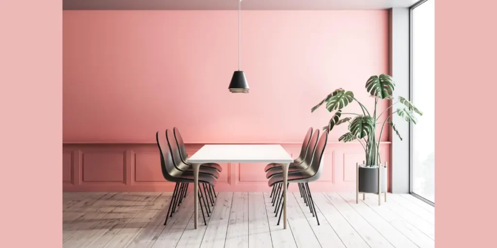
Soft blush introduces subtle elegance without overpowering the room. I choose muted pink shades that lean neutral rather than bright. This keeps the space sophisticated rather than playful.
Blush pairs exceptionally well with gold hardware and soft gray accents. I often use it to add warmth to dining rooms that receive limited sunlight.
When applied thoughtfully, blush acts almost like a neutral. It provides gentle color while preserving calm balance.
8. Rich Emerald Green
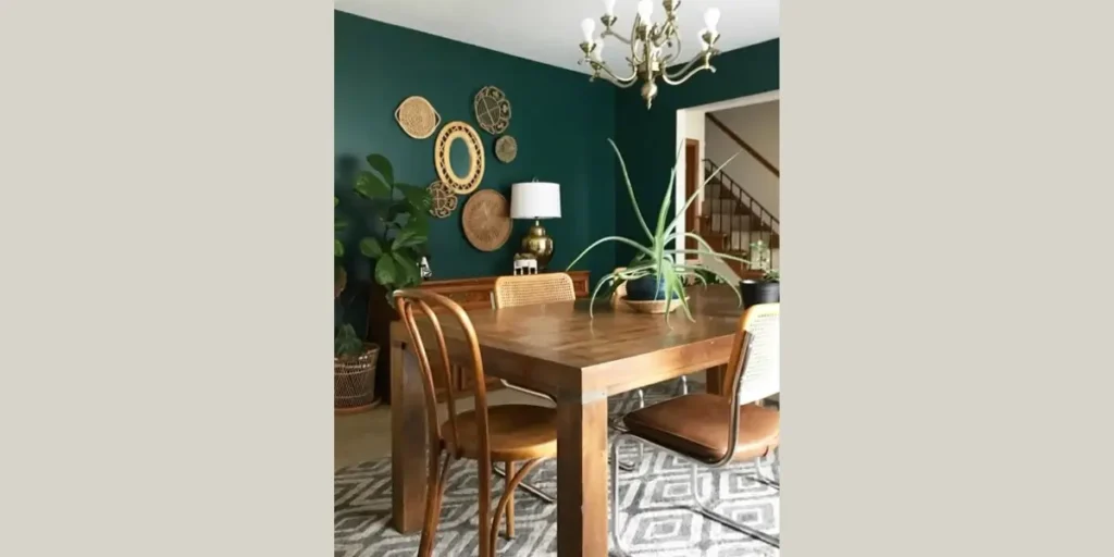
Emerald green creates a luxurious and confident atmosphere. I use this jewel tone when I want the dining room to feel dramatic yet polished. It complements velvet chairs and brass lighting beautifully.
To prevent visual heaviness, I incorporate lighter décor elements. White trim or neutral rugs maintain balance against the deep color.
Emerald works particularly well in formal dining rooms. It elevates the space and introduces refined depth.
9. Light Powder Blue
Powder blue offers a fresh and airy quality. I prefer this tone in dining rooms where natural light plays a strong role. It reflects brightness while maintaining softness.
This shade pairs naturally with coastal or contemporary interiors. I often combine it with white trim for crisp contrast.
Powder blue keeps the space relaxed and comfortable. It creates an inviting atmosphere without overwhelming the design.
10. Creamy Beige
Creamy beige offers warmth without overpowering the room. I use this shade when I want a neutral backdrop that feels softer than white but brighter than taupe. It works beautifully in dining rooms with medium to dark wood furniture.
This tone reflects light gently, which makes the space feel comfortable rather than stark. I often pair it with textured fabrics and subtle metallic accents to add depth.
Creamy beige remains timeless. It adapts easily to changing décor trends and maintains a welcoming atmosphere year after year.
11. Moody Burgundy
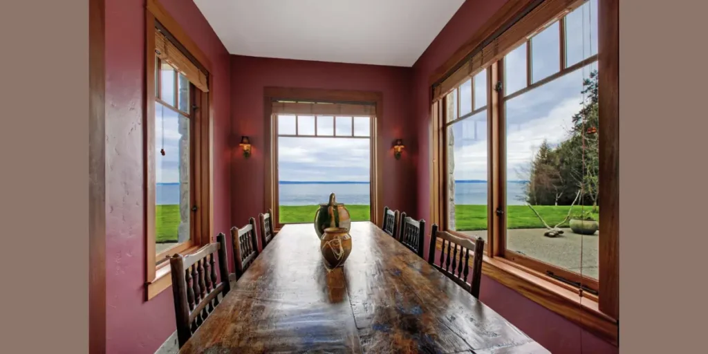
Burgundy introduces richness and depth into a dining space. I choose this shade for formal settings where I want to create an intimate and dramatic mood. The deep red undertones add character without feeling overwhelming.
Lighting plays an important role with darker hues. I balance burgundy walls with warm fixtures and lighter furniture to prevent heaviness.
When styled thoughtfully, this color creates a refined backdrop that enhances evening gatherings and special occasions.
12. Muted Mustard
Muted mustard adds warmth and subtle energy without becoming too bright. I select toned down yellow shades that lean earthy rather than vibrant. This creates a welcoming and grounded environment.
Mustard pairs well with wood finishes and matte black accents. I keep surrounding décor simple so the color feels intentional rather than busy.
This shade works particularly well in transitional dining rooms. It introduces personality while maintaining balance and comfort.
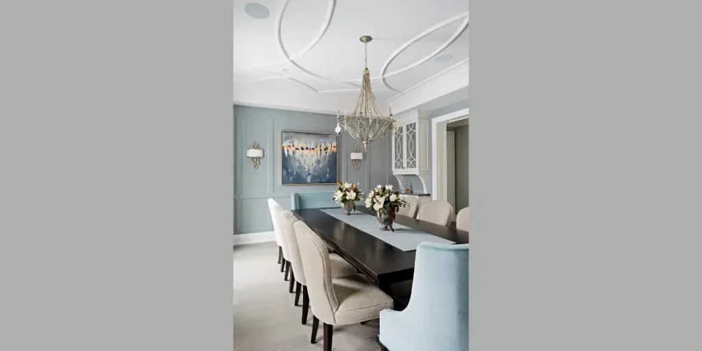
13. Cool Slate Blue
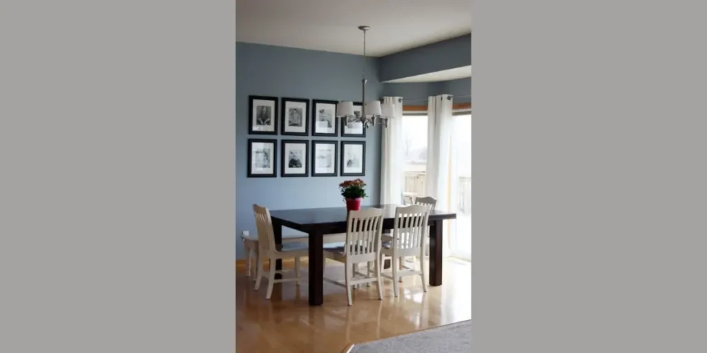
Slate blue offers a refined alternative to traditional navy. I appreciate how it combines blue and gray undertones to create a balanced, calming atmosphere. It works well in both modern and classic interiors.
This color responds beautifully to natural light. During the day it appears fresh, while in the evening it feels deeper and more intimate.
Slate blue complements white trim and soft metallic accents effortlessly. It creates subtle contrast without overwhelming the space.
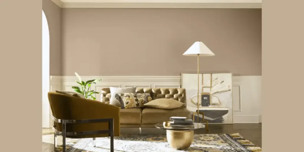
14. Soft Taupe
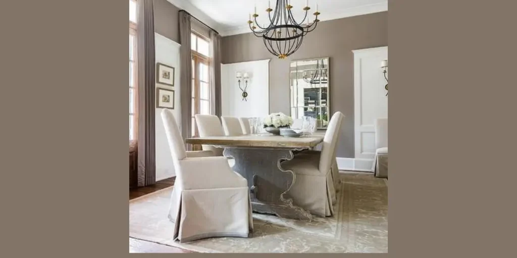
Soft taupe blends warmth and neutrality in a balanced way. I use this shade when I want depth without strong color influence. It provides a sophisticated foundation for layered textures and wood finishes.
Taupe adapts well to different lighting conditions. It appears warm under artificial light while remaining calm in daylight.
This color works particularly well in dining rooms that require flexibility. It supports both modern and traditional décor seamlessly.
15. Matte Black Accent Wall
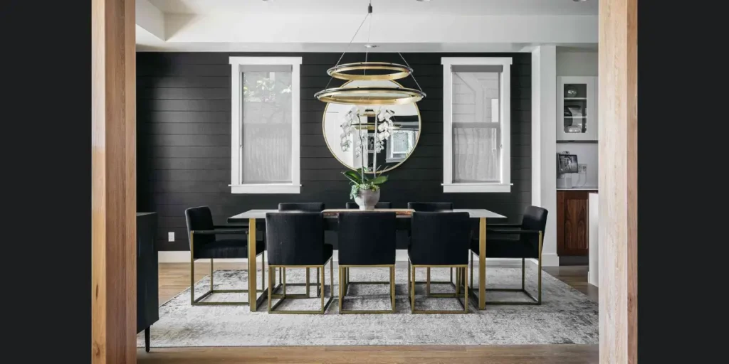
A matte black accent wall creates bold visual impact. I apply it to one wall behind the dining table to anchor the space strongly. The deep tone adds drama and modern character.
To maintain balance, I pair black with lighter furnishings and strong lighting. This prevents the room from feeling enclosed.
When executed carefully, matte black transforms the dining room into a confident and contemporary setting. It delivers contrast and sophistication in a controlled way.
How to Choose the Right Dining Room Paint Finish and Tone
Selecting the right color is only part of the process. I always consider both the tone and the paint finish before making a final decision.
The way light interacts with the surface can completely change how a color appears throughout the day. A beautiful shade can lose its impact if the finish does not suit the room’s lighting and usage.
Understanding undertones also makes a major difference. Some neutrals lean warm while others feel cool. I test samples on different walls and observe them in natural and artificial light before committing.
This step prevents costly mistakes and ensures the final result feels intentional.
Test Colors Under Different Lighting
Before finalizing any shade, I apply sample swatches on multiple walls. Natural daylight reveals undertones clearly, while evening lighting may deepen or mute the color. I observe the room at different times of day to see how the tone shifts.
Lighting direction also matters. North facing rooms often benefit from warmer tones, while south facing spaces can handle cooler shades comfortably. Careful testing ensures the color feels balanced rather than flat.
Consider Room Size and Ceiling Height
Dark colors can create intimacy, but they may also make small rooms feel enclosed. I evaluate ceiling height and overall dimensions before choosing deeper shades. Lighter tones expand visual space and reflect more light.
If I want drama without reducing brightness, I often use darker shades on one wall only. This approach maintains proportion while still delivering visual depth.
Coordinate With Flooring and Furniture
Paint should complement existing elements rather than compete with them. I examine flooring tones, table finishes, and upholstery before selecting a wall color. Warm wood pairs well with earthy hues, while cooler floors work better with soft grays or blues.
Maintaining harmony between walls and furnishings creates cohesion. When everything aligns, the dining room feels thoughtfully curated.
Choose the Right Finish for Durability
Finish selection affects both appearance and maintenance. I typically recommend eggshell or satin finishes for dining rooms because they provide subtle sheen and easier cleaning. Matte finishes look elegant but may show marks more easily.
Durability becomes especially important in spaces used frequently. A practical finish protects the investment and keeps walls looking fresh over time.
FAQs
Lighter tones such as warm white, soft greige, or powder blue often work best in smaller spaces. These shades reflect light and make the room feel more open. However, a carefully chosen darker accent wall can also add depth without overwhelming the space.
The choice depends on the atmosphere you want to create. Light colors enhance openness and brightness, while darker shades create intimacy and drama. I usually evaluate the room’s natural light before deciding which direction works best.
Eggshell and satin finishes provide a balanced combination of softness and durability. They allow for easy cleaning while maintaining a refined look. Matte finishes can work beautifully but may require more careful maintenance.
Yes, bold shades such as navy, emerald, or burgundy often enhance formal settings. These colors create depth and elegance when paired with proper lighting and balanced furnishings. Thoughtful contrast keeps the room sophisticated rather than overwhelming.
Conclusion
Choosing the right paint color can completely redefine how your dining room feels and functions. I always view color as more than decoration.
It influences mood, enhances lighting, and strengthens the connection between furniture and architecture.
Whether you prefer soft neutrals or bold statement tones, the key lies in balance and thoughtful coordination. When you consider undertones, finish, and natural light together, the result feels intentional rather than accidental.
A well selected shade does not simply refresh the walls. It creates an atmosphere that makes every meal, gathering, and conversation more inviting and memorable.