
I believe choosing the right ceiling paint can completely change the mood of your living space without requiring a major renovation budget. Most people stick to basic white because they are terrified of making a bold choice that might ruin their room.
Selecting Professional Paint Finishes for Your Home
You should always consider the lighting in your room before picking a specific shade or finish for your ceiling project. I have noticed that natural sunlight brings out the hidden undertones in paint that look completely different under a regular lightbulb.
Selecting a flat finish is usually the smartest move if your ceiling has bumps or patches that you want to hide. I find that matte paints absorb light rather than reflecting it, which helps camouflage the imperfections that come with older home drywall.
Using a high-gloss finish creates a mirror-like effect that makes a room feel more glamorous and much more expensive than it is. I suggest this for small entries or powder rooms where you want to add a bit of drama and visual interest.
I often tell my friends that the ceiling is just a fifth wall that deserves as much attention as your floors. You can use paint to guide the eye toward your favorite furniture or to create a cozy feeling in a bedroom.
1. Classic Bright White Ceiling Finishes
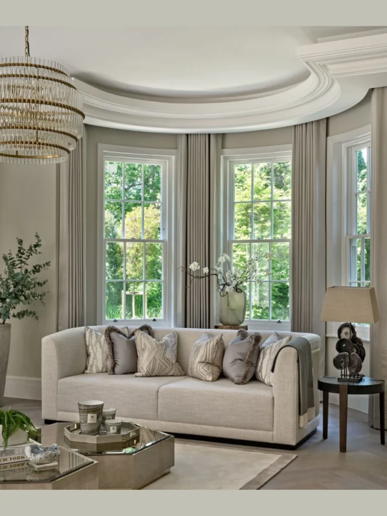
I think a clean white ceiling is the most reliable way to make a small room feel open and much taller. It reflects the maximum amount of light, which helps brighten up dark corners that usually feel a bit depressing during winter.
You should look for a “ceiling white” specifically because these formulas are designed to go on thick and resist dripping on your head. I have spent too many afternoons scrubbing paint speckles off my glasses because I used cheap wall paint for the ceiling.
Most professional designers use a slightly warm white to keep the room from feeling like a cold and sterile hospital wing. I find that a soft cream undertone pairs perfectly with wooden furniture and traditional decor styles without looking too yellow or dated.
I suggest this choice for kitchens and bathrooms where you want a crisp and sanitary look that never goes out of style. It provides a neutral backdrop that allows your colorful cabinets or tiled backsplashes to be the real stars of the show.
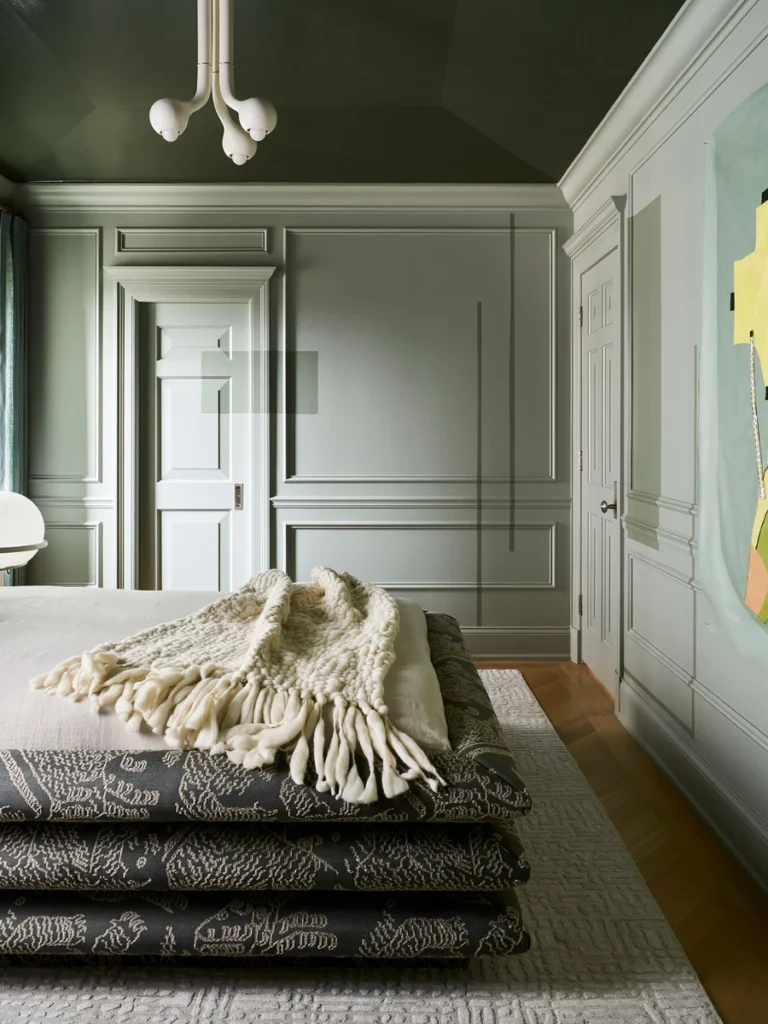
2. Moody Dark Charcoal Tones
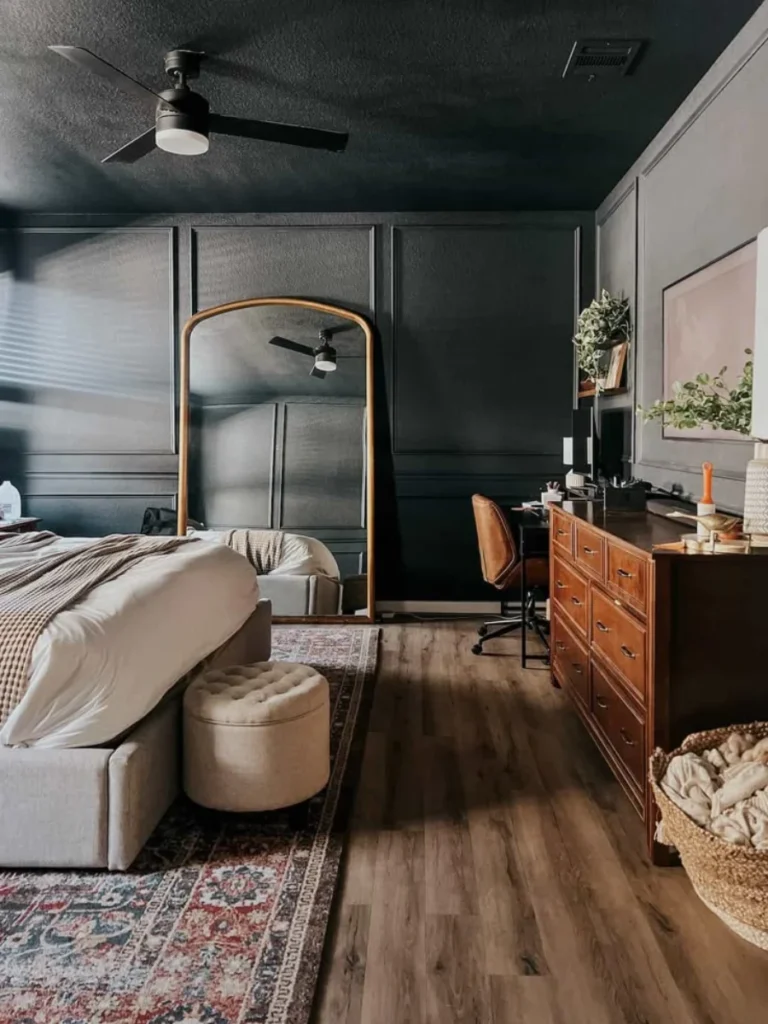
I really love the way a dark grey or charcoal ceiling makes a large living room feel incredibly cozy and intimate. It creates a “sky at night” effect that draws the boundaries of the room inward for a much more comfortable atmosphere.
You need to have plenty of lamps or large windows to prevent the dark color from making the space feel like a cave. I have seen this work beautifully in home theaters where the dark paint prevents light from bouncing back onto the movie screen.
Painting your crown molding the same dark color as the ceiling creates a seamless and modern look that I find very sophisticated. It is a bold move that shows you have a strong sense of style and aren’t afraid of a little interior drama.
I recommend using a flat sheen for dark colors to avoid a “funhouse” reflection that can be a bit distracting and overwhelming. This choice turns your ceiling into a velvety surface that adds a layer of luxury to your master bedroom or library.
3. Traditional Haint Blue Porch Styles
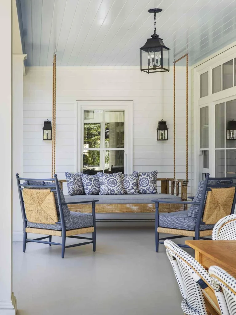
I am a huge fan of the southern tradition of painting porch ceilings a soft and pale shade of blue. This historical choice is meant to mimic the sky and is said to keep birds and wasps from building nests.
You can bring this exterior trend inside to your sunroom or laundry area to create a permanent feeling of a clear spring day. I find that it adds a subtle pop of color that feels much more refreshing than a standard grey or beige.
Most people find that a light aqua or sky blue helps lower their stress levels while they are relaxing on their patio. I suggest pairing this with white wicker furniture and plenty of green plants to complete the classic coastal aesthetic in your home.
I have found that this specific blue shade works as a neutral and goes well with almost any exterior siding color you have. It is an affordable way to add some charming personality to your home’s curb appeal without a lot of complicated work.
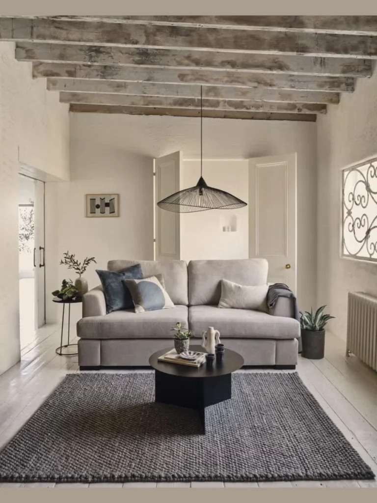
4. Modern Monochromatic Color Drenching
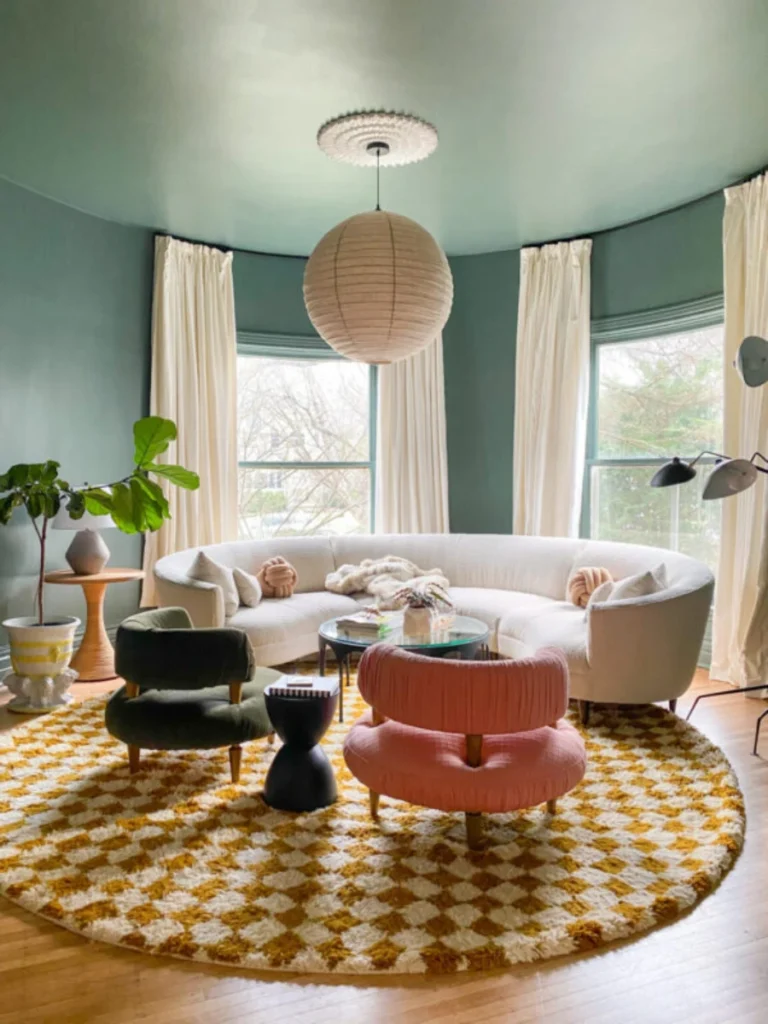
I think painting your ceiling the exact same color as your walls is the best way to create a high-end designer look. This technique removes the harsh “line” where the wall ends which makes the entire room feel much more cohesive and vast.
You will find that this works exceptionally well with mid-toned colors like sage green or a dusty rose for a soft effect. I appreciate how this style makes the architectural features of a room stand out more than the actual paint color itself.
I suggest using a different finish for the ceiling like a matte version of your eggshell wall paint to add some depth. This subtle change in sheen prevents the room from looking like a flat box while maintaining the beautiful one-color theme.
This is a great solution for rooms with odd angles or sloped ceilings that usually look messy with two different paint colors. I have noticed that it simplifies the visual space and makes a cluttered room feel much more organized and intentionally designed.
5. Soft Warm Beige and Greige Accents
I believe that warm neutral tones are the perfect middle ground for homeowners who find white too boring and black too scary. A soft greige on the ceiling adds a touch of warmth that makes a room feel much more lived-in and welcoming.
You should match the undertone of your beige to your flooring to ensure the room feels balanced from top to bottom. I have noticed that a sandy tan ceiling makes white crown molding look much crisper and more expensive than it actually is.
This color works perfectly in dining rooms where you want a calm and sophisticated environment for hosting long dinners with your friends. I find that it hides dust and cobwebs much better than a bright white surface which is a hidden bonus for busy people.
I recommend this for anyone who wants a “safe” way to experiment with color without having to repaint the entire house next year. It is a timeless choice that works with both modern and antique furniture pieces without causing any visual conflict in your home.
6. Sophisticated Navy Blue Statements
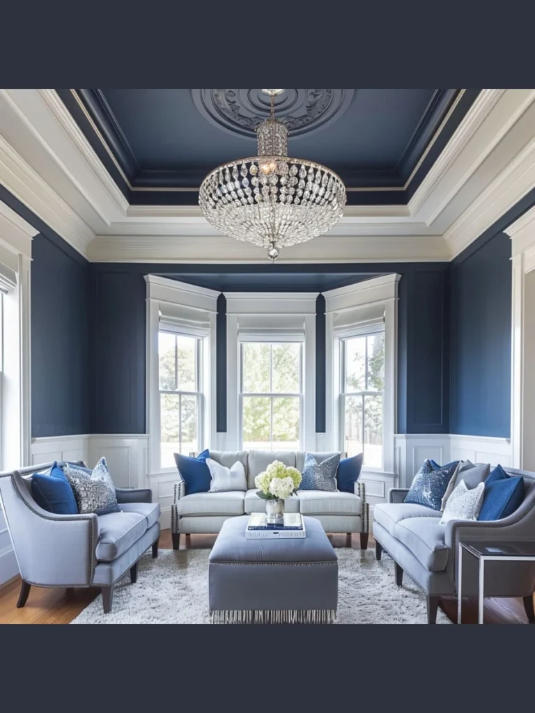
I think a deep navy ceiling provides a regal touch that makes a formal home office or library look very professional. This shade creates a strong sense of gravity that grounds a room with high ceilings and prevents it from feeling too empty.
You can pair navy with gold or brass light fixtures to create a high-contrast look that feels like a luxury hotel suite. I have found that dark blue acts as a neutral when you have a lot of white trim or wooden bookshelves.
I suggest using this color in a bedroom if you have trouble falling asleep because it mimics the natural evening sky. Most people find that the darker tones help their eyes relax more quickly than a bright and reflective white surface.
You should apply at least two coats of high-quality paint to ensure the deep pigment looks even across the entire flat surface. I noticed that skipping a primer with dark navy often leads to patchy spots that are very obvious in the daylight.
7. Cheerful Soft Yellow Hues
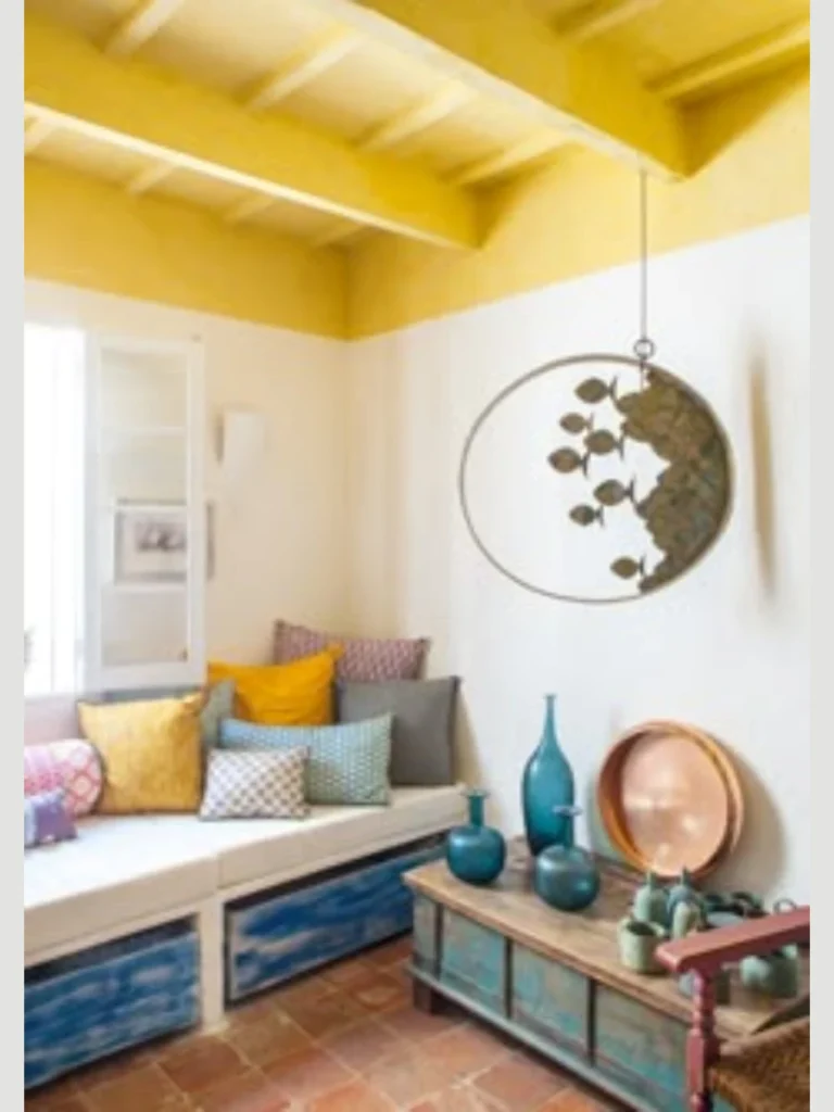
I believe that a pale yellow ceiling can act like a permanent sunbeam in a kitchen or a breakfast nook. This color choice boosts the overall mood of the room and makes the morning coffee routine feel much more energetic.
You should stick to buttery or creamy yellows rather than neon shades to avoid making the room feel like a fast-food joint. I find that a soft lemon tone works beautifully with white cabinets and light grey stone countertops for a fresh look.
This is an excellent way to brighten up a basement or a room with very small windows that doesn’t get much sun. I have noticed that yellow overhead makes the artificial light from your lamps feel much warmer and more natural during the day.
I recommend using this in a nursery or a child’s playroom to create a space that feels creative and full of life. It provides a nice pop of color that is easy to coordinate with colorful toys and playful wall art for the kids.
8. Dramatic Metallic Gold and Silver
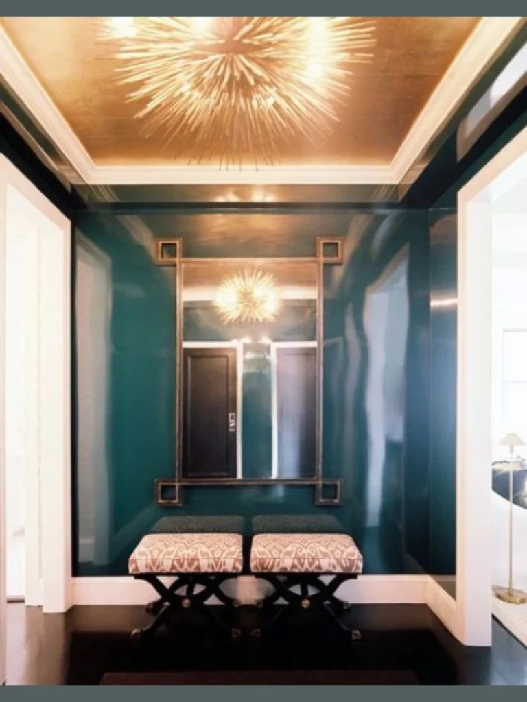
I find that using metallic paint on a ceiling adds a layer of glamour that you simply cannot get with standard matte colors. Gold or silver finishes reflect light in a shimmering pattern that changes as you move across the room throughout the evening.
You should use this sparingly in smaller spaces like a powder room or a formal entryway to create a “jewelry box” effect. I think a metallic ceiling looks best when you have a beautiful chandelier to cast sparkles across the reflective paint surface.
Applying metallic paint requires a bit more patience because your brush strokes or roller marks can show up if you are not careful. I suggest using a sea sponge or a soft rag to create a textured metallic finish that hides any application flaws.
I have found that a warm champagne gold makes skin tones look much healthier and more vibrant during a candlelit dinner party. It is a bold and artistic choice that tells your guests you are not afraid to experiment with luxury materials.
9. Earthy Sage Green Textures
I think sage green is the best choice if you want to bring a bit of the natural world into your indoor living areas. This muted green tone feels very calm and pairs perfectly with indoor plants and natural linen fabrics on your furniture.
You will notice that green ceilings help blur the line between your indoor space and your outdoor garden or backyard patio. I find that it creates a very peaceful atmosphere in a home office where you need to focus for many hours.
I suggest using a chalky or flat finish for sage green to emphasize the organic and soft nature of the specific pigment. Most people find that this color is very forgiving and hides minor drywall cracks or uneven patches better than darker shades.
This is a great alternative to grey if you want a neutral that has a bit more personality and a unique visual warmth. I have seen this work exceptionally well in kitchens with wooden butcher block counters and black hardware for a modern farmhouse vibe.
10. Glamorous High Gloss Black
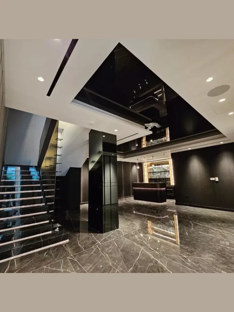
I believe a high-gloss black ceiling is the ultimate statement for anyone who wants a sleek and ultra-modern interior design look. The reflective surface acts like a dark mirror which can actually make a room feel deeper and more mysterious.
You need to make sure your ceiling is perfectly sanded and smooth because the gloss will highlight every single bump and scratch. I have spent many hours prepping a ceiling for gloss paint because the final result is so rewarding and visually striking.
I suggest using this in a dining room with a lot of natural light to prevent the black from feeling too heavy. I find that the reflection of a dining table and chairs in the ceiling creates a very high-end and artistic perspective.
Most guests will be impressed by the bravery of this choice because black is often seen as a risky or difficult color. I noticed that it works best when the rest of the room is kept relatively simple with white walls and minimal decor.
11. Soft Lavender and Lilac Tones
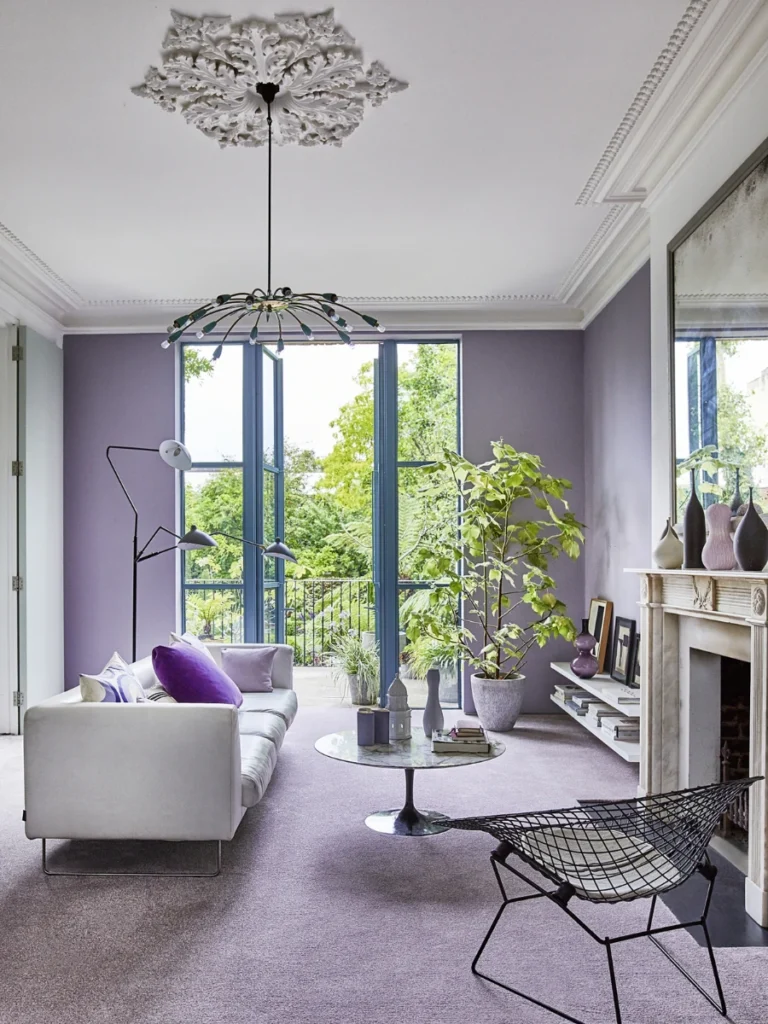
I find that a hint of lavender on the ceiling is a very sophisticated way to add color without overwhelming the whole room. This cool-toned purple creates a dreamy atmosphere that is perfect for a guest bedroom or a quiet reading nook.
You should pair this with silver accents or white furniture to keep the look feeling light, airy, and very modern. I have found that lavender acts as a great transition color if your walls are a light grey or a cool white.
Most people don’t realize that a purple ceiling can make a room feel much fresher and cleaner than a standard beige or tan. I suggest using a very pale version of the color so it only reveals its true purple tint in the bright light.
I recommend this for rooms where you want to encourage relaxation and a sense of calm after a very long work day. It is a unique choice that feels personal and creative without being too loud or distracting for the average homeowner.
12. Warm Terracotta and Clay Colors
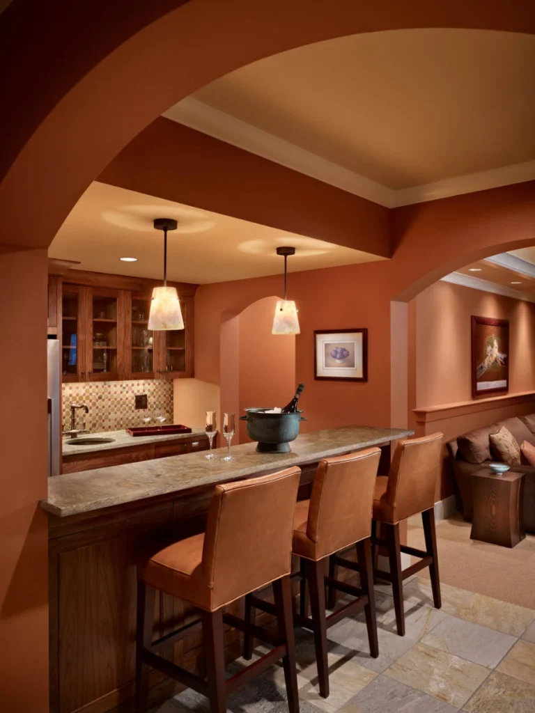
I think a terracotta ceiling brings a Mediterranean or Southwestern warmth to a home that feels very grounded and sturdy. This earthy red-orange tone works perfectly in a kitchen or a sunroom where you want a very cozy and rustic vibe.
You should pair this with exposed wooden beams or clay tile floors to create a cohesive and natural interior design theme. I find that the warmth of the clay color makes a large, open-concept room feel much more intimate and less hollow.
I have noticed that terracotta looks particularly beautiful during the “golden hour” when the setting sun hits the ceiling directly. It creates a warm glow that makes the whole room feel like it is bathed in natural and healthy sunlight.
I suggest using a flat or eggshell finish to mimic the look of natural dried clay or traditional plaster materials from Italy. This is a great choice for anyone who loves world travel and wants to bring those warm memories into their daily lives.
13. Subtle Peachy Pink Glows
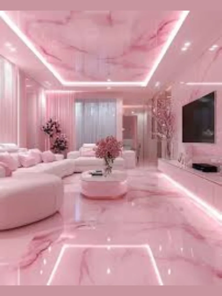
I believe a soft peach ceiling is the secret to making every person in the room look their absolute best under artificial light. The warm pinkish undertones cast a flattering glow that is much more welcoming than a harsh or blue-tinted white light.
You should use this in a bathroom or a dressing room where you spend time getting ready in the morning for work. I have found that a peach ceiling makes the room feel bright and happy even on a grey and rainy Tuesday morning.
I suggest pairing this with gold fixtures and white marble for a classic and very feminine aesthetic that feels timeless and clean. Most people find that this color is much more versatile than they initially thought when looking at a small paint chip.
This is a great way to add a “blush” to a room that feels a bit too cold or industrial due to metal furniture. I noticed that it softens the hard edges of a room and makes the entire environment feel much more approachable and friendly.
Professional Guide for Applying Ceiling Paint
I believe the success of your project depends heavily on the quality of the tools you choose before opening the paint can. Most people try to use a cheap roller cover but I find that a high-nap microfiber sleeve prevents those annoying white speckles on your floor.
You should always start by cutting in the edges with a sash brush to create a clean border against your walls or molding. I have noticed that taking the time to tape off your light fixtures saves you from hours of scraping dried paint off expensive glass.
Selecting the right primer is a vital step if you are trying to cover a dark color with a lighter one or vice versa. I suggest using a stain-blocking primer to ensure that old water spots or smoke damage don’t bleed through your fresh new coat of paint.
I recommend painting in small sections and maintaining a “wet edge” to avoid those ugly overlapping lines that appear once the paint dries. I find that working across the width of the room rather than the length makes the job feel much faster and less tiring.
Ceiling Paint Comparison and Selection Table
| Paint Idea | Best Room Type | Suggested Finish | Mood Created |
| Bright White | Small Kitchen | Flat / Matte | Airy & Clean |
| Dark Charcoal | Home Theater | Flat | Cozy & Moody |
| Haint Blue | Front Porch | Satin | Traditional |
| High Gloss | Entryway | High-Gloss | Glamorous |
| Sage Green | Home Office | Eggshell | Calming |
Best Practices for a Flawless Finish
I find that wearing a hat and protective eyewear is a smart move to keep the inevitable paint mist out of your hair and eyes. It is much easier to focus on a straight line when you aren’t worried about a drop of navy blue landing on your forehead.
You should keep a damp cloth nearby to quickly wipe away any drips that might run down the walls during your work session. I have found that catching a mistake while it is still wet is the best way to maintain a professional and clean look.
Providing adequate ventilation with a box fan helps the paint dry evenly and clears out the fumes so you can sleep in the room. I usually suggest leaving the windows open for at least four hours after the final coat is applied to ensure the air is fresh.
I think checking your work with a bright work light from different angles helps you spot any thin areas that need a quick touch-up. I always tell my friends that a second coat is almost always necessary to achieve that deep and rich professional color.
Conclusion
I think that painting your ceiling is the most affordable way to experiment with high-end interior design without a major time commitment. Moving away from standard white allows you to control the height and the energy of every room in your house with ease.
You can create a dramatic statement with black or a peaceful retreat with sage green, depending on your personal style and goals. I enjoy how a fresh coat of paint makes old architecture feel modern and exciting again for a very low cost.
I encourage you to test your favorite shades on a small piece of poster board before applying them to the entire overhead surface. This allows you to see how the color shifts from morning to night so you are completely happy with your final decision.
I believe your home should be a reflection of your personality and the ceiling is the best place to start that creative journey. I hope these paint ideas help you turn your “fifth wall” into a stunning feature that you and your guests will love.
FAQs
I find that a dark ceiling actually makes the boundaries of a room disappear which can sometimes make a space feel much deeper and more vast.
You should avoid overloading your roller and use a specialized ceiling paint that has a thicker consistency designed specifically to stick to overhead surfaces.
I always paint the ceiling first so that any accidental splatters on the walls can be covered up when you move on to the next phase.
You certainly can but I suggest using a dedicated ceiling paint because it is formulated to hide imperfections and has much less “spatter” than wall paint.
I usually recommend a flat finish for bedrooms to keep things cozy but a high gloss can look very glamorous if your drywall is perfectly smooth.