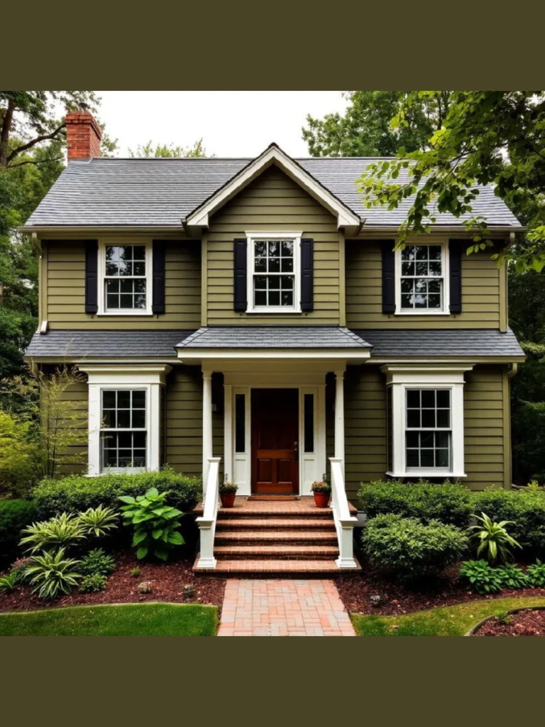
I know the struggle of staring at a faded porch floor while sipping morning coffee. It is finally time to stop ignoring those scuffs and give your outdoor space the color it deserves.
I have gathered these practical paint concepts to help you pick a look that actually lasts. These ideas focus on durability and style to ensure your home looks great for years to come.
Choosing the Best Colors for Your Outdoor Living Space
Selecting the right shade involves more than just picking a favorite color from a small swatch. You must consider how the sun hits your house to avoid blinding glares or muddy tones.
Light colors help small spaces feel much larger and reflect heat to keep your feet cool. Darker shades hide dirt better but can absorb a lot of heat if your porch sits in direct sunlight.
Durability matters just as much as the aesthetic when dealing with constant foot traffic and rain. High-quality acrylic latex paints or enamels provide the hard finish needed to prevent premature peeling or cracking.
A fresh coat of paint acts as a protective barrier for your wood or concrete surfaces. Investing in a premium primer ensures the color sticks properly and prevents old stains from bleeding through.
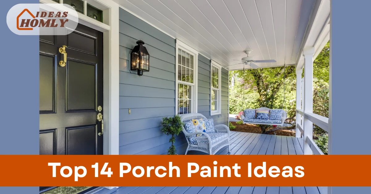
1. Classic Slate Gray for a Timeless Look
Slate gray remains a top choice for homeowners who want a clean and sophisticated appearance. This neutral tone works perfectly with almost any siding color from bright white to natural wood.
This specific shade of gray provides a professional finish that never goes out of style. You can easily pair it with colorful outdoor rugs or seasonal planters to change your look.
Maintenance is relatively easy with slate gray because it does not show every speck of dust. You simply need a quick sweep to keep the surface looking brand new all year long.
I suggest using a satin finish to provide a slight sheen that reflects just enough light. This finish helps the paint resist scuffs from heavy patio furniture and protects the underlying material.
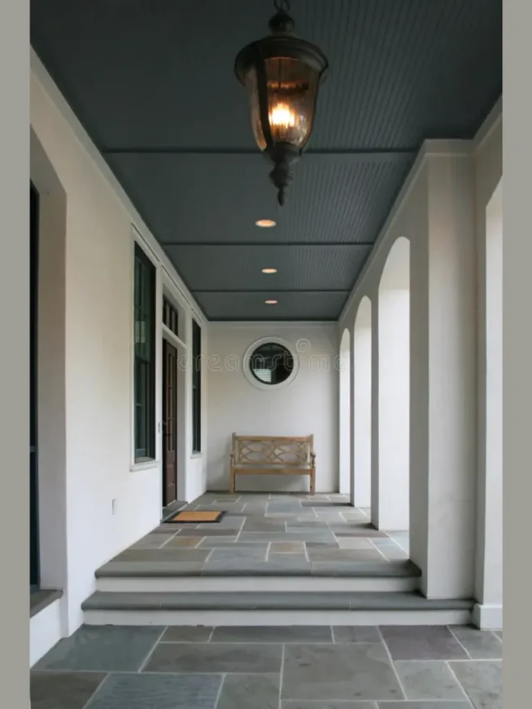
2. Deep Navy Blue for Bold Exterior Character
Navy blue is the perfect option if you want to add drama and depth to your home. This rich color creates a stunning contrast against white trim for a classic and nautical vibe.
Darker blues are surprisingly versatile and can make a large porch feel much more cozy. You can accent the deep tones with brass hardware to create a high-end look very easily.
Dark colors like navy can show salty footprints or light-colored pet hair more than lighter shades. I recommend this color for porches that receive shade to prevent the dark pigment from fading.
Clean the surface thoroughly before application to ensure the dark pigment lays down smoothly without streaks. The effort is worth it once you see how much character this choice adds.
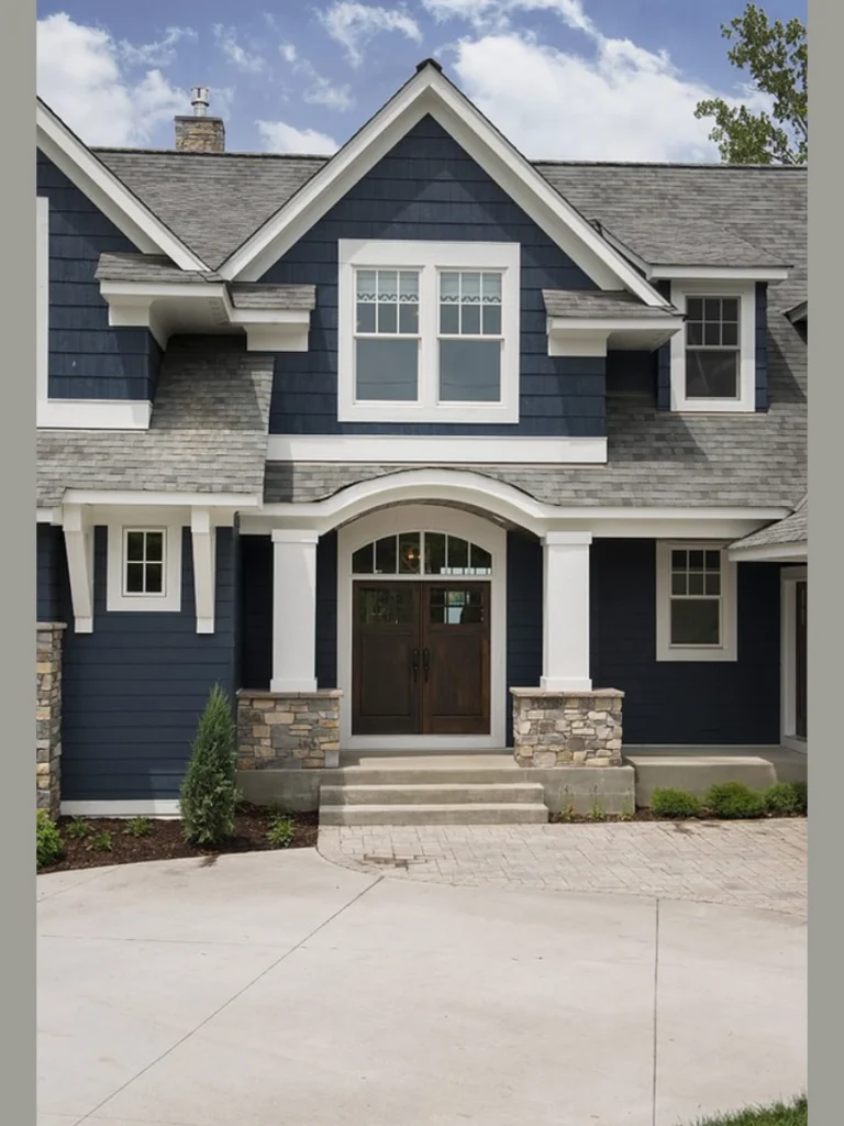
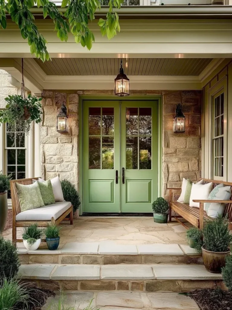
3. Sage Green for a Natural Garden Connection
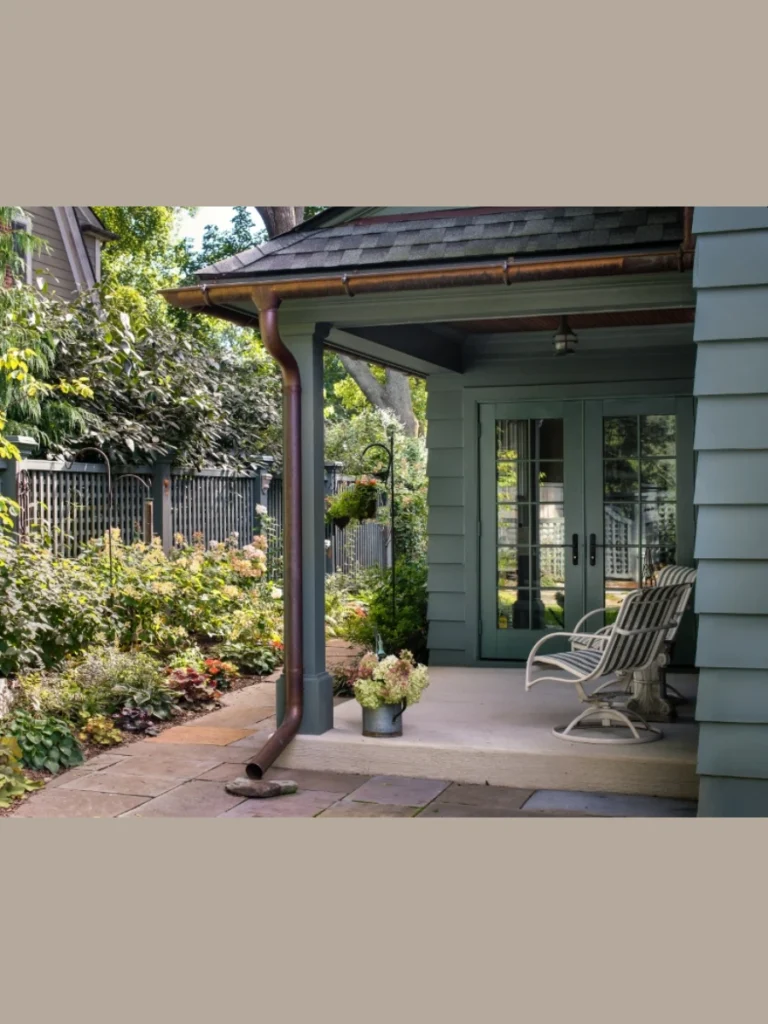
Sage green bridges the gap between your home and the landscape by pulling in earthy tones. This muted green shade feels relaxing and serves as a breath of fresh air for entryways.
The beauty of sage lies in its ability to look different depending on the daily lighting. It can appear gray in the morning and take on a warmer green glow by afternoon.
Natural wood accents and terracotta pots look absolutely stunning when placed against a sage green floor. This color hides organic debris like dried leaves much better than stark white or black.
Choose a formula specifically designed for decks to ensure the sage pigment stays true over time. I have found that sage green is a crowd-pleaser that gets plenty of compliments.
4. Crisp White for a Coastal Farmhouse Vibe
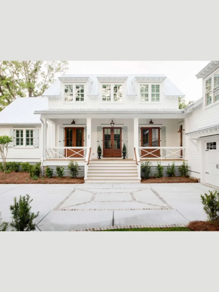
White paint offers a bright feeling that instantly makes any porch look like a vacation home. It creates a clean foundation that makes architectural details like railings and columns really stand out.
This choice is a staple for the farmhouse style and looks incredible with black hardware. You can change your decor every season without ever worrying about a color clash with white.
White floors require more frequent cleaning to maintain that pristine and polished appearance for your guests. Muddy paw prints will show up immediately, so keep a broom handy for high traffic.
Use a high-gloss porch paint if you want to scrub the surface without wearing down the color. The gloss finish also helps bounce light into your home windows to brighten your interior.
5. Rich Charcoal for a Modern Edge
Charcoal paint provides a sleek and contemporary look that updates an older porch with a professional touch. This deep gray shade offers a sophisticated alternative to basic black while hiding most scuffs from daily use.
The dark tone helps define the boundaries of your outdoor room and creates a high-contrast look with light trim. It works exceptionally well on concrete porches because the dark pigment masks small cracks or uneven surface textures.
You should consider the temperature since charcoal will hold onto solar heat much longer than lighter shades of gray. I suggest using this color on covered porches to keep the floor comfortable for bare feet during summer.
Applying a high-quality sealer over charcoal paint will help prevent the dark color from looking chalky or faded. Once it dries, you will have a stylish surface that looks like it belongs in a design magazine.
6. Soft Greige for a Warm Welcome
Greige is the perfect middle ground for those who cannot decide between the coolness of gray and warm beige. This versatile hybrid color adapts to changing sunlight and stays looking clean longer than a pure white floor.
This color coordinates beautifully with stone accents and provides a very welcoming and soft aesthetic for your guests. Greige is an excellent choice for a resale-ready home because it appeals to almost every buyer’s personal taste.
I love how greige hides the light-colored dust and dried mud that usually plagues porches in busy neighborhoods. You won’t feel the need to sweep every single day just to keep the entryway looking presentable.
Make sure you choose a greige with the right undertones to match your home’s fixed elements like roof shingles. It is a sophisticated choice that offers a high return on investment for your overall curb appeal.
7. Terracotta Tones for a Mediterranean Vibe
Terracotta paint brings a warm and earthy energy to your porch that feels like a sun-drenched permanent vacation. This reddish-orange shade works wonders on concrete and adds a layer of rustic charm to any home exterior.
This color pairs naturally with wrought iron furniture and vibrant blue accents to create a classic Southwest look. The warmth of the pigment can actually make your outdoor space feel more inviting during chilly autumn months.
You will find that terracotta is incredibly forgiving when it comes to showing garden soil tracked in from yards. It is a practical choice for gardeners who are constantly moving pots and working with dirt nearby.
I recommend using a matte finish to mimic the look of real clay tiles without the high renovation cost. It is a unique way to inject personality into a standard suburban home without doing anything structural.
8. Dusty Light Blue for a Traditional Charm
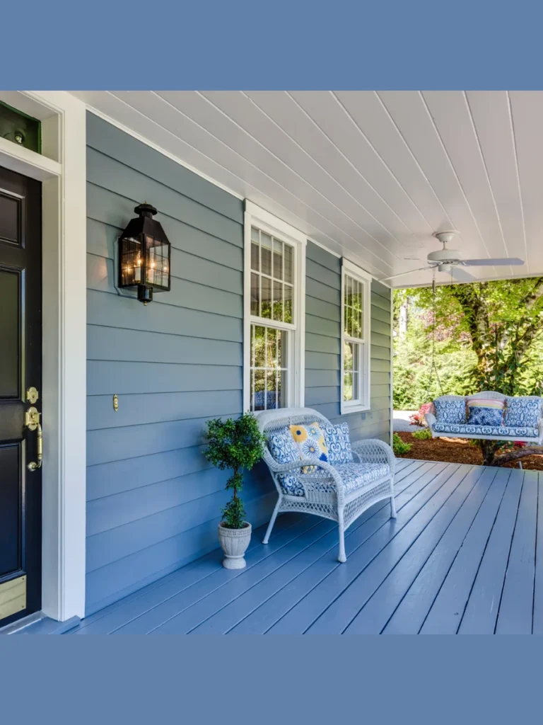
Painting a porch floor in a soft dusty blue is a long-standing tradition that adds a touch of charm. This color feels light and breezy and makes even the smallest porch feel like a part of the sky.
This color looks particularly stunning on historic homes that have plenty of white trim and traditional architectural details. It creates a calming environment that lowers the visual temperature of the space during a humid summer afternoon.
Dusty blue is surprisingly neutral and works well with a variety of accent colors like yellow or navy blue. It reflects a good amount of light back into the house, which helps your interior rooms feel brighter.
I suggest using this shade if you want a classic look that feels slightly more playful than basic gray. It hides water spots well and maintains its cheerful appearance even on overcast or rainy days throughout the year.
9. Jet Black for a High-Contrast Statement
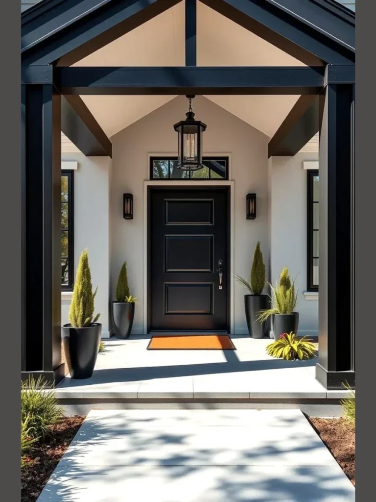
Jet black is the ultimate choice for homeowners who want to achieve a sharp and high-contrast designer look. It creates a bold foundation that makes white columns and colorful front doors look incredibly striking and modern.
Black paint hides a multitude of sins on older wood floors, including deep stains or unsightly hardware marks. I find that it gives a porch a very grounded and expensive feel that anchors the entire house.
You must be prepared for the heat factor, as black surfaces get very hot when exposed to direct sunlight. This color is best suited for north-facing porches or areas with deep overhangs that stay shaded all day.
Use a floor enamel with a slight gloss to make the black pigment look rich rather than flat or dull. This finish allows you to spray off dirt easily and keeps the porch looking like a luxury entrance.
10. Chocolate Brown for a Natural Wood Feel
Chocolate brown is a fantastic alternative for those who want the look of wood without the maintenance of staining. This deep, warm tone mimics the appearance of dark walnut and feels very solid under your feet.
It blends seamlessly with natural landscaping and stone foundations to create a very organic and cozy outdoor space. Brown is one of the best colors for hiding mud and heavy traffic in rural or wooded areas.
You can pair this with cream-colored furniture or green cushions to create a forest-inspired retreat on your front steps. It provides a sense of stability and warmth that makes your home feel very established and classic.
I recommend a semi-gloss finish to give the paint a slight “stained” look that reflects a bit of light. This choice is perfect for older porches that need a heavy-duty coating to protect the aging wood underneath.
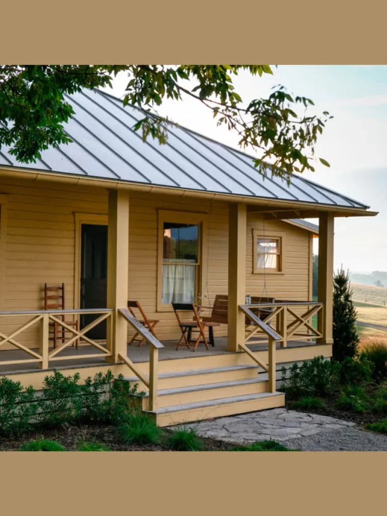
11. Butter Yellow for a Cheerful Entrance
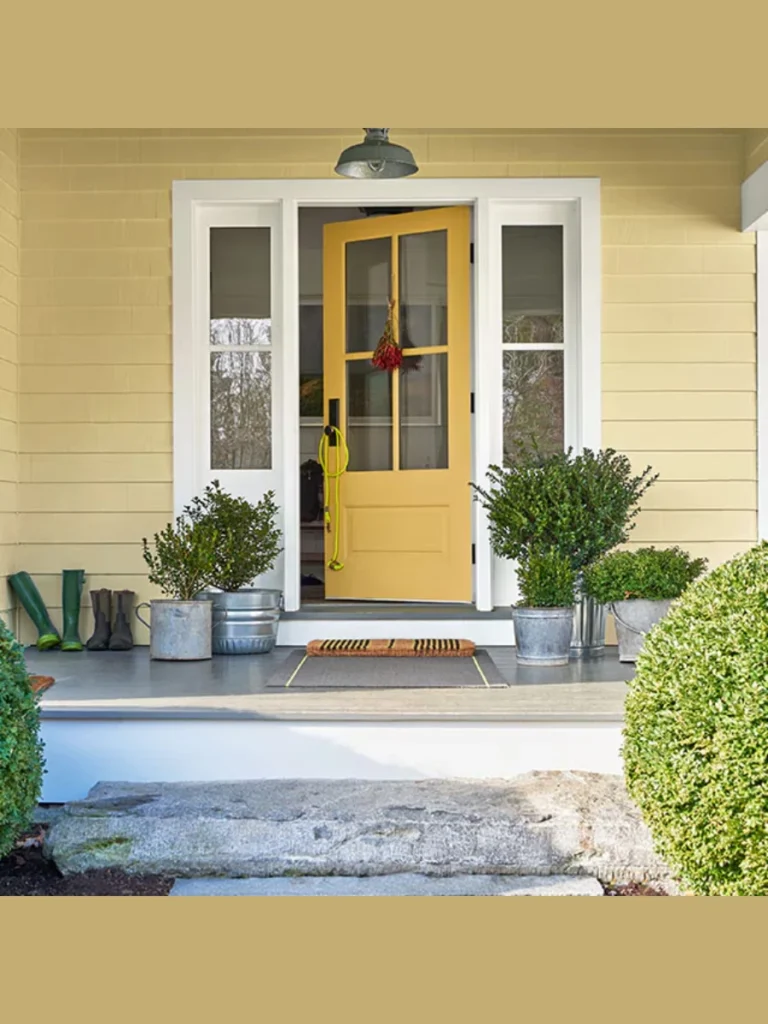
Butter yellow is a fantastic way to brighten up a dark entryway and give your home a friendly personality. This sunny shade feels instantly welcoming and works beautifully with white trim and green garden foliage nearby.
I find that yellow makes a porch feel wider and more open, which is great for cramped or narrow spaces. It is a classic cottage choice that brings a sense of happiness to your home’s exterior design.
While it shows dark mud, yellow is surprisingly good at hiding light-colored dust and dried grass clippings from mowing. You will want to use a high-quality primer to ensure the yellow pigment covers the old color.
Pair this with blue or white furniture to create a timeless coastal look that never feels too heavy. It is a brave choice that pays off by making your home the most inviting one on the block.
12. Olive Green for an Earthy Sophistication
Olive green offers a more sophisticated and grounded version of the classic green porch floor used in history. This shade feels very high-end and looks incredible on homes with stone veneers or dark wood accents.
It camouflages outdoor debris better than almost any other color, making it a very low-maintenance option for busy owners. I love how olive green stays looking clean even after a week of heavy rain and wind.
This color provides a beautiful backdrop for wooden rocking chairs and black metal lanterns for a traditional aesthetic. It feels very connected to the earth and helps your porch blend into the surrounding trees and shrubs.
Choose a satin or matte finish to keep the olive tone looking natural rather than like a bright plastic. It is a subtle way to add color without making your house look too loud or mismatched.
13. Barn Red for a Classic Country Look
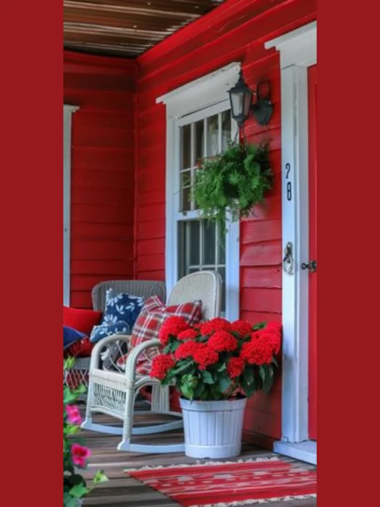
Barn red is a bold and traditional choice that adds a huge amount of curb appeal to farmhouse-style homes. This deep red feels very historic and provides a warm, energetic welcome to anyone who walks up the steps.
It looks stunning against white siding and black shutters, creating a classic American palette that feels very timeless. Red is a high-energy color that makes your porch the focal point of the entire home’s front facade.
Red paint is known for having great coverage, which makes it easier to apply over old or weathered porch boards. I suggest using a UV-rated paint to prevent the red from turning pink after seasons of sun exposure.
This color hides dark dirt and scuffs very well and only requires occasional cleaning to keep its vibrant look. It is a perfect choice for those who want their home to have a strong and confident presence.
14. Pewter for a Sophisticated Industrial Vibe
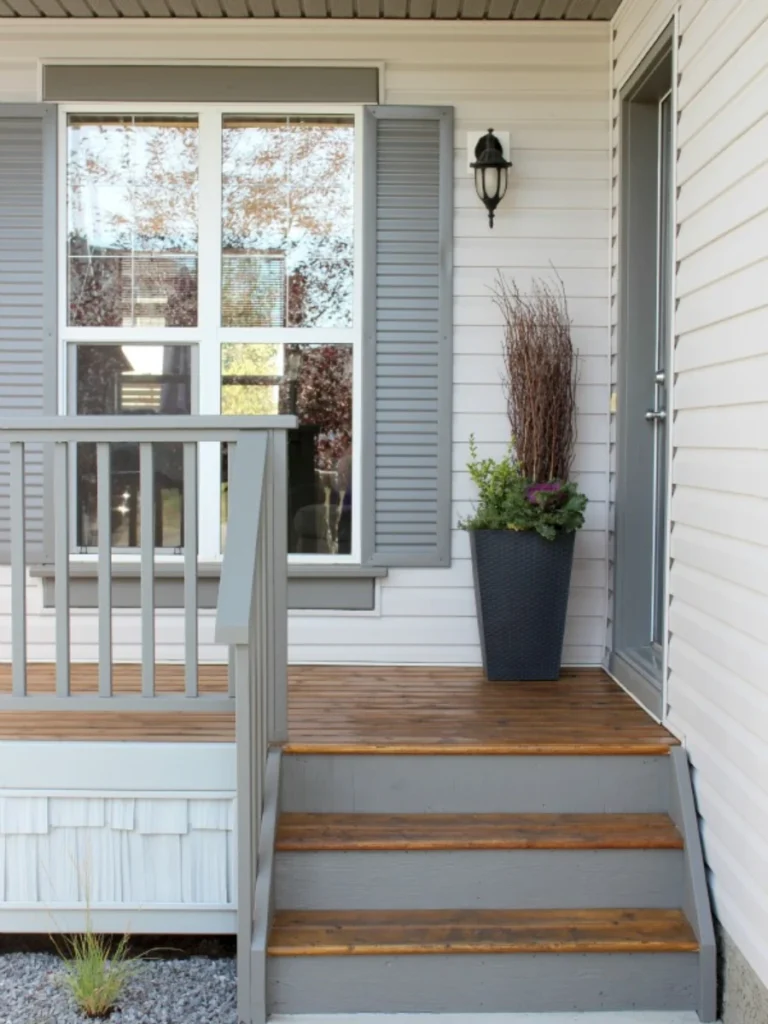
Pewter is a medium-toned gray with blue undertones that provides a very clean and metallic-inspired finish for your porch. It is slightly more modern than slate gray and offers a very polished look for urban homes.
I find that pewter hides water spots and silver-toned dust better than most other shades in the gray family. It creates a cool and calm atmosphere that is perfect for relaxing on a hot summer evening outside.
This shade works exceptionally well on concrete porches and gives them a smooth, stone-like appearance for a fraction of the cost. You can pair it with stainless steel accents or glass railings for a very sleek look.
A semi-gloss finish will enhance the metallic qualities of pewter and make the surface very easy to wipe down. It is a professional-looking choice that brings a touch of city style to any suburban front porch.
Professional Guide for a Long-Lasting Porch Paint Finish
I have learned the hard way that a beautiful porch starts with what you do before the paint hits the floor. You must clear every piece of furniture and give the surface a thorough cleaning with a stiff brush.
Removing old, peeling flakes is the only way to ensure your new color does not lift off within a few months. I always use a medium-grit sandpaper to scuff the surface so the fresh enamel has something to grip.
Applying a high-quality primer is the secret step that separates professional jobs from quick DIY mistakes. A good primer blocks old wood tannins from bleeding through and creates an even base for your chosen shade.
I recommend applying two thin coats of paint rather than one thick layer to avoid bubbles and uneven drying. You should wait at least twenty-four hours before walking on the surface to let the finish harden properly.
| Maintenance Task | Frequency | Purpose |
| Light Sweeping | Weekly | Seal small cracks or chips before they lead to peeling. |
| Soft Washing | Monthly | Removes pollen and bird droppings that can eat the coating. |
| Touch-up Painting | Yearly | Seals small cracks or chips before they lead to peeling. |
| Full Re-coating | 3-5 Years | Restores UV protection and keeps the color looking vibrant. |
Important Tips for Choosing Your Porch Materials
You should always check the weather forecast to ensure you have at least three dry days for your project. High humidity or unexpected rain can ruin the curing process and leave your porch looking streaky or dull.
I suggest buying a bit more paint than you think you need to keep for future repairs and touch-ups. Having the same batch of color makes fixing a small scratch much easier than trying to color-match later.
Consider adding a slip-resistant additive to your paint if your porch is exposed to rain or snow regularly. This clear grit provides extra traction without changing the look of your beautiful new color choice for safety.
Check the labels to ensure the paint you buy is specifically rated for “Porch and Floor” use rather than siding. These formulas are designed to be much harder and more flexible to handle the weight of heavy furniture.
Conclusion
I have seen how a simple color change can completely revive a home and make it the star of the street. Whether you want the bold look of navy or the calm of sage, the right paint is out there.
Your porch is the first thing people see, so choosing a shade that reflects your personality is a great investment. Taking the time to prep the area correctly will ensure your hard work stays looking fresh for years.
I hope these ideas help you narrow down the perfect palette for your specific home style and local environment. Remember that paint is one of the most affordable ways to add real value to your property quickly.
I am confident that following these steps will lead to a successful project that you can be proud of every day. Grab your brushes and start creating the outdoor living space you have always wanted for your family.
FAQs
Most porch paints are dry to the touch in about four hours, depending on the local humidity and temperature. I recommend waiting a full twenty-four hours for foot traffic and seventy-two hours before moving heavy furniture back.
You can paint over old layers if the existing surface is still well-attached and not currently peeling or cracking. You must sand the old glossy finish first to ensure the new coat can bond securely to the old surface.
I prefer using a roller with an extension pole for the main floor areas to get a smooth and even finish. You should save the brush for cutting in along the edges and getting into the gaps between the floorboards.
Peeling usually happens because the surface was damp or dirty when the paint was first applied to the porch. It can also occur if you used regular exterior house paint instead of a dedicated porch and floor enamel.
Most modern porch and floor paints are self-sealing and do not require an extra clear coat over the top surface. However, adding a specialized sealer can provide extra UV protection if your porch sits in direct, punishing sunlight all day.