I’ve always had a soft spot for pastels. They bring in calm, charm, and that lived-in comfort we all crave without screaming for attention. But let’s be honest: pastels can go either way. Soft sophistication… or nursery disaster.
The good news? With the right styling, pastels can make your bedroom feel modern, elevated, and totally grown-up. And that’s exactly what I’m sharing here pastel bedroom ideas that blend softness with modern flair.
Let’s talk about how pastels are taking over interiors lately and how you can make your bedroom Pinterest-worthy without it feeling like a dollhouse.
Rise of Pastels in Contemporary Interiors
Pastels used to live in baby rooms and spring cards. Not anymore.
Now, pastel colors are dominating modern design boards, Instagram reels, and interior catalogs. Why? Because they soften harsh modern edges and bring warmth without overpowering the space.
I’ve noticed more people (myself included) mixing muted pastels like dusty rose, sage, and lavender with minimal decor, textured bedding, and subtle metals. It creates a space that feels calm, airy, and stylish without being loud.
Even better pastels pair beautifully with natural wood, white walls, terrazzo, marble, and brushed brass. So no, pastels aren’t a trend. They’re a movement.
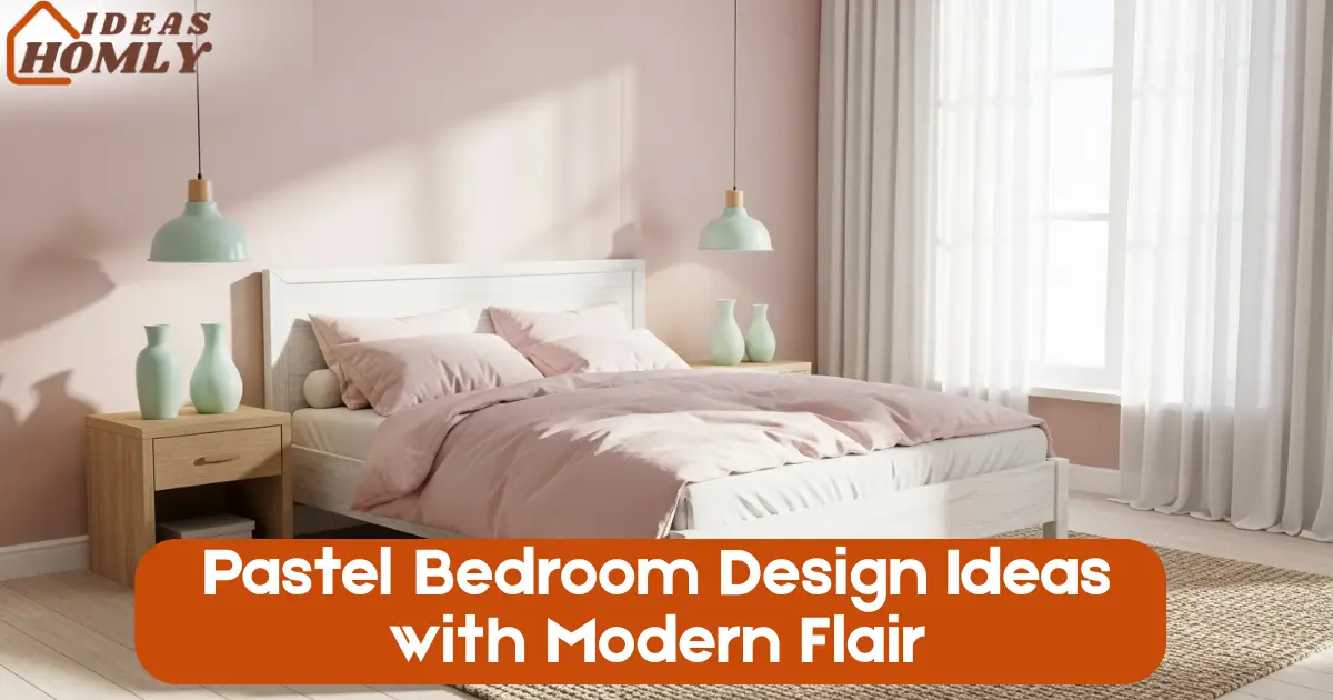
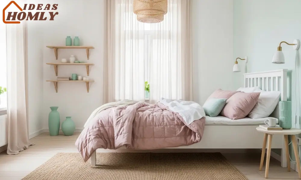
1. Scandinavian Minimalism with Mint or Blush
Let me just say this if you love clean lines, open space, and that “Instagram calm,” this one’s for you.
Mint green or soft blush pairs like magic with Scandinavian design. You don’t need a lot. Just one pastel wall, a set of linen curtains, or even just a throw pillow in the right shade.
The goal here? Keep things light, neutral, and uncluttered. I once styled a small bedroom with all-white furniture and added a pale mint accent wall. It instantly made the space feel cooler, brighter, and more restful.
Try this combo:
- White-washed wooden bed frame
- Blush pink quilted bedding
- Mint ceramic planters or vases
- Natural jute rug for grounding
- Sheer curtains to let in soft daylight
Keep the decor matte, not glossy. Glossy finishes feel out of place in minimalist pastel spaces.
A Scandinavian-style pastel room isn’t just photogenic it actually feels like a breath of fresh air. Like a tiny retreat inside your home.
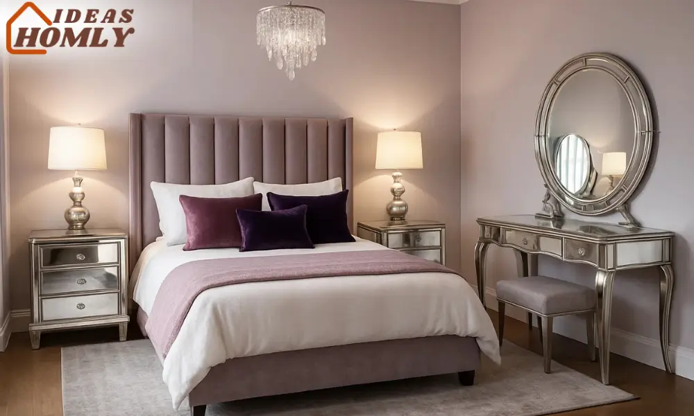
2. Glamorous Lavender and Mirror Elements
Now if you’re someone like me who secretly loves a little drama in their decor (no shame), this pastel setup will make your heart happy.
Lavender walls with mirror accents = bold meets soft.
This idea works best if you love a glam vibe but still want to keep things gentle and dreamy. Think about incorporating mirrored nightstands, metallic table lamps, or even a vintage vanity with a lavender backdrop.
I did this once in a guest bedroom and paired the setup with deep violet and dusty mauve pillows. The whole room looked chic and feminine without crossing into over-the-top.
Key pieces that work wonders:
- Velvet lavender cushions or headboard
- Crystal knobs or mirrored drawer fronts
- A soft gray or silver area rug
- Warm white lighting (avoid harsh LEDs)
Lavender has this way of being soft but still confident. Add mirrors, and suddenly the space feels bigger, brighter, and surprisingly luxurious without costing a fortune.
Pastel Color Pairing
| Pastel Shade | Works Well With | Best Room Vibe |
|---|---|---|
| Mint | White, natural wood | Airy, Scandinavian |
| Blush Pink | Beige, warm neutrals | Feminine, cozy |
| Lavender | Silver, charcoal, mirror | Chic, glam |
| Peach | Cream, soft gold | Warm, relaxed |
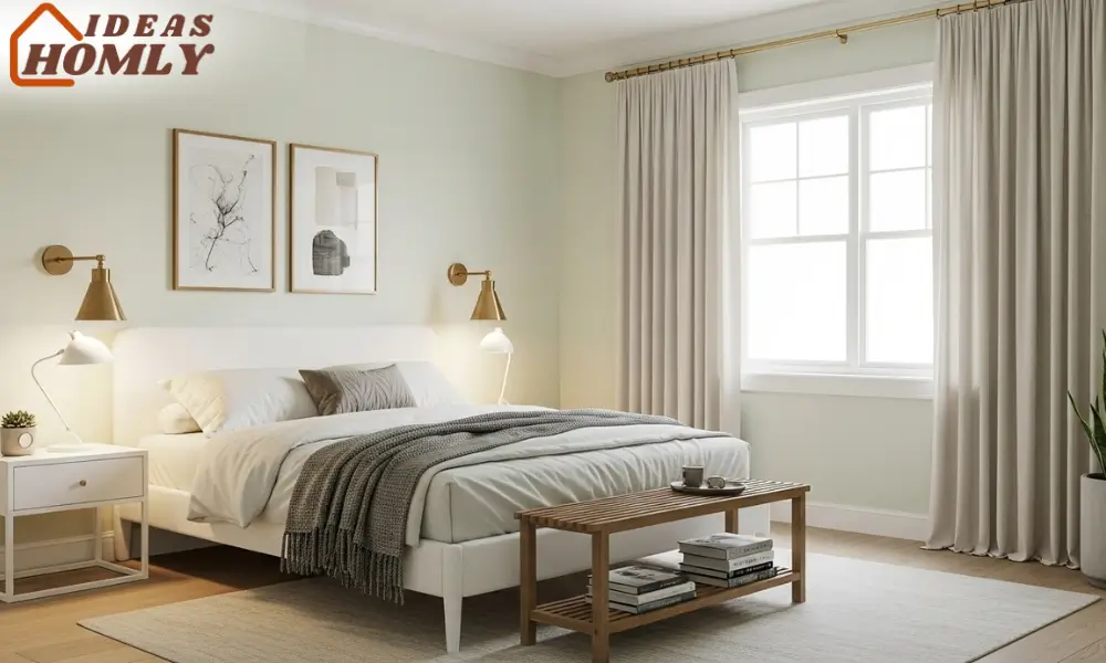
3. Minimal Pastel with Brass Accents
Now, I’ll admi I didn’t always think brass could work with pastels. But when done right? It’s ridiculously stylish.
This combo is all about balance. The softness of pastel shades like dusty peach, sky blue, or pale sage contrasts beautifully with the warmth of brushed brass. It adds that modern edge without feeling industrial or cold.
Think clean-lined furniture, neutral walls, and just a few hits of brass to elevate the look.
I once styled a bedroom with sage green walls, a simple white bed, and brass sconces. Nothing fancy, but every guest who walked in said, “This feels like a boutique hotel.”
Here’s how you can make it work:
- Stick with one pastel tone as your primary shade
- Use brass accents in the form of lighting, curtain rods, or drawer handles
- Add white or ivory as your neutral base
- Layer with soft textures like wool throws or linen sheets
This idea is perfect for someone who loves subtle elegance. It’s modern, but not showy. Warm, but not too cozy. Just the right kind of “put together.”
Also, brass has that timeless vibe so if you’re into sustainable styling, you’re winning here. You won’t feel the urge to update the space in a year.
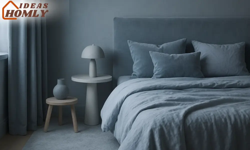
4. Monochrome Pastel Luxe
This one’s for those who love a bit of drama… but in a quiet way.
Pick one pastel color and go all in. Walls, curtains, bedding, accessories. One tone, different shades.
I know it sounds risky, but hear me out.
I once styled a room completely in soft blue-gray tones. The bed, the rug, the curtains; all varying shades of the same palette. And instead of feeling overwhelming, it felt luxurious. Like stepping inside a cloud.
The trick is to use texture and layering to avoid looking flat. Add velvet cushions, sheer drapes, and matte ceramics. Your space becomes soft and cocoon-like, but still modern.
To create a monochrome pastel room:
- Use 3-4 shades of the same pastel
- Mix materials like cotton, velvet, rattan, and metal
- Break it up with soft lighting and a few plants
- Go for large pieces in tone-on-tone styles (like a headboard that matches your drapes)
This look screams designer without actually hiring one. And it’s incredibly soothing for the mind, perfect if your bedroom is your go-to escape zone after a long day.
Monochrome pastels = modern luxury, minus the noise.
How to Avoid Making Pastels Look Too Childlike
Okay, let’s be honest. The biggest fear people have with pastels? That their bedroom will look like a baby’s nursery. Been there, dodged that.
Here’s what I’ve learned from years of experimenting with pastel design:
1. Avoid cutesy patterns
Skip the clouds, stars, bunnies, and anything remotely cartoon-ish. Let color be the feature not patterns.
2. Anchor the space with neutrals
White, taupe, and wood tones help ground pastel shades. You don’t want the whole room floating away in a cotton-candy dream.
3. Focus on clean lines and grown-up silhouettes
Stick with structured furniture. Avoid overly frilly or scalloped shapes.
4. Use accents strategically
Don’t go overboard. A pastel wall, one rug, or a bedspread is enough. Balance it with metallics, ceramics, and plants.
5. Stick with muted tones
Go for dusty rose, sage, lilac, or stone blue not bright bubblegum or neon peach.
Whenever I design with pastels, I always stop and ask myself, “Does this feel intentional or themed?” If it feels too theme-y, I pull back. A few tweaks can shift the whole energy.
Pastels That Feel Grown-Up
| Childlike Shade | Grown-Up Alternative |
|---|---|
| Baby Pink | Dusty Rose |
| Light Yellow | Buttery Cream |
| Sky Blue | Steel Blue |
| Bright Lavender | Smoky Lilac |
| Mint Green | Sage or Eucalyptus Green |
Conclusion
Pastels aren’t just for kids or spring decor anymore. With the right styling, they bring in softness, warmth, and a modern edge that fits almost any aesthetic.
Whether you’re into that Scandi-clean look with mint tones, or love the glam of lavender paired with mirrors, or maybe you’re drawn to the subtle elegance of brass with pastels, there’s a way to make it your own.
My personal favorite? The monochrome pastel luxe vibe. It feels like being wrapped in a soft blanket that also happens to be stunning.
And the best part is you don’t need a massive budget. You just need intention, balance, and a bit of courage to experiment with color.
So if you’ve been sitting on the pastel fence, consider this your sign. It’s time to give your bedroom that soft touch… with serious style.
FAQs
In my experience, pastels pair beautifully with soft neutrals like white, beige, and light gray. Natural wood also complements them really well. If you want contrast, try pairing pastels with deep shades like charcoal or navy, it adds drama without clashing.
Absolutely, just keep it intentional. Stick to 2–3 pastel shades max, and make sure they have the same undertone (cool or warm). I once mixed sage green with dusty pink and it turned out dreamy because I balanced the space with a lot of white and beige.
They’re perfect for small rooms. Lighter pastel shades can actually make your space look bigger and brighter. I’ve styled tiny bedrooms using soft blues and blush pinks, and the difference in openness was honestly impressive.
Start with textiles and accessories. Throw pillows, bedsheets, lamps, rugs; all of these are easy ways to introduce pastel tones without lifting a paintbrush. It’s how I started experimenting with pastels myself before I committed to a full wall.