
Color can completely shift how a dining space feels, often faster than any furniture change. I have seen rooms transform simply through thoughtful paint selection and careful finish choices.
Dining room painting ideas are not just about trends, they shape atmosphere, highlight architectural features, and influence how light moves across the walls.
When I approach a repaint, I consider undertones, ceiling height, and surrounding materials before choosing a shade.
With the right balance, paint becomes more than decoration, it becomes the foundation that defines comfort, depth, and personality in the dining area.
How the Right Paint Color Changes a Dining Room
Paint has the power to reshape a dining room without altering its structure. I always evaluate how color interacts with natural light, ceiling height, and surrounding finishes before making a decision.
A thoughtful shade enhances architectural lines and sets the emotional tone of the space.
The right paint choice can make a compact room feel expansive or a large space feel intimate. I focus on undertones and balance to ensure the color supports furniture and lighting rather than competing with them.
1. Bold Accent Wall Paint
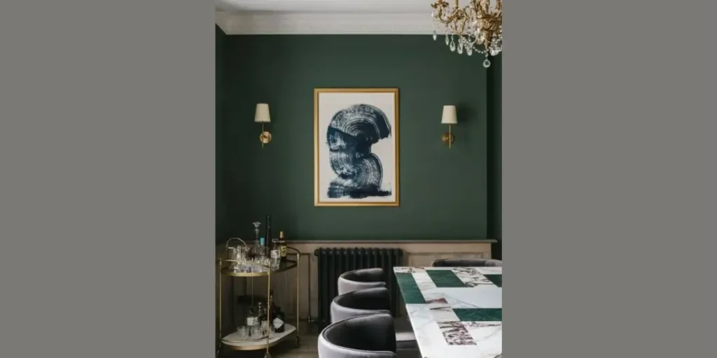
A bold accent wall instantly defines the dining area. I often use deep navy, forest green, or rich burgundy to create a striking focal point behind the table. This approach adds depth without overwhelming the entire room.
By limiting strong color to one wall, I maintain balance and prevent visual heaviness. Neutral surrounding walls keep the space refined.
When paired with layered lighting, a bold accent becomes dramatic yet controlled. It elevates the dining atmosphere confidently.
2. Two Tone Wall Design
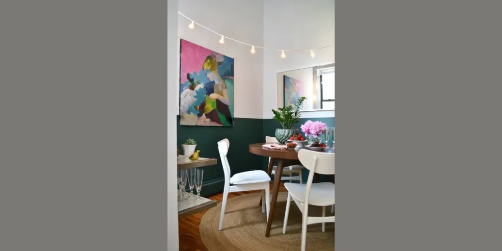
A two tone wall design introduces structure and visual layering. I apply a darker shade to the lower portion of the wall and a lighter tone above to elongate proportions.
This technique creates subtle architectural definition without requiring paneling. It enhances depth while maintaining openness.
When the colors share complementary undertones, the result feels cohesive and intentional. The dining room appears polished and thoughtfully designed.
3. Warm Neutral Beige or Greige
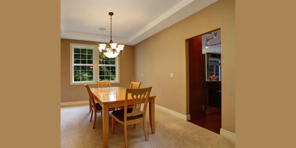
Warm beige or greige provides a timeless foundation. I rely on these tones when I want flexibility with décor and furniture updates. They offer softness without feeling flat.
Neutral shades reflect light gently, creating a welcoming dining environment. They complement both wood and metallic finishes.
By layering texture through fabrics and lighting, I keep neutral walls visually interesting. The room feels calm yet sophisticated.
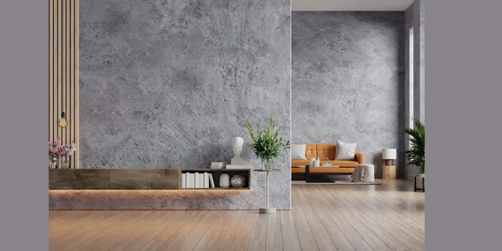
4. Moody Charcoal Gray
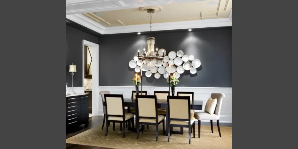
Charcoal gray creates a refined and dramatic setting. I choose this shade when I want to introduce depth without resorting to pure black.
Proper lighting ensures the space remains inviting. Warm bulbs soften the intensity of darker walls.
Charcoal also enhances artwork and metallic accents beautifully. It provides a sophisticated backdrop that feels contemporary.
5. Soft Pastel Blue
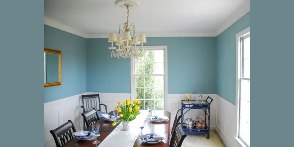
Soft pastel blue introduces calmness into the dining room. I use muted blue tones to create a serene environment without overwhelming brightness.
This shade enhances natural light and pairs well with white trim. It works especially well in smaller spaces.
By combining pastel blue with warm wood furniture, I achieve balance between cool and warm elements. The space feels fresh and airy.
6. Earthy Olive Green
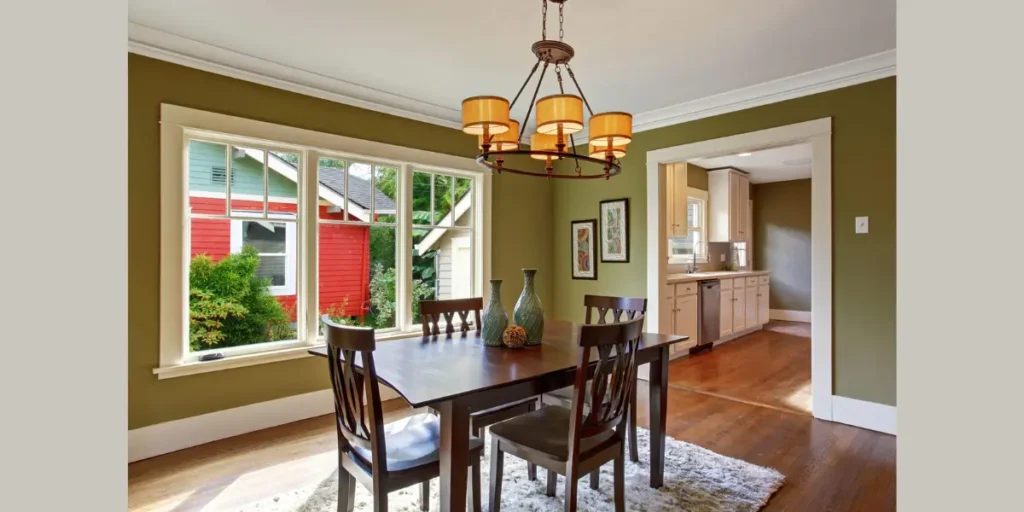
Olive green adds warmth inspired by nature. I select this tone to create a grounded and inviting dining space.
It pairs beautifully with walnut or oak furniture. The earthy undertone enhances natural textures.
Balanced lighting prevents olive from appearing too dark. When executed properly, it creates richness without heaviness.
7. Matte Black Statement
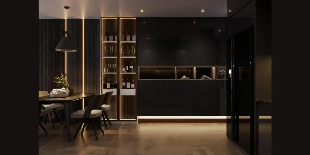
Matte black walls deliver bold sophistication. I often apply this color in dining rooms with strong natural light or statement lighting fixtures.
Black enhances contrast and sharpens architectural lines. It allows lighter décor to stand out clearly.
To maintain comfort, I combine black walls with warm metallic accents. The overall effect feels dramatic yet elegant.
8. Blush or Dusty Rose Accent
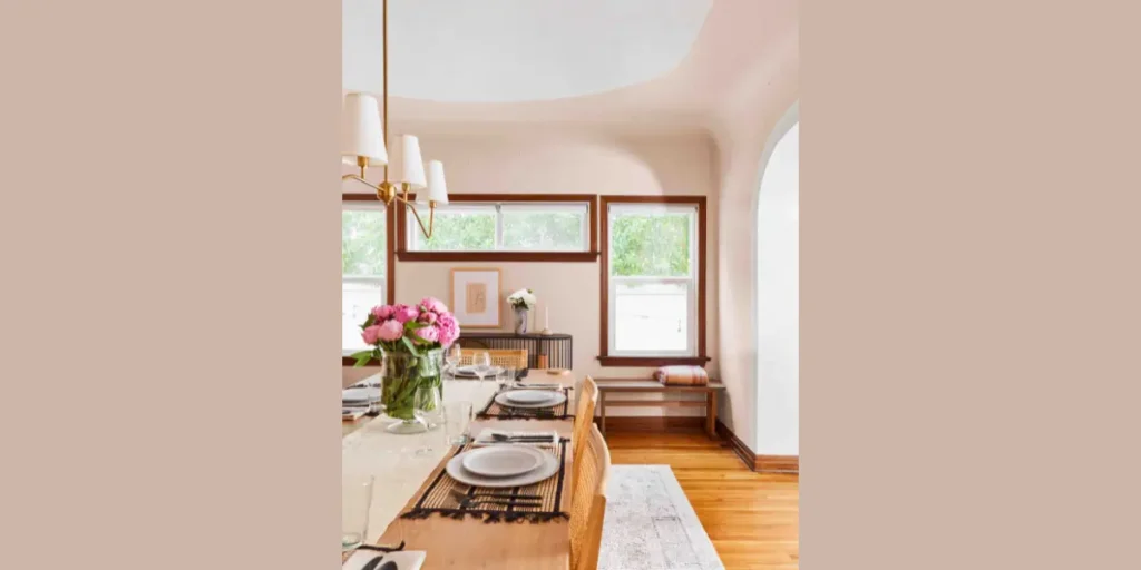
Blush or dusty rose introduces subtle warmth without overpowering the room. I prefer muted variations that feel refined rather than vibrant.
This tone complements brass fixtures and neutral upholstery effectively. It softens modern interiors.
When used strategically, blush enhances intimacy in the dining area. It adds personality while maintaining balance.
9. Textured Paint Finish
Textured finishes such as limewash or plaster create depth beyond flat color. I use this technique to introduce subtle movement across the walls.
The texture reacts differently to light throughout the day, adding dimension. It feels artisanal and layered.
This option works well in minimalist dining rooms where detail matters. It enhances interest without requiring additional decor.
10. Classic White with Colored Trim
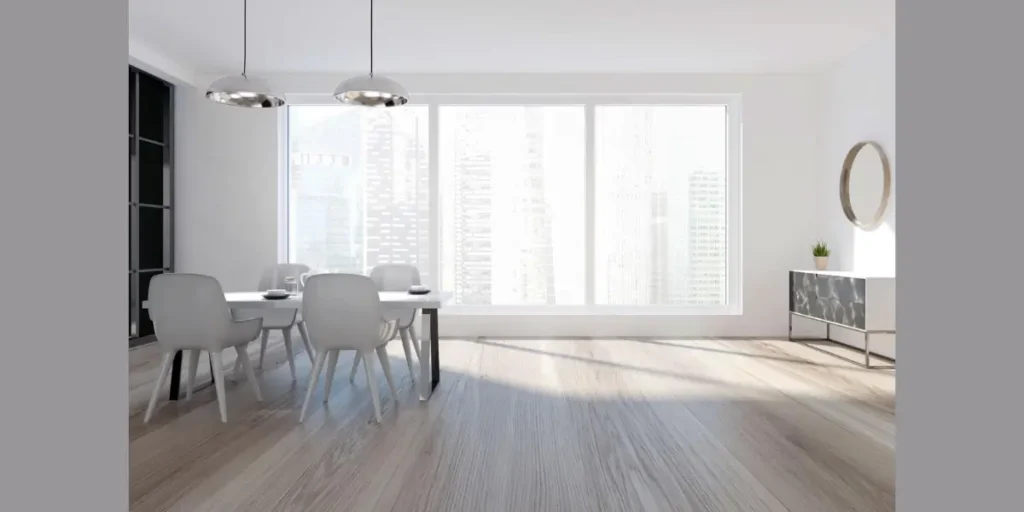
Classic white walls paired with colored trim create crisp contrast. I often use this approach to highlight architectural details.
The white base keeps the dining room bright and open. Bold trim introduces character without overwhelming the space.
By selecting a trim color that complements furniture, I achieve cohesion. This method modernizes traditional spaces effectively.
How to Choose the Perfect Paint Finish and Shade
Selecting the right paint finish and shade requires more than picking a color you like. I always begin by evaluating natural light, ceiling height, and the undertones of flooring and furniture. These factors influence how the paint will actually appear once applied.
A balanced shade should enhance the dining table, lighting fixtures, and architectural details. When color and finish align with the room’s structure, the entire space feels intentional and cohesive rather than randomly styled.
Test Paint Samples in Different Lighting
I never rely solely on a paint swatch card. I apply sample patches directly on the wall and observe them throughout the day. Natural and artificial light can shift undertones dramatically. Testing prevents costly mistakes and ensures confidence in the final decision.
Choose Finish Based on Durability Needs
Finish matters just as much as color. I usually recommend eggshell or satin finishes for dining rooms because they resist stains while maintaining a subtle sheen. Matte finishes look elegant but may show marks more easily.
Coordinate Undertones With Furniture
Every wood stain and fabric has an undertone. I compare paint samples beside the dining table and upholstery to avoid clashes. Harmonizing undertones creates a smooth and refined overall look.
Avoid Overly Glossy Finishes
High gloss finishes can create glare, especially under pendant lighting. I prefer softer finishes that diffuse light gently. Controlled sheen maintains sophistication without distracting reflections.
Consider Ceiling Color Impact
Ceiling color influences perceived height and brightness. I often keep ceilings lighter than walls to create openness. A cohesive ceiling shade supports the entire color scheme subtly.
FAQs
Lighter shades such as soft white, pale gray, or muted beige typically make a dining room appear larger. These colors reflect more light and enhance openness. However, strategic darker accents can add depth without shrinking the space.
The choice depends on lighting and surrounding materials. I often lean toward warm tones in dining rooms because they create an inviting atmosphere. Cooler tones can work well in spaces with abundant natural light.
Yes, dark paint can work if balanced carefully. I ensure adequate lighting and contrast with lighter furniture or trim. When applied thoughtfully, darker shades add sophistication rather than heaviness.
Yes, combining colors can add structure and personality. I recommend limiting the palette to complementary tones that share similar undertones. Controlled contrast ensures harmony rather than visual chaos.
Conclusion
The right paint choice can completely redefine your dining experience. I always view color as the foundation that ties together furniture, lighting, and architectural details.
Whether you prefer bold statement walls or soft neutral layers, the key lies in balance and proportion. Paint should enhance the atmosphere, not overpower it.
When shade, finish, and lighting work together, the dining room feels intentional and welcoming. A thoughtful painting strategy allows you to refresh the space without major renovation.
With careful selection and proper testing, you can create a dining room that feels refined, cohesive, and perfectly suited to everyday meals and special gatherings alike.