
Wall color has the power to completely change how a bathroom feels the moment you step inside. When I plan a bathroom design, wall color is never an afterthought—it sets the foundation for light, space, and overall comfort.
The right shade can make a small bathroom feel open, a dark space feel brighter, and a plain layout feel intentional. From soft neutrals to deeper, expressive tones, wall colors influence both mood and functionality.
By choosing bathroom wall colors thoughtfully, homeowners can create spaces that feel calm, balanced, and visually appealing without relying on expensive renovations.
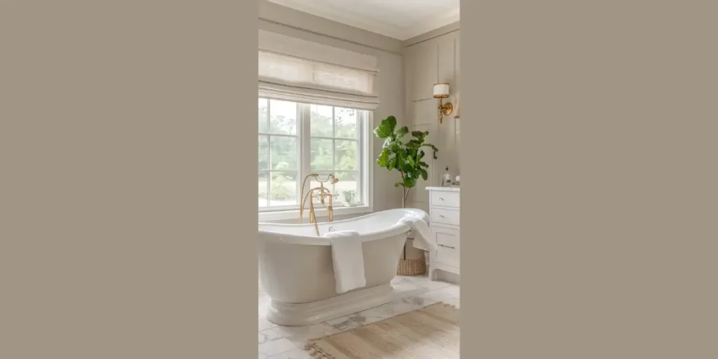
1. Soft White
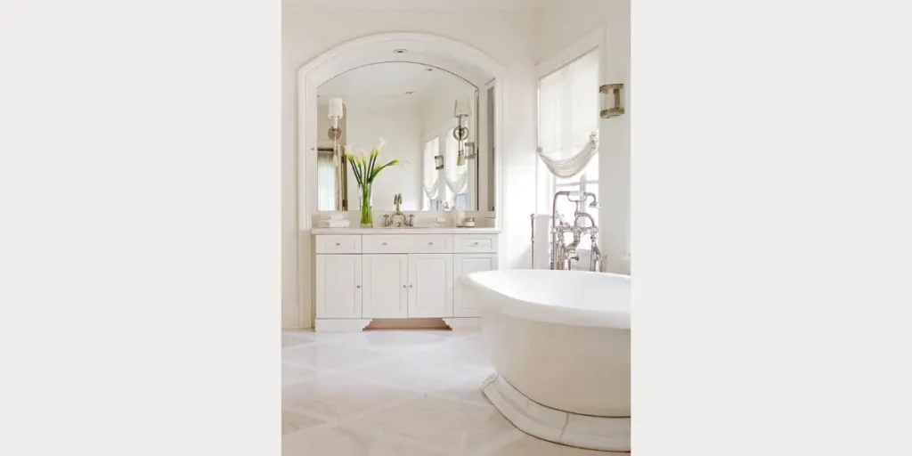
When I choose soft white for bathroom walls, I focus on clarity and brightness. This shade reflects light beautifully and immediately makes the space feel open and fresh. It works well in both small and large bathrooms.
I prefer soft white over pure white because it feels warmer and less clinical. It pairs effortlessly with marble, wood, and metal finishes without competing for attention.
Soft white is a reliable choice for long-term design. It keeps the bathroom feeling clean, adaptable, and visually calm no matter how styles or fixtures change.
2. Light Gray
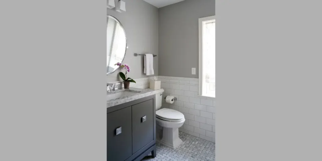
Light gray adds depth without darkening the bathroom. When I use this color, I aim for a balanced look that feels modern but not cold. It provides contrast while maintaining softness.
I often pair light gray walls with white tiles or wood accents to keep the space warm. This combination feels structured and contemporary at the same time.
Light gray works especially well in bathrooms with good lighting. It delivers a clean, sophisticated look that remains practical and easy to maintain.
3. Beige and Warm Neutrals
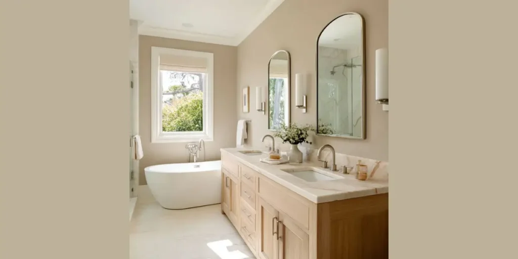
Beige and warm neutral tones help me create a welcoming bathroom atmosphere. These shades soften the space and reduce harsh contrasts, especially under artificial lighting.
I like using beige when homeowners want something warmer than gray but still timeless. It blends naturally with stone, ceramic, and wood finishes.
Warm neutrals work well for everyday bathrooms. They feel comfortable, forgiving, and easy to live with while maintaining a polished, interior-focused appearance.
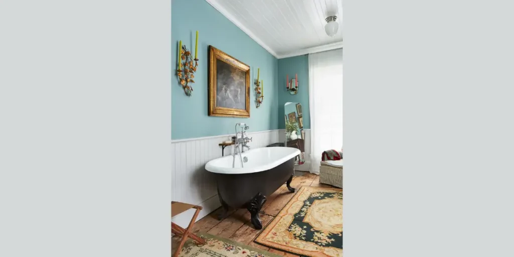
4. Soft Blue
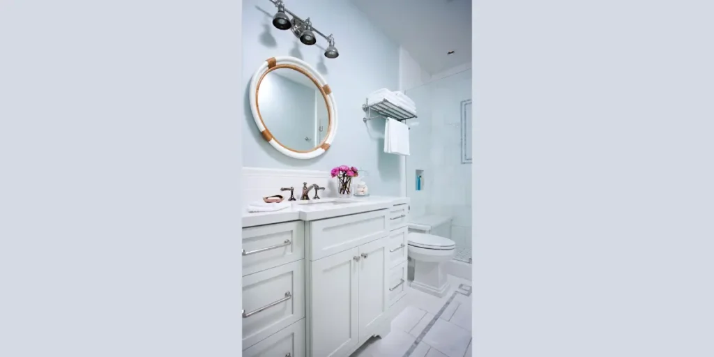
Soft blue instantly brings a sense of calm into the bathroom. When I apply this color, I focus on lighter tones that feel airy rather than overpowering.
I often use soft blue in bathrooms designed for relaxation. It connects naturally with water elements and supports a spa-like experience.
This color works best when balanced with white fixtures and simple finishes. Soft blue creates a soothing environment that encourages comfort and quiet moments.
5. Sage Green
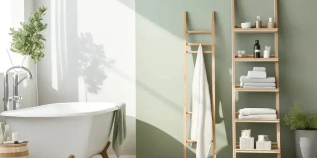
Sage green allows me to introduce nature-inspired calm into bathroom interiors. This muted green feels fresh without being too bold or trendy.
I often pair sage green walls with wood accents, stone textures, or plants. These combinations reinforce a natural, grounded atmosphere.
Sage green suits bathrooms where relaxation matters. It adds character while staying subtle, making it ideal for homeowners who want color without visual overload.
6. Charcoal Gray
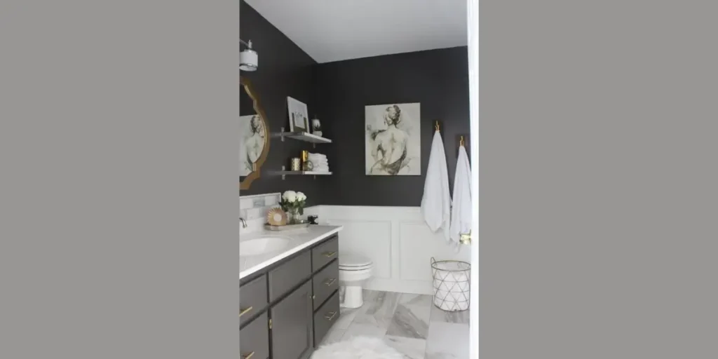
Charcoal gray brings depth and drama when used correctly. I often apply it as an accent wall or in larger bathrooms where natural light balances the darkness.
I pair charcoal gray with light tiles and warm lighting to prevent the space from feeling heavy. This contrast adds sophistication and structure.
Charcoal works best for confident designs. It creates a high-end feel while maintaining a clean, modern bathroom interior when thoughtfully planned.
7. Pale Pink or Blush
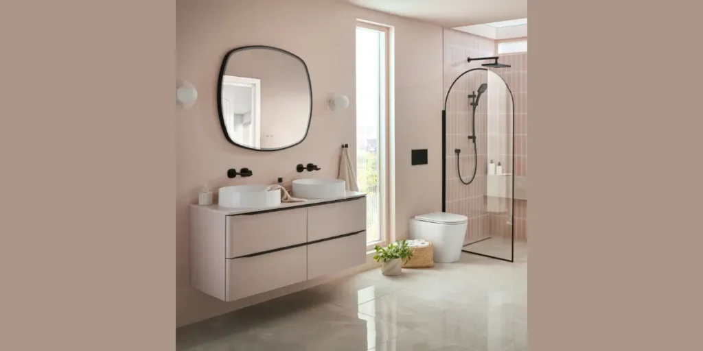
Blush pink adds warmth and subtle elegance to bathroom walls. When I use this color, I focus on muted tones that feel refined rather than playful.
I balance blush walls with neutral fixtures and simple materials. This keeps the design modern and intentional.
This color works well in contemporary interiors where softness matters. Pale pink offers personality without overpowering the bathroom’s overall design.
8. Navy Blue
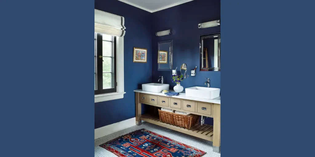
Navy blue creates a strong visual statement in bathroom interiors. I use it when homeowners want depth and character without sacrificing elegance.
I often pair navy walls with white tiles or metallic accents to keep the space balanced. Good lighting is essential to highlight the richness of the color.
Navy blue suits modern and classic bathrooms alike. It adds luxury while maintaining a controlled, polished interior look.
9. Taupe
Taupe gives me the flexibility of both gray and beige. This balanced neutral feels warm, modern, and easy to style.
I like using taupe when clients want something subtle yet distinctive. It adapts well to different lighting conditions.
Taupe works well for long-term design. It supports a calm, refined bathroom interior without feeling dated or overly plain.
10. Two-Tone Wall Colors
Two-tone wall colors allow me to add depth and creativity to bathroom interiors. I often divide colors horizontally to define the space visually.
This approach works well in bathrooms with limited size or height. Light colors above and darker shades below create balance.
Two-tone walls feel intentional and modern. When done carefully, they add character without overwhelming the bathroom’s overall design.
How to Choose the Right Wall Color for Your Bathroom
When I select wall colors for a bathroom, I always start with lighting and space size. Natural light changes how colors appear, while artificial lighting can either enhance or dull a shade.
I also consider how wall colors interact with tiles, vanities, and fixtures. Maintenance matters too, some shades show moisture marks or wear more easily.
A well-chosen wall color should feel balanced, support daily use, and stay visually appealing over time without constant updates.
FAQs
Light shades like soft white, pale gray, and light beige reflect more light, which helps visually expand a small bathroom. I often pair these colors with mirrors to enhance openness. This combination keeps the space bright and comfortable.
Dark colors can work well when used thoughtfully. I recommend them for accent walls or larger bathrooms with good lighting. Balanced correctly, darker shades add depth and elegance without making the space feel closed in.
For windowless bathrooms, I usually choose warm neutrals or light tones. These colors prevent the space from feeling dull or heavy. Proper lighting combined with the right wall color keeps the bathroom feeling fresh.
Yes, two-tone wall colors can add interest and structure. I often use lighter colors on upper walls and darker tones below. This approach defines the space while keeping the design cohesive.
Related Post
- Bathroom Wall Art Ideas
- 10 Creative Bathroom Wall Decor Ideas
- Popular Bathroom Interior Design Ideas
- Small Bathroom Storage Ideas
- Top 12 Bathroom Style Ideas for Modern Living
Conclusion
Choosing the right bathroom wall color is one of the most impactful design decisions you can make. The right shade can change how spacious the room feels, influence mood, and enhance every fixture and surface in the space.
Throughout this guide, I’ve shared color ideas that work across different bathroom sizes, lighting conditions, and design styles.
I always encourage homeowners to think beyond trends and focus on how a color performs in daily use. With thoughtful selection and balance, bathroom wall colors can create a space that feels calm, cohesive, and visually appealing for years to come.